Design Principles - Anatomy of Type & Readability/ Legibility


- “Type is speech made invisible”
- Industrial Revolution - Process of print
- Became mandatory to read in schools.
- Accents, emphasis & phonemes shown visually instead of verbally.
- “Visual speech”
-CRUDE – Associations made with “crude oil”. Stencils bring thoughts of oil barrels, military etc...
- Italics – lead you forward, hints at movement.
- Type and image conjunction  & context helps with interpretation of typeface.
- Conflicting information can be formed via colour.
- Cambridge university experiment with words – “aoccdrnig to rscheearch at Cmabrigde Uinervtisy” – strong visual literacy. More difficult to read from Gothic to Block font.
- Some people find Roman fonts easier to read than sans serif fonts – often a sign of Dyslexia. Roman becomes harder to read at a larger scale, in terms of body copy. Block becomes easier, as the spacing is easier to see.
-You can use lots of fonts under a different typeface and it work, but difference typefaces often clash. Rule of thumb: NO MORE THAN 3 FONTS.

Vocabulary

- Font – The means to create a typeface, be it computer code, lithographic film, metal or woodcut.
- Usually standard alpha numeric, and basic grammatical elements. A font is not just about letterforms, there are also glyphs.  
- PUB QUIZ GOLD: Helvetica has a square full stop, Arial has a round full stop.
- A font isn’t necessarily an entire typeface. “A series of fonts make up the Gill Sans typeface”
-Display font – a font that is usually used at titles and not for a large body of text.

- Typeface – A collection of characters, letters, symbols, punctuation etc..   Which have the same distinct design.
- Composed of fonts: Light, Regular, Bold, Roman, Condensed, Extended, Boldface.
- You can also get Gothic (stripped down sans serif font), Block (headlines, width, big black stroke), Roman (serif fonts) and Script (handwritten, curly terminals) fonts.
- A broader collection of type, font is more focussed.

- Font Family - A set of fonts all with the same typeface, but with different sizes, weights and slants.

- Weight­­ – Fonts are individual when different weights, but still come under the same typeface.

- Leading – the spacing between letters. Originated from the use of lead between letters in print.

- Counter – Negative space within a letterform. Eg. A, p d, C eg FedEx, OGC

- Bodycopy – the main written text, not including headlines etc..

- Legibility – the degree to which glyphs (individual characters) in text are understandable or recognizable based on appearance. An accurate distinction is needed, through the letter itself.

- Readability – The ease in which text can be read and understood. Influenced by line length, primary/ secondary leading, justification, typestyle, kerning, tracking etc..

- Tracking – When letters in a word are spread out.

- Kerning - When letters in a word are pulled in.  

- - - - - - - - - - - - - - - - - - - - - - - - - - - - - - - - - - - - - - - - - - - - - 

Readability / Legibility:

Identify the full typeface of your given fonts, and find the most readable: 

-Century Gothic- 
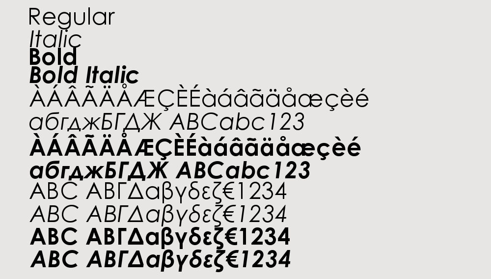

1. Century Gothic™ Regular 
2. Century Gothic™ Italic
3. Century Gothic™ Bold 
4. Century Gothic™ Bold  Italic
5. Century Gothic™ Cyrillic 
6. Century Gothic™ Cyrillic Italic
7. Century Gothic™ Cyrillic Bold
8. Century Gothic™ Greek
9. Century Gothic™ Greek Italic
10. Century Gothic™ Greek Bold
11. Century Gothic™ Greek Bold Italic


- - - - - - - - - - - - - - - - - - - - - - - - - - - - - -

-Futura-


1. Futura® Light
2. Futura® Light Oblique
3.  Futura® Book
4.  Futura® Book Oblique
5.  Futura® Medium
6.  Futura® Medium Oblique
7.  Futura® Heavy
8.  Futura® Heavy Oblique
9.  Futura® Bold
10.  Futura® Bold Oblique
11.  Futura® Extra Bold
12.  Futura® Extra Bold Oblique
13.  Futura® Light Condensed
14.  Futura® Light Condensed Oblique
15.  Futura® Medium Condensed
16.  Futura® Medium Condensed Oblique
17.  Futura® Bold Condensed
18. Bold Condensed Oblique
19.  Futura® Extra Bold Condensed
20.  Futura® Extra Bold Condensed Oblique
21.  Futura® Display
22.  Futura® Black

- - - - - - - - - - - - - - - - - - - - - - - - - - - - - -

-Arial-


1. Arial®  Light
2. Arial®  Light Italic
3. Arial®  Regular
4. Arial® Medium
5. Arial®  Medium Italic
6. Arial® Bold Italic
7. Arial® Extra Bold
8. Arial® Extra Bold Italic
9. Arial®  Black
10. Arial®  Black Italic
11. Arial® Condensed Light
12. Arial®  Condensed
13. Arial®  Condensed Bold
14. Arial® Condensed Extra Bold
15. Arial® Narrow Regular
16. Arial® Narrow Italic
17. Arial®  Narrow Bold
18. Arial® Narrow Bold Italic
19. Arial®  Monospaced Regular
20. Arial® Monospaced Oblique
21. Arial® Monospaced Bold
22. Arial® Monospaced Bold Oblique
23. Arial® Rounded Light
24. Arial® Rounded Regular
25. Arial® Rounded Bold
26. Arial® Rounded Extra Bold 

- - - - - - - - - - - - - - - - - - - - - - - - - - - - - -

-Myriad- 


1. Myriad® Light
2. Myriad® Myriad Light Italic
3. Myriad® Regular
4. Myriad® Italic
5. Myriad® SemiBold
6. Myriad® SemiBold Italic
7. Myriad® Bold
8. Myriad® Bold Italic
9. Myriad® Black
10. Myriad® Black Italic
11. Myriad® Semi Condensed
12. Myriad® Semi Condensed Italic
13. Myriad® Semi Condensed
14. Myriad® Semi Condensed Italic
15. Myriad® SemiBold Semi Condensed
16. Myriad® SemiBold Semi Condensed Italic
17. Myriad® Semi Extended
18. Myriad® Semi Extended Italic
19. Myriad® Semibold Semi Extended
20. Myriad® SemiBold Semi Extended Italic
21. Myriad® Bold Semi Extended
22. Myriad® Bold Semi Extended Italic

- - - - - - - - - - - - - - - - - - - - - - - - - - - - - -

-Lucinda Sans-


1. Lucida® Sans Roman
2. Lucida® Sans Italic
3. Lucida® Sans Demibold
4. Lucida® Sans Demibold Italic
5. Lucida® Sans Bold
6. Lucida® Sans Bold Italic 

- - - - - - - - - - - - - - - - - - - - - - - - - - - - - -

Most Readable Fonts: 


1. Century Gothic™ Regular 
2. Futura® Medium
3. Arial® Medium
4.Myriad® Regular
5. Lucida® Sans Roman

Why are these the most readable?

Negative Space - I found that the fonts which had the best negative and positive space ratio were much easier to read. Fonts that are "light" can often be hidden by their background at distance, whilst fonts that are "bold" or "extra bold" can become less readable due to the counters within the letters not being as obvious (this is more legibility). 

Format - Even though I looked at just sans serif, I found that when looking at serif fonts on a screen they were less readable. This works inversely, with serif type being more readable when printed. I think this may be due to the light on a screen helping with negative space for sans serif, whereas serif letters can often be more obvious on paper, due to us recognising and associating each serif with each letter. 


Design Principles - The Anatomy of Type


 I learnt of the many sub - categories in which type can be fitted into, how type can and has been produced, and it's history. I also learnt about the details of how type can be identified, and the how characteristics can be made obvious of any given typeface.

Ascenders:

Any part in a lowercase letter that extends above the x-height, found for example in b, d, f, h, k, etc. Some types of ascenders have specific names.

Baseline:


The imaginary line upon which the letters in a font appear to rest.

Bowl:


The curved part of the character that encloses the circular or curved parts (counter) of some letters such as ‘d’, ‘b’, ‘o’, ‘D’, and ‘B’ is the bowl.

Bracket:


The bracket is a curved or wedge-like connection between the stem and serif of some fonts. Not all serifs are bracketed serifs.

Cap height:


The height from the baseline to the top of the uppercase letters

Counter:


The enclosed or partially enclosed circular or curved negative space (white space) of some letters such as d, o, and s is the counter.

Crossbar:


The (usually) horizontal stroke across the middle of uppercase ‘A’ and ‘H’ is a crossbar.

Descender:


Any part in a lowercase letter that extends below the baseline, found for example in g, j, p, q, y, etc. Some types of descenders have specific names.

Ear:

 
Typically found on the lower case ‘g’, an ear is a decorative flourish usually on the upper right side of the bowl.

Eye:


Much like a counter, the eye refers specifically to the enclosed space in a lowercase ‘e’.

Loop:


In a double-storey ‘g’, the loop is the enclosed or partially enclosed counter below the baseline that is connected to the bowl by a link. The enclosed or partially enclosed extenders on cursive ‘p’, ‘b’, ‘l’, and similiar letters are also called loops.

Serif:


Small, finishing strokes on the arms, stems, and tails of characters. Serif typefaces are usually used for text since the serifs form a link between letters that leads the eye across a line of type.

Stem:


The upright element of a letter or character.

Tail :


In typography, the descending, often decorative stroke on the letter ‘Q’ or the descending, often curved diagonal stroke on ‘K’ or ‘R’ is the tail.

Terminal:


The end (straight or curved) of any stroke that doesn't include a serif.

X-height:


The height of the lowercase letters, disregarding ascenders or descenders, typically exemplified by the letter x. The relationship of the x-height to the body defines the perceived type size. A typeface with a large x-height looks much bigger than a typeface with a small x-height at the same size.


----------------------------------------------------------------------------------------------------------


The next task we undertook was involved using the 5 different typefaces we had to research that came as a default on the University Macs. To find my chosen typefaces, look here (a post on my Design Context blog). 

Initially, we were told to split the type into categories of our own, we chose the following:

-Script
-Typewriter
-Modernist
-Transitional
-Contemporary/ Digital  


We then split the same typefaces into categories involving method and time of production:

-Stone
-Sable
-Bone
-Wood
-Lead
-Silicone 


We then exchanged our own letters with partners, with no information given about the typeface, meaning we had to find out information about them ourselves:


Impact - Geoffrey Lee (1965)


-----------------------------------------------------------------------------------------------------

ITC Bauhaus Heavy - Edward Benguiat & Victor Caruso (1975)


-----------------------------------------------------------------------------------------------------

Palatino - Hermann Zapf (1948)

-----------------------------------------------------------------------------------------------------

ITC American Typewriter - Joel Kaden & Tony Stan (1974)

-----------------------------------------------------------------------------------------------------


Helvetica Neue Ultra Light - Linotype Staff (1983)


- The original typeface itself was designed in 1957 by Max Miedinger & Eduard Hoffmann at the Haas'sche Schriftgiesserei (Haas Type Foundry) in Switzerland. 

- It was developed from the common Modernist typeface Neue Haas Grotesk.

Neue Helvetica is a reworking of the typeface with more structure and unified width and height. The legibility was also improved, with things such as heavier punctuation lines and increased spacing used to aid the "crisp, sharp" feel of Helvetica.  
- The font family is made up of 51 fonts including 9 weights in 3 widths. 
- Neue Helvetica also comes in variants for Central European and Cyrillic text.
-Buy it for $29 at www.myfont.com


OUGD403 - Studio Brief 3 - Alphabet Soup - Illustrator - Print Induction

Although these images could not be used with my Illustrator typeface, I still feel I learnt a lot from the experience. I focussed on the printing of type, and I liked the repetition of it. 

Firstly, I wanted to look experiment with ways in which I could spell the word "Pop". 


I began to experiment with how I could visually represent the word "Pop" with type, inspired mostly by bubbles, and the process of popping itself. 


Here I attempted to reproduce the pattern I made for the letter "A". I really like the worn quality from using dry and little ink. If I had more time, I would definitely like to print my whole typeface in a non - digital way. 


OUGD403 - Studio Brief 2 - Message and Delivery: Research


Brief: 

-Initial Questions-

What statement/fact/question are you intending to communicate?

The effects alcohol has on both health and society in a social context. I intend to mainly focus on the social side, as all binge drinking posters previously produced focus simply on health and risk of sexual assault. 

I intend to produce something that communicates how it is a depressing thing that in order to socialise or fall in love, alcohol now acts as a social lubricant. Why do we have to rely on a poisonous substance to do something which should be natural and easy? Furthermore, why has society created an opinion that to get drunk is a funny thing.

 Smoking has now become an anti social and bad habit, why has alcohol increasingly become a normal thing to abuse?

The episode of "999 What's The Emergency" brought up a key problem. Women are now trying to drink the same as men, since they now feel equal in society. It is a scientific fact that women cannot consume alcohol at the same rate as men, so I intend to communicate this, and make it clear  as to how much they can drink.

What is the tone?

Serious - A problem is being addressed. Alcohol and abuse of the substance is often seen as comical. Here I intend to emphasise its effects. 
- Formal - Helps add a serious tone. 
-Informative - Explanation as to what alcohol does to both the body and the mind. I intend to show this both visually (in a clean, simple way) and verbally. 
- Relatable - Often binge drinking posters discuss sexual abuse and extreme cases of drinking. I find that people often cannot relate to the posters as they haven't experienced it. By looking at social factors, I think people will be able to relate to the message much more. 

Who are your audience?

- Since the episode of "999 What's The Emergency" I watched focussed on women and how they are beginning to drink as much as men, I intend to direct it solely at women. 

- I aim to target my work at binge drinkers as well. These are normally people between the ages of 18 - 35


- - - - - - - - - - - - - - - - - - - - - - - - - - - - - - - - - - - - - - - - - - - - -


-Initial Ideas-

Text:

As previously mentioned, I wanted to look at the social destruction of alcohol. There are two themes I could have looked at:
-General socialising. When people go out, do they make good friends that last a life time?
-Love / Lust. Can a woman find love whilst intoxicated / are "one night stands" worth it? 

I decided to go with the latter, as it is a common misconception (whilst drunk) that somebody is much more attractive. 

I intended to create something satirical, with a serious undertone to it:

-Mum? How did you and Dad meet? - A rhetorical question that connotes the idea of how unromantic a one night stand really is. 
- LOVE DRUNK - DRUNK LOVE. A juxtaposition of contrasting phrases. Love drunk - somebody who is deeply in love. Drunk love - something which feels like love, but is short term, and only when intoxicated. 


As shown above, the idea I chose to take further was the "LOVE DRUNK - DRUNK LOVE" idea. I realised the usage of just the phrase itself did not contain enough clarity, so I intend to explain each side of the phrase. This can be seen on the bottom half of the above image, where I have used the green box areas as space for text. 


 I really liked how I could play with the communication of this simple message. However, the ideas seemed too plane and did not create anything personal.  This is the reason I added some text:

Since the two phrases were similar with only order creating separation, I wanted to replicate this in the stories:

The "Love Drunk" story tells a tale of a girl who is besotted by a man, without the mention of alcohol once. The idea of the story was to put the reader into the shoes of this unknown character, giving them hope of something similar. 

The "Drunk Love" story holds some of the same characteristics  but with a hard hitting, depressing ending. I chose to play with the grapho- phonemic relationship by creating typos, as if the character typing it is drunk. It was fun creating a readable yet confusing text to read. The key was to ensure the first and last letters of each word were the same. 


Here I experimented with blurring of the text, ti replicate the distorted vision and perception the consumption of too much alcohol entails.  I think this effect is suitable and intend to play with it and experiment further with it, but I think layout should be the priority at this moment in time. 


I felt as if the space was not utilised, so I decided co create a split, simply inverting down the middle. The result is still plane and confusing. 


Here I have introduced colour. I still feel as if the layout does not work, and I do not think the colour works for my chosen audience. 


Still considering colour, I have come to the conclusion to use the darker pink (ce7898). It isn't too bright and cheesy, and I think it will appeal to my chosen audience.


Since the layout did not work as landscape, I decided to experiment with a portrait orientation. I feel as if this works slightly better, but the text still feels stretched. One advantage is the comparison of each text is easier. 

I decided to stick with the original layout (landscape) but use it as my "Text and Image" piece, and add some imagery of some sort in the confusing space. 

However, I still liked the idea of using a comparison of imagery, and was definitely inspired to manipulate the text to express the abuse of alcohol (as shown by the blurred text above)


I really liked the idea of using the split in colour to represent "LOVE DRUNK" and "DRUNK LOVE". Here I have used a statement which could be said by someone experiencing both: "Can I buy you a drink". This could be used as a chat up line, but also as something often said when people are drunk. I purposely used the word "drunk" instead of "drink" by the end, as it seems to tell the story of somebody getting progressively drunk, and by the end their words are slurred. 

I feel this image works, but the progression into alcohol abuse doesn't seem to be consistent or get worse. I intend to experiment with the manipulation of text further.


-Final Text Piece-
 From the last image, I have made the white side of text more distorted, with progression of the letters becoming more and more warped. I also added a more subtle blur to show the distortion of perception caused by alcohol. 


- - - - - - - - - - - - - - - - - - - - - - - - - - - - - - - - - - - - - - - - - - - - -


-Initial Ideas-

Text and Image:


The development of this is mainly in the last "text" section. 

The stage at which I came to without imagery is the following (ignore the slight off white on the right side, I changed this afterwards):


It is clear that some imagery is needed to fill the empty space above and below the text. I think these needed to be simple imagery, due to the rest being so simple. 

They also both needed to reflect the two stories, and maintain some common ground of comparison. 


I chose to use this simple imagery. The first side shows a cocktail class and a beer bottle (I chose these as they appeal to my chosen audience. Also, cocktails are associated with class and sophistication.

On the second side, the bottle is smashed and the glass is chipped, with the contents spilling up the side.

I chose a simple silhouette for each as I thought they would match the rest of the image well. If I added any tone, I think the imagery wouldn't fit with the text. I also wanted to make the comparison between the two imagery to be as simply communicated as possible.

-Final Text & Image Piece-


In my opinion, the image choice works well with each side of the story. 
I think this piece will tie the separate text and image pieces together. 


- - - - - - - - - - - - - - - - - - - - - - - - - - - - - - - - - - - - - - - - - - - - -


-Initial Ideas-

Image:


I found this piece the hardest to communicate. This is because for continuity, I needed to the imagery to be simple, clear, clean and crisp. 


I initially experimented with the idea of using a can and it's packaging to my advantage. However, as you can see to the right, I struggle to create packaging that looked as if it was stuck onto a can. I also saw the concept as slightly too boring, so moved on. 


One idea I had for imagery was to look at the idea of vision, hence glasses. The left side is meant to represent "Love Drunk", and the right acting as "Drunk Love". I was inspired by the idea of "beer goggles"

However, I chose to shy away from this idea, as I felt it was much more complex than the simple imagery and message I have previously used. Also, I produced the image on Adobe Illustrator, software which I am new to. This is why it is not rendered to a quality I am happy to work with. 


I still wanted to work with the idea of vision, so I experimented with the idea of "point of view" imagery. As I have used text in the text and image piece to put the audience into the shoes of the intoxicated, I wanted to do the same with the imagery.


I drew this simple vector of a handsome man on Adobe Illustrator. This is meant to represent the viewpoint of the reader.

I added the image into the same background divide I have been using, and added simple imagery on either side. However, I found that the imagery on each side was way too confusing, so decided to remove it.


-Final Image Piece-


- - - - - - - - - - - - - - - - - - - - - - - - - - - - - - - - - - - - - - - - - - - - -


-Final Triptych- 


- - - - - - - - - - - - - - - - - - - - - - - - - - - - - - - - - - - - - - - - - - - - -

-Evaluation-


Below are the evaluations my class mates filled out after looking at my work.

SCANNED HERE

Feedback:

Communication - Overall, the feedback I received on this was good. Every person who filled out a sheet understand my message with ease. This is key as it shows that the concept itself has worked, despite information not being given way in an obvious manor. 

What could be developed further? - With this question, I found that I may need to experiment further with the type, or colour. However, I also received lots of feedback that the colour usage works well. I am unsure as to what other typeface to use, as I chose Futura for the simplicity, and to not distract from the message. I could possibly use another Gothic typeface, but I doubt it will make much difference to the delivery of message. 

I received good feedback on my choice of stock. I chose  "Antique White"  as my stock, and from the feedback, I found that it emphasised further a feminine feel, which is intended towards my audience. 

Do they work as a set? -  The feedback on this was unanimous. Everyone said that all the pieces work as a set, due to colour and the blurred theme within each piece. 

Are the posters "memorable, immediate high impact and clear?" - All 3 sheets described the work as "memorable", which has definitely pleased me! 


Copyright 2010. All rights reserved.

RSS Feed. This blog is proudly powered by Blogger and uses Modern Clix, a theme by Rodrigo Galindez. Modern Clix blogger template by Introblogger.