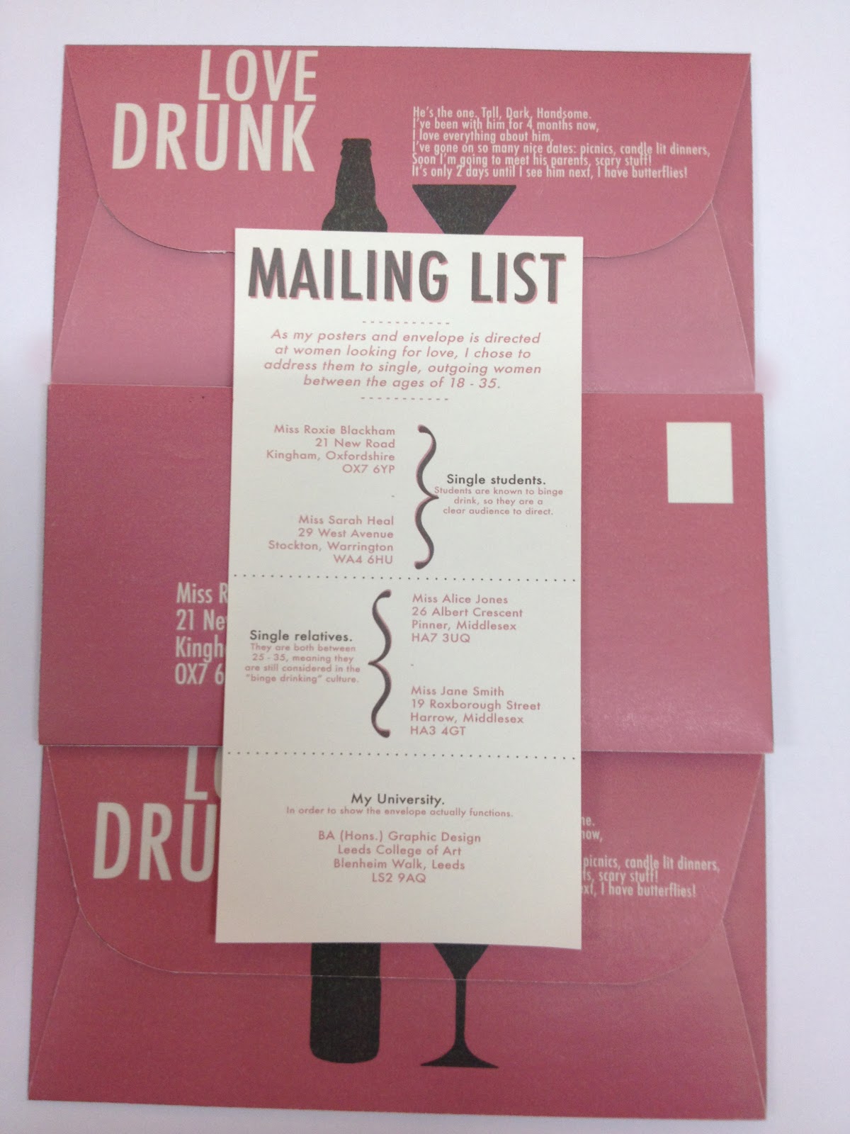
- This is the outside of the envelope. I chose to take a picture like this as it will help with designing. It helps ensure that everything I produce is the correct way up, and that the flap and inside piece line up so that the bottle and cocktail glass are positioned correctly.
-Development Of Envelope Proportions-
One thing I noticed when designing the envelope is that the measurements of the other sides is flexible and can still fit under the brief. The central piece has to always be 11cm x 22cm, but the flaps on all four sides can be any measurement, as long as the envelope still folds up.
The initial sizing I worked with meant the top flap (the side normall licked and stucked down) was too small to work with, especially when I intended to add a significant amount of information on it. I made this side longer (instead of being 3cm I made it 7cm).
The bottom edge was too large in my opinion, as I did not need to add much information to it. I made this shorter, from 9.5cm to 8cm.
The side flaps were originally 2cm, but I changed these to 3cm, simply for aesthetic reasons. I also had to add arrows on them to communicate the opening of the envelope, so the arrows needed to be big enough, and need enough space.
These are the measurements of my envelope template. In red is the intial measurements I was working with.
I also decided to curve the edges, as I felt it made the shape slightly more feminine, which helps as women are solely my audience.
-Development Of Design-
To ensure that the two silhouettes lined up correctly, I used both rulers and a grid, then added guides into the right places. This was quite difficult to get my head round, but the prototype sketched envelope I produced helped.
Having got this worry out the way, I then worked on the layout of the rest of the envelope around the things that couldn't be positioned in any other way.
Design For The Outside:
Design Decisions:
- Colour - I stuck with the same colours as originally used on my posters. On the posters, the pink had a reinforced identity of the "Love" side, which is why the outside of the envelope is pink.
- Content - I think the key to including the right amount of content on the outside of the envelope is to strike a balance between confusion and too much information. The outside needs to hold curiosity, in order for the person who receives it to retain interest and open it up. Too often than not, I receive envelopes in the post and they will seem boring or junk mail, so I will throw them away without a second glance.
I left the content minimal, but I think the story on the back flap will slightly confuse, then make the receiver of the letter want to open it. This is why the story is literally on the back flap.
- Imagery - Obviously I added very little imagery, but I made sure that the two arrows were clear and the right direction to communicate the opening of the letter. It was also key to ensure they fitted in with the design of the other imagery.
Design For The Inside:
Design Decisions:
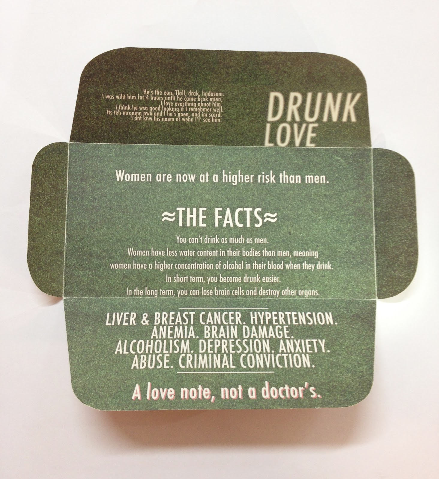
-Colour - Unlike the posters where the "Drunk Love" side was white with grey text, I wanted to invert it. This was because I wanted to still hold the consistency of the envelope with the posters, but create a slight difference that still works. Also, I wanted a dramatic change from the outside of the envelope, which I do not think I would have obtained with white.
- The last line of text is the most important in order to summarise everything. I chose to add a pink shadow behind it so that it stands out in front of the rest of the text.
- Content - Drunk Love - The "Drunk Love" wording and poem are positioned directly the other side of the envelope than the "Love Drunk" text. I chose to do this as it makes them easy to read and compare. Both pieces of poetry are the same size, and this is the same with the titles, so I wanted to maintain the consistency.
- Women Are.. Text - I chose to add "Women are now at a higher risk than men" in an area of the envelope which is the only text seen when first opened. The sentence itself is vague and slightly confusing, which hopefully encourages the reader to pull the rest open.
- The Facts - I think this was the most difficult content to include. It was important that the wording seemed important and factual enough, yet still understandable and informal enough to be understood and appealing to my chosen audience. I chose to use the second person personal pronoun "you" often, so I direct the facts directly at the reader.
- Facts Summary - There was much more information I could have included about the effects of alcohol and how they cause all these things, but I did not fill the inside with text, as I felt as if it could put people off reading it. This is the reason I summarised everything to do with alcohol abuse. I started with health risks, but also included psychological and social problems.
- Final sentence - In theory, this was added to re - word " Love Drunk" and "Drunk Love" into one sentence, and needed to act almost like a slogan. It needed to be brief, punchy and memorable.
Mailing List:
Design Decisions:
Content: I wanted to explain why I chose the audience I did: single female students, single over 25's and Leeds College of Art.
Colour: Once again, I chose to use the same colour scheme, in order to fit the brief. I chose a white background this time, as I thought it would work well if I had a background of each colour (the inside and outside of the envelope) and one the colour of the stock. Also, the stock I chose to use (Antique White) had not been utilised to I wanted to show that.
Imagery: The usage of curved brackets was for both the function of showing the 2 addresses come under one section of audience and also because I see them as a quite a feminine aesthetic choice.
- - - - - - - - - - - - - - - - - - - - - - - - - - - - - - - - - - - - - - - - - - - -
- - - - - - - - - - - - - - - - - - - - - - - - - - - - - - - - - - - - - - - - - - - -
-Crit Feedback-
Feedback Summary:
- Message: Overall the feedback I received was great, my message was communicated well, as everyone understood my work, without my posters.
- Is the visual outcome appropriate to the message: I also received good feedback on this. One problem I did encounter (which no one brought up in the crit feedback) is that the inside of my envelopes did not come out the colour I expected it to. I wanted the inside to be the grey (as shown on my design further up), but it somehow printed a strange dotted grey/ green. However, I found this serendipitous, and I received feedback that it reflected the "blurry haze" caused by drinking.
- Purpose : Both sheets mentioned that the work fulfilled it's purpose. I was worried that the content wouldn't work well, but obviously it was clear enough. One piece of negative feedback which I have taken on board is the wording I used "You can'r drink as much as men". I intended this sentence to be hard hitting, but unintentionally produced a phrase which seems quite demeaning. I intend to replace this with a phrase slightly softer, or worded differently.