Showing posts with label Creative Suite Session. Show all posts

OUGD504 - Design For Print (35) - Creative Suite Session 4


 We had to work out issues with the above document. This is what we found, and how to solve it: 

 1. An image in RGB, when it should be in CMYK. You have to import into Photoshop directly through InDesign, and edit then save the image. 


2. An image has been scaled down too much. increasing it's resolution too much. The file is unnecasrraily large, and should be scaled down in Photoshop (just like above).  You can resize the image, as long as you then apply the scale back in Photoshop.


3. The text at the bottom has been printed using a registration colour. All you have to do is apply black. The separations preview panel will show your ink limit. Where there is more than 300 % ink, you get a warning. 


 4.  There is a Pantone swatch colour that is in the swatches, but not used. 


5. An image is saved as a JPG, not as a TIFF or Adobe PDF. Again, this can be edited in Photoshop, to be saved as either a PSD or a TIFF. You also have to relink the file afterwards.


6. Another image has been scaled, but without the resolution being changed. 

 7. An image has been scaled up:


8. An RGB swatch has been used. All you have to do is change the swatch colour mode to CMYK. 


9. An image isn't placed over the bleed. 


PDF options:

- 'High Quality Print' - Best for a digital printer. 
- 'Press Quality' - Best for commercial print. 
- 'Blurb PDF' - A preset for blurb, where you can send off your work to be printed. 


OUGD504 - Design For Print (19) - Creative Suite Session 2

InDesign Software Workshop

How to prepare publications for commercial print.

The page size of your InDesign document is determined by the final outcome that you will produce. You don't always have to work to the standard A paper sizes, eg A4.

When designing for commercial print, you should always discuss paper stocks, finishes, spot colours and bleeds with the printer before designing. 3mm is a standard bleed, however some printers use different bleed settings, for example Blurb.

You can use the 'Blurb Book Creator...' plug-in on InDesign to set up your Blurb book correctly.

The slug defines the area outside of your bleed page and is used for Printer's Marks. The slug is useful for adding fold marks if something is going to be folded.

If you're producing a multiple page document and the majority of your content is text, then you can click 'Primary Text Frame' - this will add a text frame to every page in the same place.

If you didn't want your first page to be numbered 'page 01' then you can change where the numbering starts with 'Start Page No'.
                                                                                                                                               
Applying Colour

InDesign applies colour in the same way as Illustrator - applies it to a vector shape.

You should work with the swatch palette when working with colour in InDesign, so that your colours are consistent.


The swatches look different in InDesign to Illustrator - the default palette is a lot more practical than Illustrator and Photoshop. Each one of our swatches is labelled by it's ink mixture of CMYK. We also have indicators on the side - one that tell us that the swatches are CMYK printable (the square consisting of CMYK triangles), and the grey square tells us that the swatches are global.

We will need to create our own swatches - using one of the following buttons...


These buttons both bring up the same dialogue box.

You can then change your ink percentages to create the colour you want, and then apply this to whatever you want on the page. A global swatch will change everything on the page when the swatch is altered.


To edit a swatch, you double click on the swatch. You will see that everything updates!

before

after

Like in Illustrator, you can set up some tint swatches in InDesign.
If you select a swatch, you can choose 'New Tint Swatch...' in the swatch palette menu.


If you edit the 100% global swatch, then the tint swatches will also change!


For spot colours, create a new colour swatch and change the drop down box to the spot library you want to use...


You can specify which swatch you want to use by typing the code into the box, for example I chose 213...


Setting up tint swatches of spot colour will give you tonal variation, but you're using the same one ink to print each one. You set up spot colour tints in exactly the same way as we did previously!


We will now use the Photoshop images from the last workshop in this InDesign document.

Create a new page to work from, as this will default the Swatch Palette.

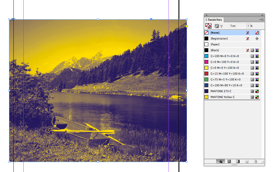
We will now see how InDesign works with the duotone image we created.


In the preview box, you can only see your file in greyscale - this is nothing to worry about.

As soon as you place your duotone image, the two swatches you used in photoshop have now been added to your swatch palette!


This is useful as you can use the same two inks from your duotone image in your InDesign document, for example you could create some text that is Pantone 273 C coloured.


When placing a spot colour image into InDesign, you know that it will print successfully because, yet again, the swatch of the colour has been added to your swatch palette!

This works with Illustrator files as well!


If you're preparing images in Photoshop to bring into your InDesign layout, you need to think about certain properties for printing:
1. Resolution - 300dpi
2. Actual size - images need to be the size that you want them on your page before placing
3. CMYK or spot - be careful of our use of colours & convert RGB to CMYK
4. Format for saving - .tiff or .psd (if you're working with transparency then save as .psd)

When preparing design work in Illustrator, you need to consider:
1. Colour - CMYK or spot colours for printing
2. Format for saving - .ai
3. Can copy and paste vectors into InDesign


We are now going to look at how we can separate our InDesign layout into CMYK colours ready for printing.


InDesign and Illustrator can separate CMYK images into their individual inks.


Now all of our inks are active. So we can now click on individual inks to see how each ink will be applied in a black and white representation.


Each one of these views can be used for positives for screen printing so that you can produce 4 colour screen prints.

We have 3 spot colours available in our separations preview that haven't been used. They appear in the separations preview palette, because they appear in the swatch palette. If you leave swatch palettes that you haven't used in your palette, then these could be added to your separation costs when printing commercially.

Always delete extra spot colours that haven't been used before you send your job off to be printed.
You can tell the printer to separate the positives through the print dialogue box when you decide to print.


When choosing printer's marks, checking Page Information can help to identify which positive will be cyan, magenta, yellow or black.


In the Output options, where it says 'colour' you can change the drop down menu to 'separations'...


If you still have unused spot colours in your swatch palette, you can tell the printer not to print these in this dialogue box..


The printer will now print separated positives.

The 'Frequency' and 'Angle' columns are to do with the halftones of the printed images.
The size of the dot determines the tint of that colour. During the commercial print process, these are very specific to the printer being used. For a high quality print you are usually looking at 150 lpi (lines per inch). Billboards usually use around 50 lip, because the detail doesn't have to be as fine due to the image being viewed far away. Silk screen prints should be printed at 40-65 lpi.

The angle of the dots is used so that the dots don't overlap over one another - this makes sure that there aren't any optical interference appearing, like in moiré:


You cannot output separations with certain printers. Laser printers can do this very well at uni, however the printers in the 'digital dungeon' won't be able to process this.
✿✿✿✿✿✿✿✿✿✿✿✿✿✿✿✿✿✿✿✿✿✿✿✿✿✿✿✿✿✿

On a new document, create two simple shapes and overlap them..


When you turn on your separations preview, this turns on your 'overprint preview' as well.

If you only view the cyan positive, you will see that where the yellow has overlapped the cyan, the cyan has been 'knocked out'.


A black ink overprints by default, so it doesn't knock out the other colours due to being the darkest colour printed. You can choose whether your colours are knocked out or overprinted.


In order to use the Attributes palette, you need to select an object.

If you select the yellow object and click on 'Overprint fill' then you can see that the two inks are now going to mix during the printing process. This will create a 3rd colour during the printing process.


You only see the results of these changes when you're in overprint preview. If you turn off overprint preview, everything displays as it would do before.


Another thing to consider is the amount of ink that is going to be applied.

If too much ink has been applied, the paper will tear during the process. You can use the 'Ink Limit' preview to see where there is too much ink being used. This will appear in red.


You can also hover your mouse over areas of the image, when in 'separations preview', to see how much ink has been used - you can see that 300% ink has been used in the centre of the image..


If you wanted to place a varnish where some text is, you need to set it to overprint..


This means that when you print your image, the text hasn't knocked out your other inks - you can then print that area of text as a varnish or glue for foiling!


InDesign allows you to set up tonal variations of spot colours so that you can overprint with tints.


You can also create mixed ink swatches, to create the colour of the overprint..


When you view this in the separations preview, you can see that the circle in the middle is made up of a certain amount of both of the colours mixed.


This won't increase the cost of printing, as you're only printing with 2 inks.
 

Copyright 2010. All rights reserved.

RSS Feed. This blog is proudly powered by Blogger and uses Modern Clix, a theme by Rodrigo Galindez. Modern Clix blogger template by Introblogger.