How to tell the truth?
Our question given to work with was "How to tell the truth?". At first we found this confusing, with it's context being confidence.
How can somebody tell the truth about confidence? Surely confidence is innate in, and there is no way to lie about confidence?
- - - - - - - - - - - - - - - - - - - - - - - - - - - - - - - - - - - - - - - - - - - - - -
We chose to look at how media convey appearance, and how this can cause anxiety in people. (click here to see my blog post on appearance).
Below is my primary research, which showed that people feel anxious and much more self conscious after reading a gossip magazine:

Audience: We chose to direct our work at gossip magazines, for obvious reasons. They are the people who cause the problems, as shown by my research. We intend to make them aware of the problems they are causing, and possibly how they can change the way they communicate messages.
Initial Ideas:
Below is the initial spider diagram we made for the type of work we intend to produce:

We chose to produce a mailshot for several reasons:
- We intend to address the magazines themselves, and the manipulation they are doing to their readers. By producing a mailshot, we can compose a mailing list that means the certain magazines causing lack of confidence will be directly sent information about the harm they are causing.
We will need to provide a lot of information regarding what they are doing, so need space to work with.
Initial Ideas:
Below is the initial spider diagram we made for the type of work we intend to produce:

We chose to produce a mailshot for several reasons:
- We intend to address the magazines themselves, and the manipulation they are doing to their readers. By producing a mailshot, we can compose a mailing list that means the certain magazines causing lack of confidence will be directly sent information about the harm they are causing.
We will need to provide a lot of information regarding what they are doing, so need space to work with.


Chosen idea:
Mock Magazine - We chose to produce a mock magazine that replicates the style of the magazines we are intending to send out mailshot to.
There are several reasons why we chose this over other methods of communication, such as:
- A mock magazine can contain much more information than other ideas (such as a poster). We intend to include lots of information, so an editorial works perfectly.
- The cheesy and almost anti - design work of gossip magazines will contrast hugely with the strong serious message we intend to communicate.
- It will be easier to designate different roles and areas to design. We intend to include information which all of us found from our research, meaning roles will be suited well.
Topics to include:
- Facts & Figures - Me - My research covered looking at how the magazines influenced people's confidence. I intend to include both my primary research (results form my questionnaire) and secondary research, in order to reinforce my research.
-Good Vs Bad Role Models - Danielle - This page will be mostly body text, and will address the "bad role models" these gossip magazines include. An example of this could be Lindsay Lohan, who is always in and out of rehab, and is extremely skinny. Another example could be Katie Price, who is constantly modifying her body. Should women aspire to go through some extreme procedures to feel more confident, or should they learn to be happy with what they were born with?
- Eating Disorders & Depression - Amy - This page will show how the magazines can influenced their readers to an extreme, giving case stories. I think this page will be particularly hard hitting, as it emphasises my facts, and adds a personal viewpoint.
-Mock Advert - Andy - Despite the mailshot being directed at just gossip magazines and not advertising companies, we thought to make the mock magazine realistic we needed to include an advert page, something seen on every few pages normally.
- Fold Out Page - Sophie - Obviously we did not have the time or enough content to produce a full magazine, but we wanted to designate a page each, meaning 6 pages. We came across this Matalan advert (below) which used a fold out page. Sophie was in charge or producing a fold out double spread that encouraged the viewer to open up the 4 page spread of the above 4 A4 pages.


- Front Cover - Sam - We had to decide on the overal content before she could produce this page. Just like gossip magazines, the front page needs to summarise the publication, and explain the contents briefly.
Consistency:
As we have designated different pages to different people ( as oppose to working on the entire magazine together), we needed to ensure consistency. Below are the measures we undertook:
- Type - We chose to use "Bodoni Bold Italic" as our headline font. This was the font I used for my research, and is often used in gossip magazines. For body text, we chose to use Arial Regular, to give clarity and readability.
Below: 3 different magazines that have used Bodoni (or a very similar typeface) as their header font.

Colour Scheme - We researched into existing and recurring colours in Gossip magazines, and came up with three colours to work with.
Below: The three colours that are ubiquitous in gossip magazines. In order to hold consistency with precision, we also made sure we took the codes to work with.

- - - - - - - - - - - - - - - - - - - - - - - - - - - - - - - - - - - - - - - - - - - - - -
-Designing My Page-
Existing Feminine Infographics:
I chose to explore existing infographics concerned about women, hoping to find an appropriate design influence for the infographic I was producing.

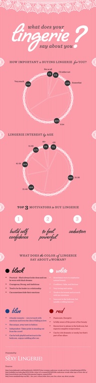

Unfortunately, these gave me little inspiration.
Colour - I was already limited to the three we decided on previously. However, I did feel as if I had some hope, as I think the little use of colour (mostly just pink and white used) in the above middle infographic is successful and easy to read.
Layout - Again, the layout of the above infographics (or any) did not help. The format I have to use is A4 (29.7 x 21cm). This means I cannot present my information in a list, like the above do.
Striking the balance: I think when producing my infographic, I will have to strike a balance between a magazine layout and that of an infographic.
- - - - - - - - - - - - - - - - - - - - - - -
Layout:

Design Decisions:
- Colour scheme - I have decided to go with the red colour we decided to use as my background. This is because my page will be the first to be read when the mailshot is opened up, so it needs to stand out. I also intend to stick to simple colours, and only using black and white with the rest of the infographic. This will give it a much needed clarity. As well as this, if I used the other colours we intend to use in the magazine, it will create a horrific clash.
- Title - As previously shown, Bodoni looks fantastic as a header font, and at large scale. This is why I have left a large space for my "facts and figures" headline.
- Explanation of facts - This area is to explain the experiment I undertook; showing how gossip magazines can affect confidence as oppose to a control.
- Primary Research - I would have loved to have enough space to express all my figures I found from my primary research, but unfortunately only have enough space to show one. I intend to use my facts about how the magazines have affected people's confidence on certain appearance characteristics compared to the control.
These stats will be expressed very simply in the most simple of infographic forms: bar charts. This is because straight away I want to show a difference in confidence, without reading any numbers.
Secondary Research - I intend to fit as many facts as possible in this space, in order to reiterate my primary research. However, unlike the primary research, I intend to express this information in a much more visually pleasing way.
Quote: This area is to be made up of a large quote, which will stand out, in hierarchy just under the headline. It will have a strong impact, and will be found from my qualitative research. I hope to find one which fits well, and summarises the facts and figures ectly.
- - - - - - - - - - - - - - - - - - - - - - -
Production
Headline and Explanation

The above is my final layout for the title and explanation. I chose to use the "&" symbol as oppose to the word "and" simply because it gives a much more feminine aesthetic.
Below are unsuccessful outcomes I experimented with:


- - - - - - - - - - - - - - - - - - - - - - -
Primary Research Section

I chose this layout over the rest, as I feel it contains the most clarity, and is easy to understand.
Below are unsuccessful outcomes I experimented with:


- - - - - - - - - - - - - - - - - - - - - - -
Secondary Research Section
I wanted this to be more visually interesting than the primary research, but also be easy to understand.
I created simple outlines representing men and women, which are to be filled by a solid colour, depending on the percentage relating to the fact:


I wanted to give these silhouettes a much more human aesthetic than normally seen in infographics, as I felt it would be much more suited to the magazine context. The male is a slightly thinner stroke, due to the importance of the facts about women over that of men. Only one fact is about men, but it is meant to show that they aren't affected to the same extent, but are still affected.

Above is the idea I chose to go with. I produced a "poloroid" style frame, as these are often used in gossip magazines. It also means I can move them and change the angle they're positioned at, so they appear as if they are stacked or pinned on a wall.
Below are unsuccessful outcomes I experimented with:


Final Polaroid Section:

- - - - - - - - - - - - - - - - - - - - - - -
Quote
This quote had to be several things:
- Truthful. I wanted it to come from the mouth of someone. A made up quote is useless.
- Have a strong impact. It needs to back up all the facts and figures that had already been read.
- Summarise well. The heirachy of the page means that the quote will already be read before facts, so the quote needs to be just as clear as the facts.
These were quotes from my original research:
" I feel like I should lose weight when I see celebs on holiday"
“I always see people with nice clothes and wish I had them”
“My friends are always buying clothes. I wish I had enough money to go shopping with them”
“Mum always tells me to get down the gym”
“Deep down everyone likes to look nice and care about how their friends view them”
“There are always area of improvement, nobody is perfect”
- - - - - - - - -
Unfortunately, none of these could really be applied. I asked 10 more people the question "How do you feel after reading a gossip magazine?", below are some quotes:
"I feel like I need to buy more stuff, sometimes make up, sometimes clothes"
"Gossip mags make me feel uncomfortable and more self conscious"
"They're so stupid, they never say anyone looks really good or anything like that"
"I don't feel much, they don't effect me to be honest"
"They make me lose faith in society. I just don't get how people on reality tv are famous"
"People are just in there for their looks, no one in them has any talent at all"
"Gossip mags make me feel disgusted at how I look"
"I feel like shit after reading them. Even if I was having a really good day and feeling good about myself, theres always something or someone I will see that will make me feel yuck"
"I hate how cheesy their designs are, I guess I look at that more than think about how the people in it effect me"
"They make me feel thick"
Quote in it's context:

- - - - - - - - - - - - - - - - - - - - - - -
Final Image:
Final Product:
Front Page - Samantha Walker
"Reveal Page" - Sophie Abell
Infographic Page - Joe Leadbeater
2nd Page - Danielle Yearsley
3rd Page - Amy Hill
Mock Ad - Andy Smith