Design Practice
Joe Leadbeater
Latest Entries
OUGD505 - Studio Brief 2 - Final Photos
Below are the final, editted photos, ready for submission boards.


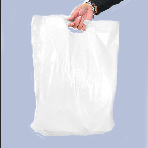
OUGD505 - Studio Brief 2 - Mockups


I also experimented with some other products the
Design Museum could sell, such as Sake:

And Pins:

Postcards (These were eventually printed, but not very well):


In full:


OUGD505 - Studio Brief 2 - Final Crit
Unfortunately I could not make the crit in the morning, but I came into uni in the afternoon to both give my classmates feedback, as well as hoping to get some on my work.
In the afternoon, I showed my classmates where I was up to, and also provided a set of questions.
Obviously everyone was busy with their work, so the answers appear to be fairly brief. I only wanted confirmation that my work was moving in the right direction.
Below are the sets of questions and the feedback:
1. Do you think the colours schemes used in the posters are suitable?
2. Do you understand and like the concept?
3. Please refer to the stock next to this laptop. Which do you think would be suitable for business cards?
4. Can you think of anything available to purchase in the Design Museum shop?
Sarah Heal
1. I really like the colours you have used. They seem to suit the product design you have shown in the photos and the products that will be in the exhibition.
2. I really like it and think it's suitable for the things you would exhibit.
3. I think the '540gsm' stock is most suitable. It has lots of nice imperfections that suit the rest of the work.
4. Bags, posters, sketchbooks, rubbers, pencils, T shirts.
James Keefe
1. Originally I thought it would of been better if you used red and white, because they're known as Japanese. But I think these colours work better in the context of everything else.
2. Yeah it works well, and it's good that he deconstructed pattern hasn't been used too much.
3. The mount board one, similar to the business cards. Is the dot on the eye meant to be a Japanese roof?
4. Canvas bags, Saki?, T Shirts, Rice beer? Chopsticks.
Will Jeffrey
1. I really like the blue and purple ones. I think if you can, use them more with the branding.
2. It's clear and works well with the idea of product design and how manufacturing works.
3. The 540 GSM one.
4. Rubbers, pencils, rulers, bags, postcards.
Danielle Harrison
1. The neutral tones work really well, and it would be good if they were used more in other things, like postcards?
2. Is it to do with building?
3. The thickest one, it looks pulpy and oriental.
4. T Shirts, postcards, posters, bags.
Conclusion From Feedback
1. It seems unanimous that my colour choices for the poster were right. Some of the feedback even mentioned using the colours with other aspects of the brand.
2. Most of the feedback received was positive, and everyone understand the idea of deconstruction in relation to manufacturing as a process.
3. Everyone went for the 540GSM stock, so I will definitely use it over the other options.
4. I intend on mocking up bags, t shirts, and designing poster tubes. I would also like to design postcards in the colours of the posters.
Subscribe to:
Comments (Atom)

Copyright 2010. All rights reserved.
RSS Feed. This blog is proudly powered by Blogger and uses Modern Clix, a theme by Rodrigo Galindez. Modern Clix blogger template by Introblogger.