Showing posts with label Studio Brief 1. Show all posts

OUGD505: Studio Brief 1 - Final Crit

For the crit, we presented what we had produced, and then went around the table leaving written formative feedback for one another.

ADD PICTURES THAT OF INSIDE OF BOOK NOTES


Strengths
- Layout really reflects content. Appropriate use of stock & binding also. (+1, +2, +3)
- Really like the binding and how appropriate it is. 
- I like the way the pagination is in the centre.

Areas For Improvement
- Make sure the Japanese & English match so it doesn't look like some Japanese doesn't look like translate. 
- Spelling mistakes
- Change where page numbers are. 

Considerations
- For the packaging, like the idea of using black card, could foil some Japanese symbols. 
- Feels really delicate - Maybe a more substantial cover. Try packaging with wood, balsa. Red sugar paper cover?


Where I Plan On Taking The Feedback
Overal the feedback was positive, which means very little needs changing. One problem with the book previously was issues of the binding affecting readability, but this was not brought up at all in this crit. 

I plan on looking into the packaging further, experimenting in ways I could package the book. 

The main changes to make will be spelling mistakes, which should be quick and easy!

OUGD505: Studio Brief 1 - Study Task 4 - Build A Brand

We were told to construct a brand .......

COPY DANIELLE / AMYS NOTES

I was in charge of the business branding, both designing and mocking up. 

Below you can see what I produced: 


OUGD505: Studio Brief 1 - Crit

Below you can see the things I prepared for the crit:

- Mock up of Japanese Stab Stitch Binding 
- A variety of stocks I could print on
- The 3 packaging nets
- The publication printed at a 1:1 scale. 


Feedback


Main Points Raised:

The (+1) show that more than one person agreed on the point.
I have also highlighted the main points I need to address. 

Strengths:
- Well considered stock choice (+2)
- Overall contemporary, sophisticated design (+1)
- All aspects are well thought out, eg. stock, binding method, type
- Really love the Japanese type + binding, very appropriate to topic
- Very simple, clean, grid based layout!
- Like the idea of Japanese 'hole' for packaging.

Areas for Improvement: 
- Black stock doesn;t flow with choice of stock for publication
- Intro page - looks closer to the margin on English side
- Page 11 layout is too spaced out, too confusing for the eye. 
- Page 15 bottom is out of grid and doesn't align with page 15

Considerations
- Maybe try and justify text in columns, to match your grid system. 
- Inside margin needs to be bigger, to allow for the binding. 
- Black thread for binding. 
- Watch out for the design falling into the spine, you will will need an extra 5mm in the spine. 
- Are you going to screen print of laser cut onto the cover for the title? 

OUGD505: Studio Brief 1 - Study Task 2 - Packaging Nets

Below you can see the packaging nets I produced for my crit. I wanted to produce something that matched the stock of my publication, and also the high end look of my publication. 

Envelope:


2 Different Sleeves:
I used a circle to represent the Japanese flag, and tested different places in which the circles could be positioned. 


OUGD505: Studio Brief 1 - Digital Version of Publication

Below you can see the full publication:

OUGD505: Studio Brief 1 - Japanese Stab Stitch Binding

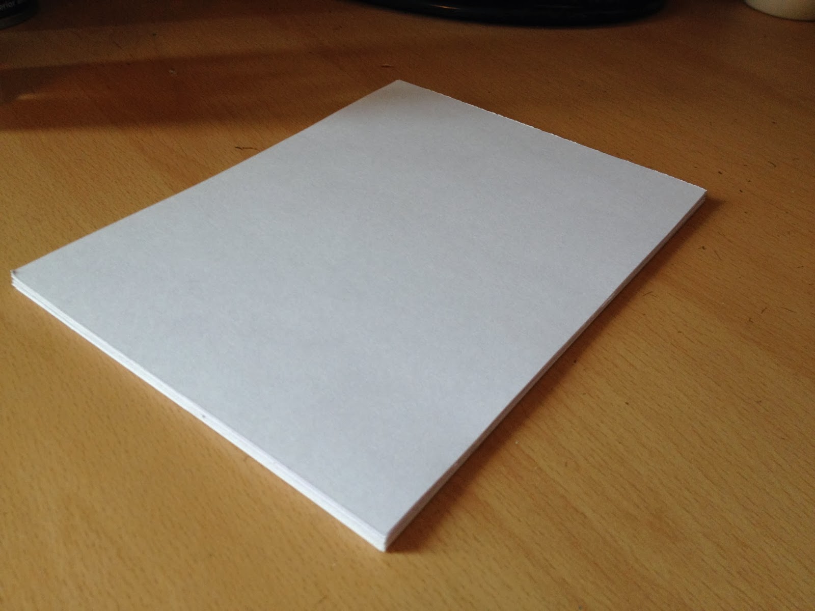
As a perfect example of high quality, considered Japanese design, I wanted to use Japanese Stab Stitching. This is something I haven't ever tried before, so I thought it would be good to learn on some test sheets. I used the same amount of pages I intend on using for my actual publication, and stock roughly at the same thickness. 

I followed this tutorial: http://www.designsponge.com/2013/03/bookbinding-101-japanese-four-hold-binding.html

The result is below:


Conclusion

Overall I was pleased with the result. I have struggled to get binding right before, but I think Japanese stap stitch was much easier to do than I had initially imagined. I intend on using this with my actual publication. I am going to have to allow an extra 1cm bleed within the spine, to allow for the binding.  I also think I may not risk double page spread images, as they could be difficult to line up.

OUGD505: New Research Topic & New Boards

After a crit with my classmates, I realised that 'Phonetics' could be a difficult research topic to work with. My boards displayed a huge amount of text, and contained complex linguistic vocabulary, something which unfortunately is necessary for Phonetics. 

There is very little imagery involved with phonetics, apart form complex diagrams, which cannot be understood easily. 

For Studio Brief 1, we have to produce a publication, and I feel that with Phonetics, I would have to produce a second publication for Studio Brief 2, which wouldn't be too exciting. 

I considered other things that have interested me, one of them being product design. 

Below you can see the areas which I considered looking into, with my chosen topic in bold: 

- Iconic product design
- The history of the chair
- Iconic British products
- The history of Alessi
- A brief history of the mobile phone


OUGD505: Studio Brief 1 - Research Boards

Below you can see the 5 research boards I prepared for the workshop: 


Ideas I was given in the crit: 

- A possible exhibition on phonetics?
- This project would be heavily typographically based, is that what I want?
- Possibly look at something slightly less 'dense', and more visual. 

In the afternoon, we looked at the presentation of our boards, you can see the feedback I received below: 


Notes On The Lesson

What not to do:
- Write in 1st person
- Initial sketches aren't always relevant (they want to see what you produced, not how you got there)
- Spelling mistakes / typos
- Food stains / crumpled paper
- Print problems
- Poor image quality
- Too much text (TLDR - too long, didn't read)
- Too little text - like a scrapbook

What to do:
- Name and number your boards
- Titles
- Show your final products
- Good quality photos of final products
- Crit each other's boards
- Proof read

After this, we handed our design boards over to someone else on the same table and wrote everything that they did wrong on their boards, for example spelling mistakes or poor layout.

My feedback was as follows:

RESEARCH BOARDS
- Bad quality images
- TLDR
- Grammar errors
- Slightly pixelated images
- Misalignment
- Annotate images so that they can be understood
- TLDR!

OUGD504 - Design For Print (37) - Books as Documents

Unfortunately the 'Process and Finishes Book' had been ordered 10 days ago, and I have yet to receive it in the post. However, below you can the document as it was sent off for print:


The reference book pages (without examples):


OUGD504 - Design For Print (36) - Binding The Reference Book

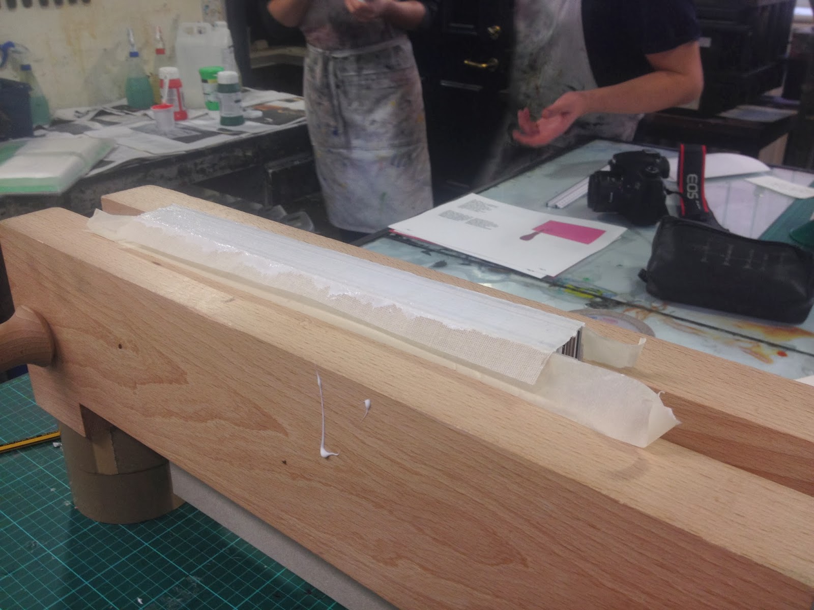
I took a trip to Vernon Street, and learnt how to perfect bind my book using scrim:


Clamping the book, giving it an edge to bind:


Applying PVA glue:


Applying scrim:


The overal result:


I cut off the excess next:


I then used a large guillotine to cut the book:


Unfortunately the book was too thick to cut on the guillotine, so I cut the rest by hand:


OUGD504 - Design For Print (35) - Creative Suite Session 4


 We had to work out issues with the above document. This is what we found, and how to solve it: 

 1. An image in RGB, when it should be in CMYK. You have to import into Photoshop directly through InDesign, and edit then save the image. 


2. An image has been scaled down too much. increasing it's resolution too much. The file is unnecasrraily large, and should be scaled down in Photoshop (just like above).  You can resize the image, as long as you then apply the scale back in Photoshop.


3. The text at the bottom has been printed using a registration colour. All you have to do is apply black. The separations preview panel will show your ink limit. Where there is more than 300 % ink, you get a warning. 


 4.  There is a Pantone swatch colour that is in the swatches, but not used. 


5. An image is saved as a JPG, not as a TIFF or Adobe PDF. Again, this can be edited in Photoshop, to be saved as either a PSD or a TIFF. You also have to relink the file afterwards.


6. Another image has been scaled, but without the resolution being changed. 

 7. An image has been scaled up:


8. An RGB swatch has been used. All you have to do is change the swatch colour mode to CMYK. 


9. An image isn't placed over the bleed. 


PDF options:

- 'High Quality Print' - Best for a digital printer. 
- 'Press Quality' - Best for commercial print. 
- 'Blurb PDF' - A preset for blurb, where you can send off your work to be printed. 


OUGD504 - Design For Print (34) - Final Crit & Feedback

I printed my work, as seen below. The covers and binding haven't been done for the reference book, but I have included an example of my intentions. I also included the prints (in order) for the reference book, as well as my almost completed book on screen. 


Feedback


I asked the following questions:

Do you think the colour scheme works through the 'process & finishes' book?

Would you find the inclusion of interviews interesting?


Overal, I was not pleased with my feedback whatsoever. Most of this was on my behalf. I stupidly left the password lock on, meaning only one person who left me comments could see the 60+, almost completed book. The majority could only view the reference book, which has very little written content. I feel extremely disappointed in myself for it, but have learnt to take a password lock off for my next crit. 

Positives 

People like the idea of including interviews, as it is different to just focusing on the print process itself. 

The idea of a reference book. 

The stock in the reference book work well together. 

Negatives 

'The prints in the reference book seem repetitive' - The reason behind this is a focus on a contrast in processes, so the user can see differences in the same design. 

'Information needs much more classification and detail' - From someone who also said they couldn't view the 'process & finishes' book! 


For next weeks 'Design For Web' Crit, I intend on making my information much easier to understand and TAKE THE PASSWORD OFF MY MAC!
 

Copyright 2010. All rights reserved.

RSS Feed. This blog is proudly powered by Blogger and uses Modern Clix, a theme by Rodrigo Galindez. Modern Clix blogger template by Introblogger.