
I worked in a group with Sarah Heal and Roxie Blackham.
Previous competition entries:
2011 Winner - Helveti Spagheti - Luke O'Brien

I liked the idea behind this. The cake itself looks like spaghetti on toast, but the end product is sweet: The bread is made up of Victoria sponge, and the lettering is white chocolate.
I also would like to use a play on words with the title of my cake.
Other Entries:


Other Graphic Design Related Cakes:


Initial Ideas
“The Guttenburg
Press” – A combination of Battenburg cake and the first ever print press. If we
were to go with this idea, we planned to make lead type out of Battenberg
squares of yellow and pink.
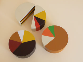
CMYKake – A cake
involving CYMK.
Leeds College of
Smarties – A cake that resembled the college at which we study, but made out of
smarties. (We were unsure as to how this could be accomplished)
Design Sheets:
We produced a few initial design sheets, in order to visually develop our initial concepts:


Design Sheets:
We produced a few initial design sheets, in order to visually develop our initial concepts:


Chosen Idea
“The Bauhaus
Kuchen” (The Bauhaus Cake) – We had recently found out that our tutor, Fred,
had worked at the Bauhaus. This impressed us enough that it influenced out cake
decision.
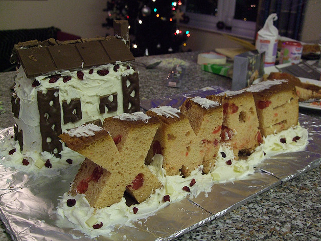
Obviously the Bauhaus is a huge building, but we intended to just produce the block that is most famous:

The building itself has a fairly boring exterior, so we wanted to make changed to it on the inside. We changed the name of the cake to "The Centre of Creation" , and chose to enhance the inside of the cake with garish colours, representing the explosion of ideas that came from inside the building, until it initially got shut down by the Nazi's in 1933.
Research Into Cakes and Architecture:
These show that cakes can hold a rigid shape with tight corners, as well as enough detail in windows that we would like to achieve:


Research Into Cakes and Architecture:
These show that cakes can hold a rigid shape with tight corners, as well as enough detail in windows that we would like to achieve:


Initial Experimentation:


At first the colours were added systematically, but by the end the pattern resembled a painting by Jackson Pollock.


“We added the buttercream and jam too early, whilst the cake was still hot. The result was a sloppy and weak mess.
- - - - - - - - - - - - - - - - - -
Second and Final Product:
We learnt a few things from out initial experiments:
- Purple mixture resulted in a grey coloured sponge, so that needed to be avoided.
- Be patient, and wait for the cake to cool before applying the buttercream.
- Be much more systematic with the different colours of cake.
Mixture:
This time we worked from the centre outwards, producing a rainbow shape. We felt this will give a much more consistant "rainbow" effect when the cake is cut open.


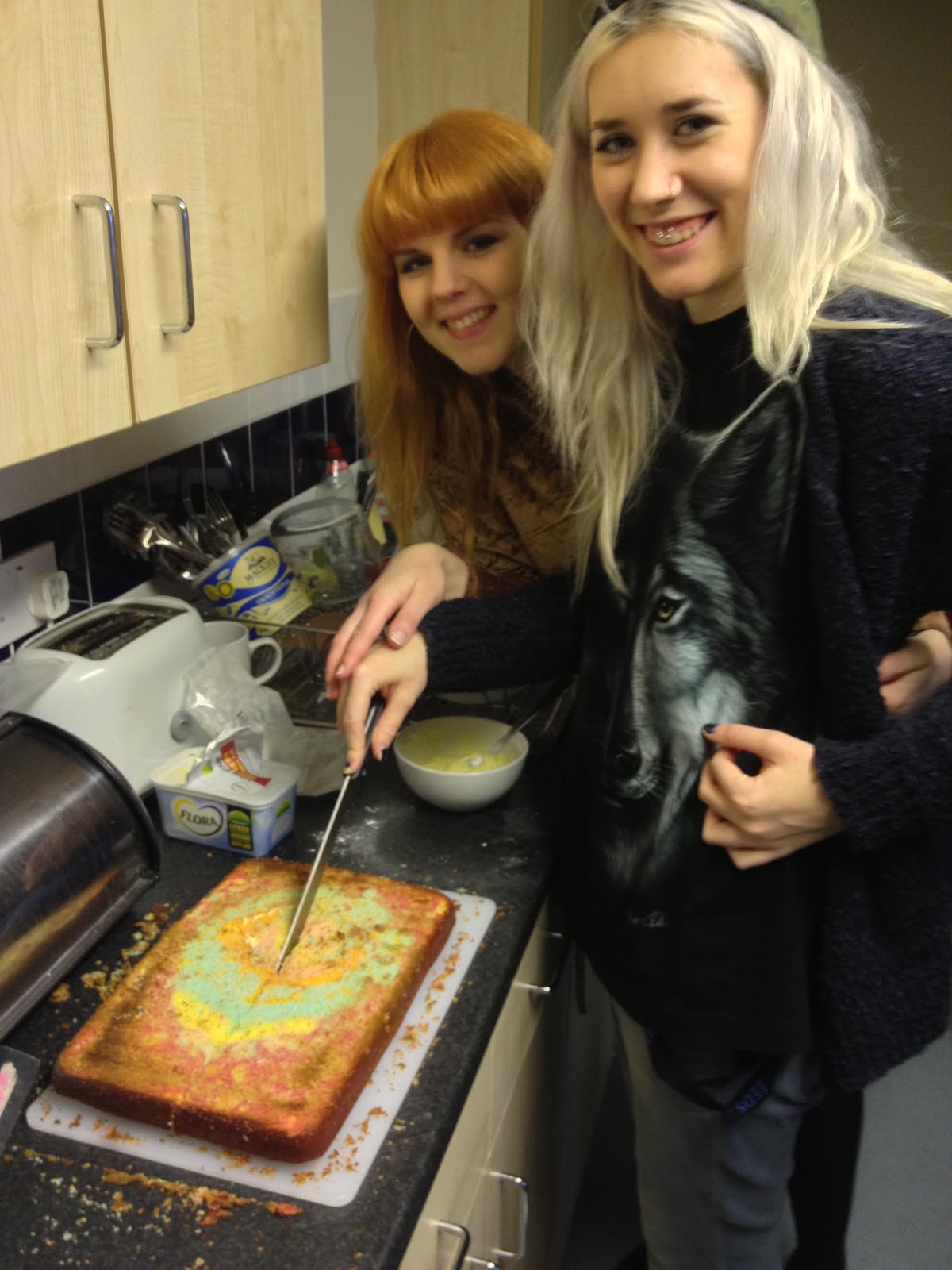
The ceremonial cutting of the cake. We used the equivalent of four victoria sponge mixes: 2 in the first cake and 2 in the second.


We added a Christmas tree and icing on top of the cake, to give the Bauhaus a Christmas feel.
