Design Practice
Joe Leadbeater
Archives
OUGD401: From Theory Into Practice
Originally I
planned to do a publication on Optical Illusions, the research for this can be
found here on my design context post.
Initial Crit
I presented my research into Illusions, and here is my feedback:
- A Book on Illusions may be visually interesting.
- There is very little history to Optical Illusions.
- The book may furn out as a ' Catalogue of Optical Illusions', and not show an understanding of knowledge in a particular field.
Change of Concept:
Ideas That Could be Applied
- Variety of Stock - My book could have a variety of different stock included, with different textures or colours.
- Hardback Cover - This could possibly be cloth bound, as texture is another thing you cannot get with a Kindle. It also shows the craft side of books.
- Embossing - To do with the feel of the book, this could be on the hardback cover.
- Screen printed Ink - The book being physically produced, instead of digitally printed.
- Perfume embedded within the ink - People enjoy the smell of books, so why not embed smell into the ink?
- Exterior Binding - A way of showing how the book has been constructed.
- Half tone imagery - Something which is only used to save money in mass production with ink, and would not be needed digitally.
- ' The fold' - Something which is in physical books but not E - Books. I could communicate in a way which focuses the eye on the fold in the book, or uses it towards a design's advantage.
Primary Research
This can be found on my design context blog, here.
Essentially, I found that Steve Clark much favours Kindles to his 3500 book collection. As a writer and proofreader, this surprised me. It shows that even the greatest of book lovers are now converting to Kindles, a scary prospect.
This has taught me is that my book should be extremely persuasive, and should challenge peoples perceptions of books, in order to convince them that physical books are a craft that is being lost.
Secondary Research
I researched into the history of the book, with my internet research found here on my design context blog.
Presentation and Crit
I presented the above concept, along with this PDF (in order to show how I intend for my aesthetic to look)
Link To Isuu Document
Crit with Fred
Although I found the previous feedback valuable, I wanted a second opinion on the book, as I wanted to ensure that my concept was as strong as possible. This is why I chose to book in with a one to one crit with Fred. I presented the same information, and received the following feedback:
- Half tone imagery may not be visible enough - This is understandable, as a lot of the images I will be working with have high amounts of detail.
- The use of images that fade off the page and reappear on the other side is not original - This influences me to adapt my choice of aesthetic.
- The use of perfume in the ink is not appropriate - New books do not smell of perfume, so adding perfume would take away from the concept.
- Think realistically, try to limit processes - I have now decided to digitally print my pages, as screen printing would take far too long. I still intend to produce a hardback book with embossing on the cover.
- Ensure the content of the book is not just about the process of the book being made, there were also huge steps in history to do with the content - When did books stop being used simply for religious devotion?
- Maybe include ways in which books are physically produced, outside of the content? - I now intend to have one section with crop marks left on, one section involving pagination imposition, and another involving grid made visible.
I then researched into both pagination imposition and different types of crop marks, which can be found on my design context post here.
Design Sheets
Having come up with a clear idea of my aesthetic, I started with some design sheets in relation to layout.
Below are my original layout ideas I had. The images coming off the side of the pages was meant to represent mis printing, but after speaking to Fred, I realised the only way I could truly show that would be by doing it, which I chose against:

I then chose to create another design sheet (below), which did not have these features. I still wanted to use images across the folds, as I felt that drawing the readers eye back and forth across the fold was important, as folds are a feature that cannot be interacted with when using a Kindle:
Issuu Link
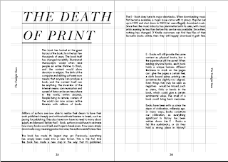
'The Death of Print'
Obviously due to the rise in E - Books and Kindles, the
art of print seems to be dying out. I would like to produce a publication that
highlights the features of reading something physical, in order to communicate
what we're all missing out on if we convert to a technological version.
Features
could include usage of a variety of stock, screen printed type and image with
fragrance embedded in the ink, and pop up/ interactional features. Essentially
things that you miss out on when reading on a Kindle.
Content would
include info graphics about the ongoing battle between books and e-book, with
both primary and secondary research, or possibly the history of the book.
Contextually,
the project would mainly consist of physical usage of production methods and
materials.
Initial Ideas
Obviously the best way of conveying my opinion that physical books are much more interesting than a Kindle, I had to summarise the positives and negatives of physical books in comparison to E - Books.
Physical Book
Positives / Unique Qualities
- The physical 'holding' of a book varies - When using a book, each is different in its weight, its feel etc. When using a Kindle, nothing changes but the content.
- The feel of a book - Different books are produced from different stock, and vary with both hardback and soft back covers. Some people favour reading books with thicker paper, others prefer a thinner stock.
- The smell of a freshly produced book - Books often have a unique smell to them, which cannot be found with a Kindle.
- Binding - Obviously Kindles do not have any physical pages, therefore binding is never visible.
- Print - Although screen based work is much more sharp, books can hold unique qualities in relation to the ink. It can be reflective, or maybe even mis - printed, where ink should or shouldn't be on the page.
- Size - Books vary in size, whereas a Kindle screen always stays the same.
- A physical collection - Many people enjoy having a vast collection of books to show off. You could have a thousand books on a Kindle, yet it would still look the same.
- Getting away from a screen - nowadays, people use screens for everything; Entertainment, Work. Reading something which doesn't have a light glaring back at you can be much more relaxing.
- Overall craft - Books can be seen as an art form, whereas Kindle's sheerly communicate information.
- Interactivity - Books can hold lots of physical tasks that cannot be done or observed on screen to the same degree, such as pop up and pages that slide out.
- Sentimental Value - Books that have been passed down through generations hold a value which cannot be taken digitally. In fact, nothing digital ever seems to hold any sentimental value, as it constantly seems to look new. This may be due to the internet not being very old, but out of date technology is seen as a bad thing, not appreciated for its history. Books can sometimes have stains or scars that bring back a certain memory.
- Sentimental Value - Books that have been passed down through generations hold a value which cannot be taken digitally. In fact, nothing digital ever seems to hold any sentimental value, as it constantly seems to look new. This may be due to the internet not being very old, but out of date technology is seen as a bad thing, not appreciated for its history. Books can sometimes have stains or scars that bring back a certain memory.
Negatives
- Space - Books can take up a lot of space, which people may not have. Once a book has been read, many people often see it as a pointless object to own.
- They're not backlit - Kindles can be read in the dark, as the screen can be backlit.
- Price - Physical books tend to much more expensive that that of a Kindle. An average book will cost between £5 and £10 (in relation to novels, not vast Encyclopaedias), whereas A Kindle Book can cost just £2.
- The hassle of buying books - People are becoming lazy, and want to rely on the internet and computers to dictate their lives. If they can buy a book instantly without leaving their room, they would much prefer that than finding a book shop and buying the book.
Ideas That Could be Applied
- Variety of Stock - My book could have a variety of different stock included, with different textures or colours.
- Hardback Cover - This could possibly be cloth bound, as texture is another thing you cannot get with a Kindle. It also shows the craft side of books.
- Embossing - To do with the feel of the book, this could be on the hardback cover.
- Screen printed Ink - The book being physically produced, instead of digitally printed.
- Perfume embedded within the ink - People enjoy the smell of books, so why not embed smell into the ink?
- Exterior Binding - A way of showing how the book has been constructed.
- Half tone imagery - Something which is only used to save money in mass production with ink, and would not be needed digitally.
- ' The fold' - Something which is in physical books but not E - Books. I could communicate in a way which focuses the eye on the fold in the book, or uses it towards a design's advantage.
- Mis - printing - This can be shown by either messy ink or by image/ text being obviously mis - aligned.
I also chose to focus on the History of The Book, as oppose to infographics. This is to show the rich history the physical book has, and the idea that Kindles are resulting in the 'death of this'.
I also chose to focus on the History of The Book, as oppose to infographics. This is to show the rich history the physical book has, and the idea that Kindles are resulting in the 'death of this'.
Primary Research
This can be found on my design context blog, here.
Essentially, I found that Steve Clark much favours Kindles to his 3500 book collection. As a writer and proofreader, this surprised me. It shows that even the greatest of book lovers are now converting to Kindles, a scary prospect.
This has taught me is that my book should be extremely persuasive, and should challenge peoples perceptions of books, in order to convince them that physical books are a craft that is being lost.
Secondary Research
I researched into the history of the book, with my internet research found here on my design context blog.
Presentation and Crit
I presented the above concept, along with this PDF (in order to show how I intend for my aesthetic to look)
Link To Isuu Document
The feedback I received was extremely positive:
- Richard told me that my concept and aesthetic will meet all the criteria, and that it sounded like ' a book lovers wet dream'.
- The rest of the people in my group gave me strong feedback.
- I also came up with the idea of producing a version for a Kindle during the crit, which I received more positive feedback about.
Crit with Fred
Although I found the previous feedback valuable, I wanted a second opinion on the book, as I wanted to ensure that my concept was as strong as possible. This is why I chose to book in with a one to one crit with Fred. I presented the same information, and received the following feedback:
- Half tone imagery may not be visible enough - This is understandable, as a lot of the images I will be working with have high amounts of detail.
- The use of images that fade off the page and reappear on the other side is not original - This influences me to adapt my choice of aesthetic.
- The use of perfume in the ink is not appropriate - New books do not smell of perfume, so adding perfume would take away from the concept.
- Think realistically, try to limit processes - I have now decided to digitally print my pages, as screen printing would take far too long. I still intend to produce a hardback book with embossing on the cover.
- Ensure the content of the book is not just about the process of the book being made, there were also huge steps in history to do with the content - When did books stop being used simply for religious devotion?
- Maybe include ways in which books are physically produced, outside of the content? - I now intend to have one section with crop marks left on, one section involving pagination imposition, and another involving grid made visible.
I then researched into both pagination imposition and different types of crop marks, which can be found on my design context post here.
Design Sheets
Having come up with a clear idea of my aesthetic, I started with some design sheets in relation to layout.
Below are my original layout ideas I had. The images coming off the side of the pages was meant to represent mis printing, but after speaking to Fred, I realised the only way I could truly show that would be by doing it, which I chose against:

I then chose to create another design sheet (below), which did not have these features. I still wanted to use images across the folds, as I felt that drawing the readers eye back and forth across the fold was important, as folds are a feature that cannot be interacted with when using a Kindle:
Issuu Link
As you can see, I have now selected all the layouts I intend to use, based on the content that will go into those pages.
Grid
I used the same grid throughout the publication, which is shown below:

Despite already coming up with a grid, I chose to experiment with the layout of my content further, as shown below:
Variations of Title Positioning


Content:


Early Years - Final Development
Below is the final content set in the grid I planned to use:
Open publication - Free publishing
I chose to do this process AFTER designing the actual pages, as I felt it replicated the true nature of the task. You would design a document, then prepare it for print by adding print marks under the printer settings.
The first step was to create outlines out of all the text, then reduce the size and centre it:


I then added the crop marks which were positioned next to guides, so I knew where exactly they would go if I was to crop the pages:

I experimented with two different registration marks, as you can see below (left and right):

After deciding on the registration marks, I then added a greyscale chart in the correct position, and added these features to the master of the pages, in order for them all to appear on the same place on each page.

Early Years - Final Document
Open publication - Free publishing
Mid - Life
Having researched into Pagination Imposition, I created a layout which matched these pages. Unfortunately, due to the small scale of each smaller page (within the double page spreads, each A4 page was split into 4) it meant that I had to use a simple and easy to understand layout. If I was to complicate the layout, I would have to scale both the images and text down, which would severely effect readability and legibility.
Below is the final document for the Mid - Life section:
Twilight Years - Layout Experimentation
I began by creating a scaled down version of the grid I have been using throughout the publication, but made visible. I didn't want the grid to distract, so I ensured it was very light. I used a stroke at 0.5, at 55% opacity.


Twilight Years - Final Document
Below is the final document for 'The Twilight Years':
Having researched into Pagination Imposition, I created a layout which matched these pages. Unfortunately, due to the small scale of each smaller page (within the double page spreads, each A4 page was split into 4) it meant that I had to use a simple and easy to understand layout. If I was to complicate the layout, I would have to scale both the images and text down, which would severely effect readability and legibility.
Below is the final document for the Mid - Life section:
Twilight Years - Layout Experimentation
I began by creating a scaled down version of the grid I have been using throughout the publication, but made visible. I didn't want the grid to distract, so I ensured it was very light. I used a stroke at 0.5, at 55% opacity.

Below are layout experimentations I had when considering the layout of the publication:


Below is the final document for 'The Twilight Years':
Open publication - Free publishing - More twilight years

Sanding the plate so it's clean from grease:

Flattening the copper plate:

Exposing the plate:

Cleaning the reacted plate:


I then added an inside sheet to each hardback to cover up the rest of the mount board.
The next step was to emboss the cover:

End Result:


Binding


Producing the Front Cover - Embossing Plate
The front cover was embossed using metal etching. I went to Vernon Street to produce it, and the process is shown below:
I printed my cover inverted, with the black area being the area that WON'T be embossed.


Exposing the plate again:

Putting the plate in acid, to dissolve areas of the plate. This was left for 8 hours.

I had to ensure that all areas I did not want to react were covered. This is why I went over sections with acrylic paint:

The resulting plate, ready for embossing:

Producing the Front Cover - Hardback Cover


I then added an inside sheet to each hardback to cover up the rest of the mount board.
The next step was to emboss the cover:

End Result:


Having researched a variety of binding techniques, I found coptic stitching to be best, as it means I could split my sections up easily, as well as creating a beautiful stitch.
I followed online tutorials, and produced a mock up version first:


Final Bound Mock Up:

Obviously, I then bound the actual book.
These are the different sections printed on my chosen stock before binding:

After binding the sheets:

Binding to the from and back cover:


To find the finished photos of my physical book, click here for the final images on my design context blog.
Kindle Version of the Book
Having finished all the content of the book, I also made the Kindle version of the book. In order to convey my opinion about Kindle's simply holding boring information, this is exactly what I produced for the Kindle version. I used simply text, but ensured the book was still in the same order.
The Kindle version can be found here, on the Amazon Website. Pictures of it can be found here on my final photos.
Subscribe to:
Comments (Atom)

Copyright 2010. All rights reserved.
RSS Feed. This blog is proudly powered by Blogger and uses Modern Clix, a theme by Rodrigo Galindez. Modern Clix blogger template by Introblogger.