I decided it would be best to write up my wireframe in a much more visible structure, so it is easier to work with. The whole thing is also to scale:
Design Practice
Joe Leadbeater
Archives
OUGD504 - Design For Print & Web (3) - Brainstorming Ideas
Having already researched into typographic terms, you can see the terms I decided I
could possibly work with for a concept:
alphabet
The characters of a given language, arranged in a traditional order; 26 characters in English.
Alphabar - A bar revolving around the alphabet, with the menu revolving around each letter, or the number 26.
ampersand
The symbol for "and" (&) that is a monogrammatic.
A restaurant revolving around the form of this symbol?

apex
Where strokes come together at the uppermost point of a character; examples of different types: rounded, pointed, hallow, flat, and extended.
A restaurant positioned on the corner of a building, with the top view being the above 'A' shape. The apex area could be something more significant.
bar
The enclosed horizontal stroke in characters 'A', 'H', and 'e'.
'Bar' Bar?
'Bar' Bar?
boustrophedon
Writing with alternating lines written in opposite directions; one line is written from left to right, then the next line's letters are reversed, written from right to left.
A restaurant revolving around this? - Or will it be hard to follow?
A restaurant revolving around this? - Or will it be hard to follow?
bowl
The enclosed oval or round curve of letters like 'D', 'g', b', and 'o'. In an open bowl, the stroke does not meet with the stem completely; a closed-bowl stroke meets the stem.
Plates shaped like the 'bowls' in a specific typeface?
Plates shaped like the 'bowls' in a specific typeface?
cold type
The general term for type which is created by photocomposition, in which no heat is required.
A sushi restaurant?
A sushi restaurant?
dingbats
Once known as "printer's flowers," these are the small decorative marks, bullets, or symbols that usually make up a specialty face. Zapf Dingbats is one well-known example of a dingbat font.
A restaurant revolving around the form of dingbats?
A restaurant revolving around the form of dingbats?
Further Research
I decided that none of the above ideas were workable, so looked outside typographic definitions. The highlighted idea is my chosen concept to work with.
'The Quick Brown Fox' - A pub / gastro restaurant, revolving around the famous typographic phrase.
'Kern' - A Swedish restaurant with a scandanavian theme - I found out that a previous student of LCA had produced something similar for the same brief!
Eric's Grill - A restaurant based around the typeface Gill Sans.
Vignelli's / Vignelli's Italian - A highly modernist italian restaurant, revolving around Massimo Vignelli, the modernist designer.
Fruitiger's - A healthy cafe, similar to Pret A Manger or EAT. There would be an emphasis on fruit, with influences from Adrian Frutiger.
Decided Idea:
Vignelli's Italian - I have chosen this as I feel it has vast scope to work with as a concept. I could directly be influenced by Vignelli's designs, or just take an approach similar to that of Massimo Vignelli.
Decided Idea:
Vignelli's Italian - I have chosen this as I feel it has vast scope to work with as a concept. I could directly be influenced by Vignelli's designs, or just take an approach similar to that of Massimo Vignelli.
OUGD504 - Design For Web (18) - Changes of Coding With My Website
After a very helpful crit, I realised there are some dramatic changes I could make to my website, and things I could experiment with. You can see this below:
'Try and see what a logo would look like on your website'
I experimented with a small 30px x 30px logo, centred on my page, aligned with the top two links:


'You need to get the horizontal scroll bar working!'


Creating an image the same size as the album artwork, to fit in the scrolling area:


Changing the About Page
'The About Page seems quite empty, and doesn't utilise the space as much as I think it could'
As you can see below, I worked with the previous 3 column grid, but aligning the text to the left.


This was similar to code to my 'timeline' page, and would work in the same way.
Producing the dividers:
These were similar to the timeline, but was text telling you of the band, instead of a year.


'Try and see what a logo would look like on your website'
I experimented with a small 30px x 30px logo, centred on my page, aligned with the top two links:


Different variations:


I thought that none of these fit, and the use of a logo was not needed in terms of communication.
Something I already knew, but I was determined to get this right:


I managed to get the coding right (as you can see below with some text images).


The trick:
In HTML:
<div id="container6">
<div style="width: 11090px; height: 350px; overflow-x: scroll;">
CONTENT IMAGES HERE
</div>
IN CSS:
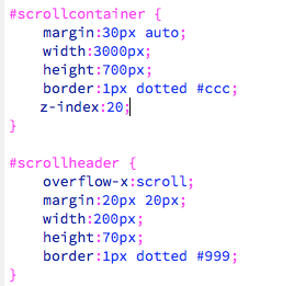
#container6 {
width:1600px;
height:360px;
top:0;
margin-top:220px;
overflow-x:auto;
z-index:20;
position:fixed;
}
This now meant I could work on both the timeline and gigs pages.
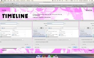
Adding the imagery for the timeline:
As previously shown in my final crit, my intentions for the timeline were as seen below:


The images would simply be a rollover, with a link to a video of the A - Side song.
Creating The Dividers For Each Year
I wanted to look at different ways I could divide the years up for the timeline, as I felt the idea I had shown in the mockup could have been too basic. Below you can see some of the variations I took:


This is the final design I chose to work with. I felt the previous ideas were too 'fancy', and distracting from the content. This way of working is highly functional.

Experimenting with Horizontal & Vertical Scroll
I also experimented with not just a horizontal scrollbar, but a vertical one too - almost by accident. I felt it would be easier to just stick to a horizontal scroll, as it would be easier to follow through chronologically:

Producing the Rollover Images
As you can see below, I used layers in Photoshop to design a consistent rollover image.


Adding A Youtube Link
I was originally going to allow the youtube link to be clickable and opened in a new tab. However, since I was working with a rollover image anyway, I decided to just copy and paste the Youtube link, and add this to the rollover image as a link.


Changing the Design of the Timeline
'Something isn't right about the timeline and gigs pages. You need to make the 'submit' page much easier to see'
I decided to make the information scrollable, so that it is not distracting when viewing the timeline.
I also ensured that the 'submit' link was permanently visible outside the scrollable area, so it can easily be viewed.
Creating an image the same size as the album artwork, to fit in the scrolling area:


Changing the 'submit' button, to a rollover image, matching the rest of the links:


I changed the title (to match the home page), with a black background. I also made this outside of the horizontal scroll, working the previous 'left column' container I produced. This meant that the title will stay where it is, whilst the content scrolled:


'The About Page seems quite empty, and doesn't utilise the space as much as I think it could'
As you can see below, I worked with the previous 3 column grid, but aligning the text to the left.

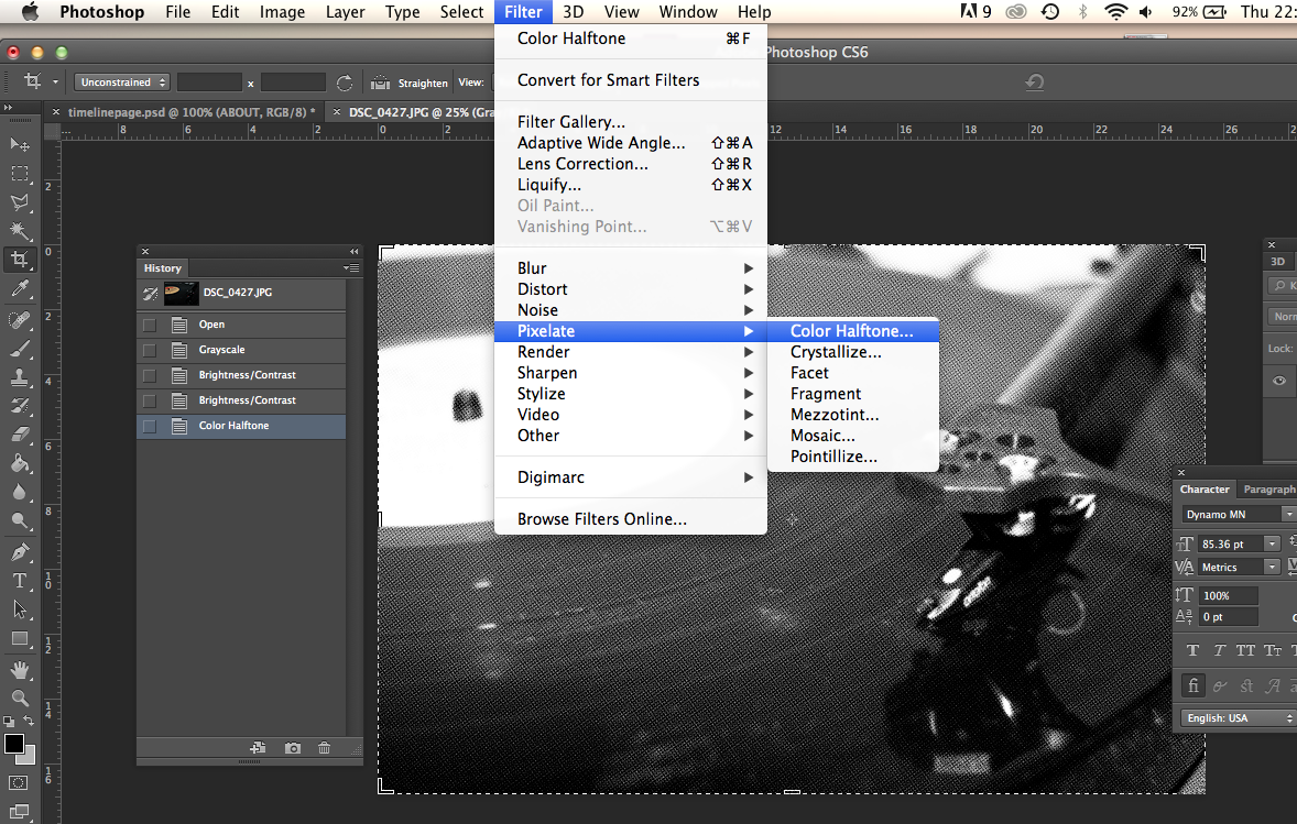
Adding a black container to fit an image in:

I took an image of my record player, then editted into greyscale, and changing it into half - tone. I felt this would be fitting to the 'Punk' theme.


Producing the 'Gigs' Page
This was similar to code to my 'timeline' page, and would work in the same way.
Producing the dividers:
These were similar to the timeline, but was text telling you of the band, instead of a year.

I had issues embedding actual YouTube videos into my page, which I asked my tutors about. They informed me that this has been an issue in previous years.
I decided to use rollover images again, with a clickable link the video.
Adding screen shots of the videos into Photoshop:
I used guides to make sure all my content would be kept in the same place.


Adding the rollover images in Dreamweaver:

The finalised page:

Subscribe to:
Comments (Atom)

Copyright 2010. All rights reserved.
RSS Feed. This blog is proudly powered by Blogger and uses Modern Clix, a theme by Rodrigo Galindez. Modern Clix blogger template by Introblogger.