Below are modifications I made when creating the website:
I realised the home page wasn't very visual, and so I wanted to add imagery, to make the page more exciting, and more appropriate for a restaurant:
How a rollover image could work:
Examples of different images in the slideshow:
Other pages:
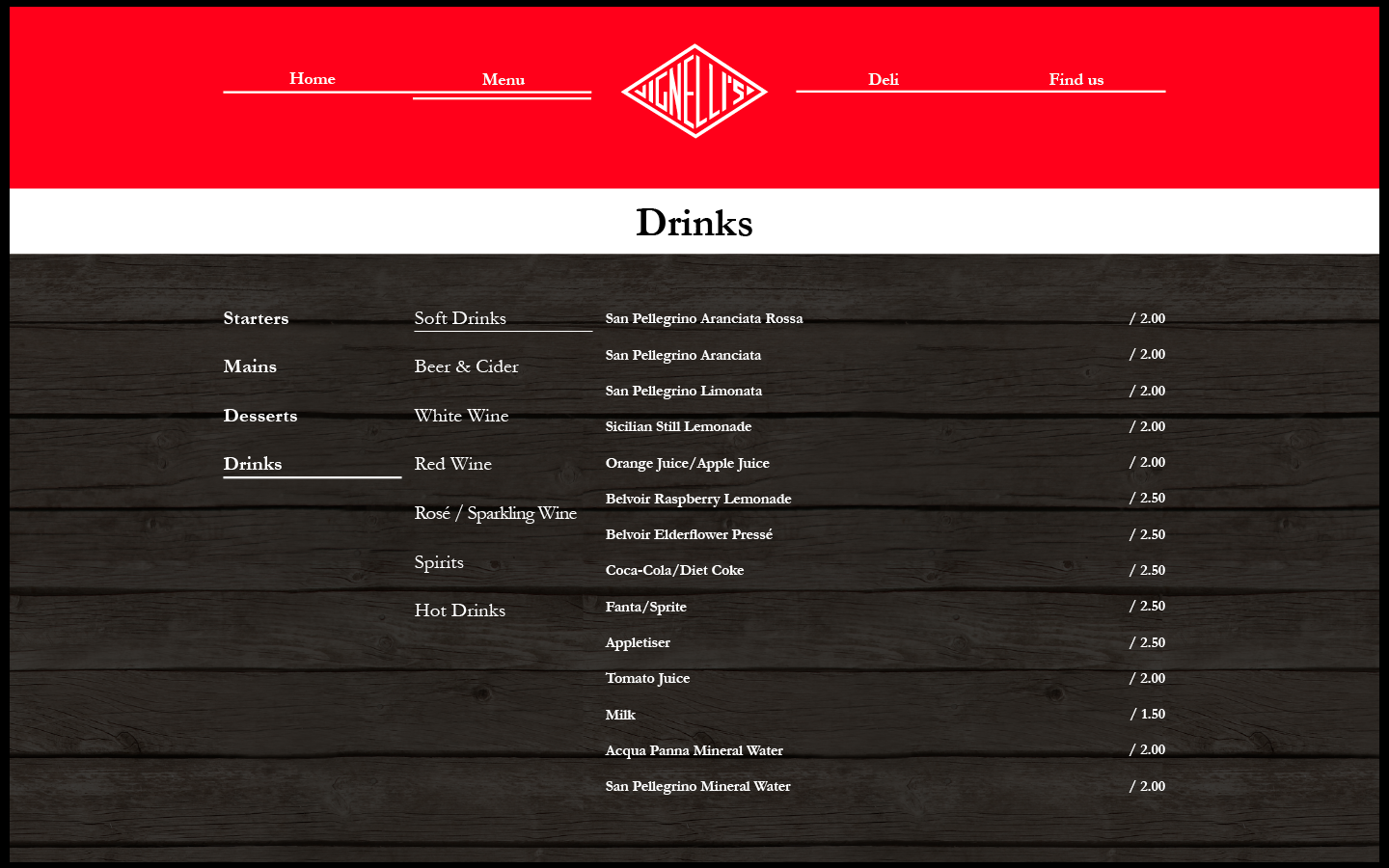
Having worked out a grid and layout to work with, it was much easier to edit and create the rest of the pages:
The Menu

The Deli - I used my mocked up images of products to show how this could work. There would be a horizontal scroll column so all products can be seen:
The 'Find Us' Page - I used a mocked up image of the restaurant to show how location, as well as showing the actual address.


