Below you can see the final design sheets that I have produced for this brief:
Design Practice
Joe Leadbeater
Showing posts with label Design For Print & Web. Show all posts
Showing posts with label Design For Print & Web. Show all posts
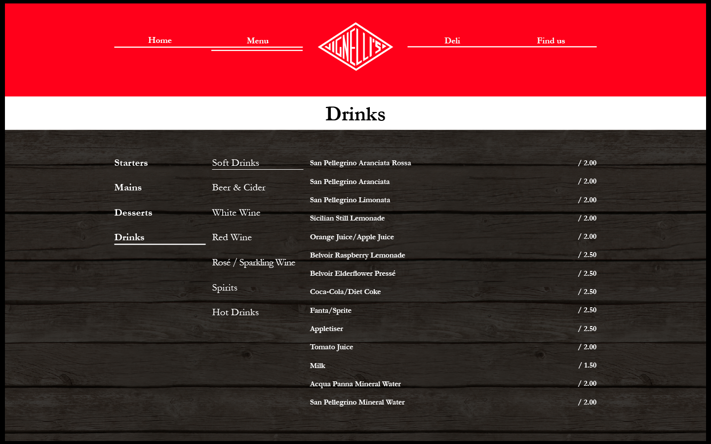
OUGD504 - Design For Print & Web (14) - Final Website Designs
Below you can see the final pages for my website mock up.
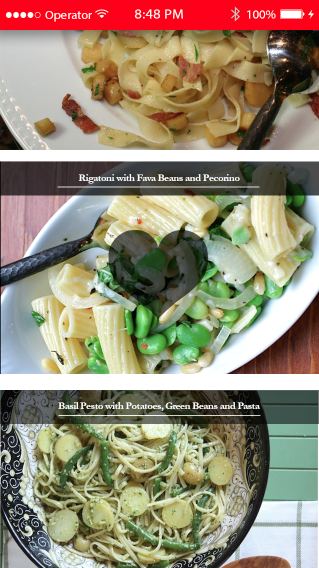
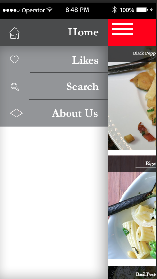
OUGD504 - Design For Print & Web (13) - Designing the App
I asked in the final crit if an app could be approriate - My classmates told me it would be a great idea to producing a cooking app, that fitted with the rest of my brand.


When the lines are clicked at the top menu, you can see the following options:
Below you can see how the recipe pages would work. This is from a 'single click' from the homepage.


This will be the info page, letting people know about the restaurant. This is important as it could result in more business for the restaurant.


Below you can see design variations I made, before coming to a final design:
I started off with the design below:
I found this to look quite cheap, not the same sophisticated aesthetic I was looking for, I removed the drop shadow and started again:
I looked at the aesthetic of my website, and decided it would be best to match it on the app, the result being below. I feel this works well, and is much more sophisticated than my previous designs. The page would just droll horizontally, with the top bar disappearing when the scrolled down from the top. When double clicked, users can 'like' a recipe'. This would appear under likes, so they can view the recipe with others they like the look of. A single click will take you to the recipe.
When the lines are clicked at the top menu, you can see the following options:
Below you can see how the recipe pages would work. This is from a 'single click' from the homepage.
I mocked up how the app would look on a homepage of a phone too:
OUGD504 - Design For Print & Web (12) - Designing the Website
Below are modifications I made when creating the website:


I realised the home page wasn't very visual, and so I wanted to add imagery, to make the page more exciting, and more appropriate for a restaurant:


How a rollover image could work:

Examples of different images in the slideshow:


Other pages:
Having worked out a grid and layout to work with, it was much easier to edit and create the rest of the pages:
The Menu


The Deli - I used my mocked up images of products to show how this could work. There would be a horizontal scroll column so all products can be seen:


The 'Find Us' Page - I used a mocked up image of the restaurant to show how location, as well as showing the actual address.

OUGD504 - Design For Print & Web (11) - Pack Shots of Work
I booked a slot in photography, in order to take more professional photos of my work.
I learnt quite a few things whilst setting up about pack shots:
- Continuous lighting should be used instead of flash bulbs, this gives a softer aesthetic.
- 35mm is optimum zoom.
- Tripods can be used upside down to take photos from above.
- You can bounce light off the walls for softer lighting, or use a brolly.
- A 'fill' can be used to help bounce light off specific areas.
- A custom white balance can also make your photos appear softer.
The Photos:
Subscribe to:
Posts (Atom)

Copyright 2010. All rights reserved.
RSS Feed. This blog is proudly powered by Blogger and uses Modern Clix, a theme by Rodrigo Galindez. Modern Clix blogger template by Introblogger.