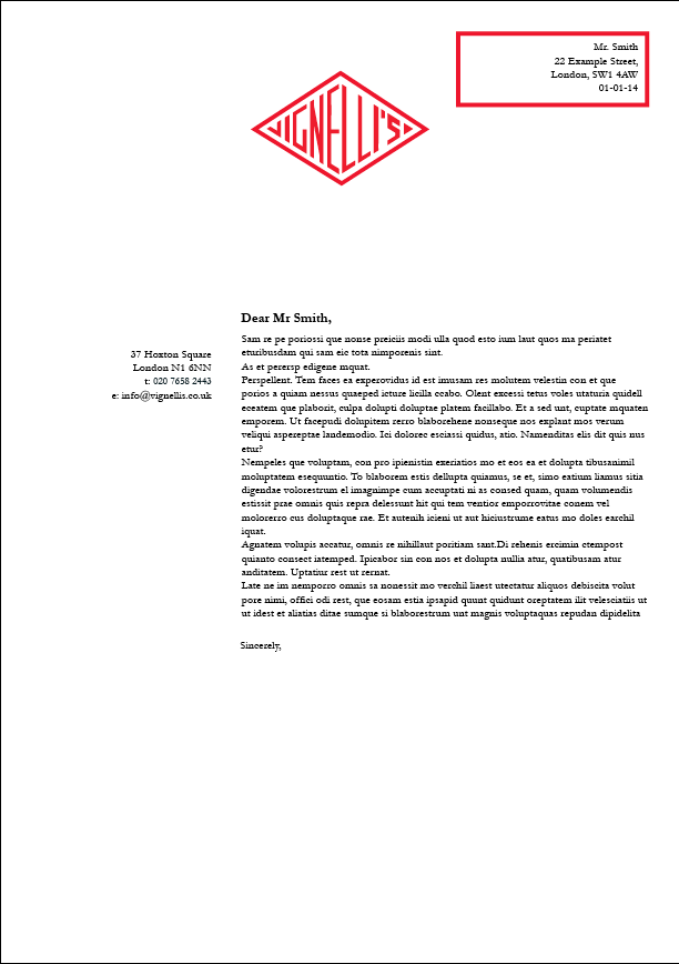
I experimented with different variations for my letterhead, as I wanted to add areas of colour. I have used boxes previously for both my menu and my business cards, so wanted to see if it could also be applied here:
I felt that the boxes were far too fussy and distracting. The reason for a letterhead is to display information and communicate a message through the body copy, and I did not want aesthetics to over- ride the functionality.
I chose to keep the final design simple, with just a logo at the top:


