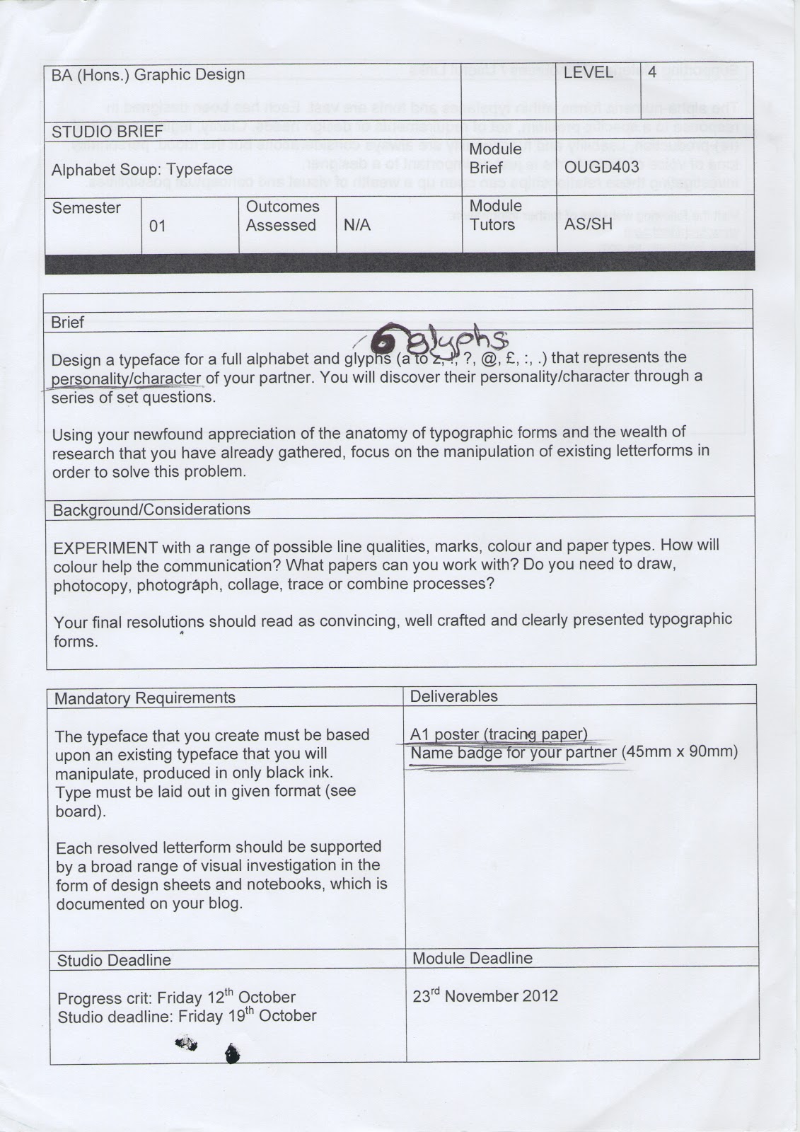
\

We were put into partners, mine being Jamie Pudsey. We then spent a lot of time answering some set questions, in order to find out more about each other:
What is your favourite colour?
Dark purple, navy blue.
Which living designer do you admire most and why?
Peter Saville - He designed the iconic Joy Division album artwork.
What is your most treasured possession?
My bike.
What would your superpower be?
To be able to teleport anywhere and anytime.
Who would play you in a film of your life?
Robert De Niro / Jason Statham
Who would you invite to your dream dinner party?
Robert De Niro, Al Pacino, Dell Boy.
What makes you unhappy?
People who are famous for no reason- characters from " The Only Way is Essex", Kerry Katona, etc..
What would be your fancy dress costume of choice?
Ermm...
I felt as though these questions did not help me enough, so I asked him many other things, such as his taste in food, music, and other interests. I also researched into his family background, as well as his artistic interests. I think it's best to find out as much about a person as possible before analysing them, as you can begin to make summaries of parts of their personality.
In conclusion, I summaries that Jamie has strong interests in organic aesthetic, and has a strong interest in nature. He also likes to use different materials when he works, which I too would like to replicate. Unfortunately, these two points were obstructed by the brief:
-Nature: The brief instructs only the usage of black and white, whereas nature is associated with colour and many different tones.
-Material Usage: The brief instructs only the use of black ink, as well as the final outcome being on tracing paper. This means I could not use any natural materials with the final outcome of my work.
Initial Experimentation
As limited as I am material -wise, I chose to look at ways I could consider the usage of ink. One route I did not want to go down is that of drawing the letters, as I feel this takes away from the organicity that intend to create.
Here I have soaked a piece of cartridge paper in water, then lightly pressed a brush with Quink on it over the paper, to create a lower case e. I really like how the ink spreads without any human input once it hits the paper. The outcome is a highly detailed letterform.
One criticism is that the letter has no form. I would like to see how type that has already been designed can be manipulated in a way so that they BECOME organic, instead of PRODUCING something organic.
Crit Feedack: I learnt three key things in my Crit which I need to consider, these can be found here. In summary, the key points I need to consider are:
- What existing typeface should I base mine on?
- How does ink and water react on tracing paper?
- How will the letters work on a smaller scale (to fit the badge)
Chosen Existing Typeface:
Century Gothic: I chose to use this typeface, as I learnt from my Crit that I needed a typeface with structure to it, in order to create a good comparison between structure and the natural shape and form produced by the ink. I intend to have some clarity in some areas of the letters, but ensure that some areas are left looking more free. In order for the ink to take full effect I have attempted to use maximum amount of space:
-A heavy weight of type, meaning more space is taken up.
-The bowl sections of letters such as a, b, and d will be utilised in a way so that the ink can have more space to have freedom.
I used a stencil that I made with the first five letters in Century Gothic, in order to give my letters much more structure than previous experimentation.
I changed to the use of Indian Black Ink instead of Quink, as I feel it has a much sharper contrast, and seems to produce much more detail.
.jpeg) Upper/ Lower Case?
Upper/ Lower Case?
I decided to go with lower - case for the following reasons:
-There are more bowls in lower case, meaning more space for the ink to take up. Lower case also has more curves, which I think go better with the ink and water approach.
-Capital letters do not seem to feel quite as organic.
-Jamie is laid back and calm, which suits lower case better.
I experimented with the ratio of ink to water, as you can see in the upper case letters. My favourite was the first, where I was as subtle as possibly with the ink.
I really like the outcome of this approach. One point that came up in my Crit is that will the detail be the same when printed onto tracing paper. Below shows the outcome of it:
This seemed like a real setback in the project. The letters are blurred and have very little or no detail. The entire effect seems to have disappeared, simply because the tracing paper does not absorb the water anywhere near as well as cartridge paper. Another disadvantage is that the when the ink and water dry, the paper appears crinkled and difficult to use. The outcome is supposed to be on tracing paper, so theres no way I could avoid that. The only thing I could do was to experiment with other processes:
- As the cartridge paper outcome produced the most detail, I looked at working from that. I chose to use a pen (0.05mm in diameter) to trace each letter. I chose a small pen as I would like to attempt to replicate the detail. I also intend to avoid making any lines that look like pen lines. I sheerly want it to be linear and no strokes.
Here is a tracing of the letters above (the letters printed on cartridge paper). I experimented with filling in areas in black on the first letter, and leaving some white. However I chose to stop this, as it left lots of lines and took away the linear effect. As much as I was against the idea of using pens, I do not think the outcome as linear looks bad at all. The letters are still clear, but also have the natural feel. However, I do miss the tone produced on paper.
Other Experimentation

--------------------------------------
Here I have
considered other ways in which I can use ink to manipulate letters.
1. Just ink without water.
2. Lots of water and very little ink.
3. Ink pressed down, but then soaked up by tissue paper instantly.
4. Ink on its own, but blown around with the use of a straw.
--------------------------------------
Bubbles?
As I found from tracing the letters, the inside of each letter seemed to be fairly plane. I hoped to use bubbles inside the stencils, so that when I trace the ink, the inside of the letters would be more interesting. The process took was:
1. Produce the stencils and attach to cartridge paper.
2. Combine ink, water and washing up liquid.
3. Use a straw to blow bubbles into the liquid, so black bubbles are produced.
4. Hold the paper upside down and press it against the black bubbles.
This was an interesting process, as it was very hit and miss. Sometimes the patterns produced were intricate and dynamic, and other times just ended up as a grey blur.
As you can see, some letters produced the detail that I wanted, such as the second b, and the second e. However, the majority left a fairly plane result (such as the first b).
The lack of detail I got from the prints is also shown in the tracing. Another problem was that the detail on some letters was so strong and intricate that they proved impossible to trace, as my hand is not sensitive enough, and I could not find a pen any thinner than 0.05mm.
Also, I found the shape with bubbles is much clearer, however, is no where near as visually interesting as with just ink and water. For this reason, I chose to revert back to my original process.
Working Towards a Final Piece
As I did on a small scale, I decided to create a stencil to print my design with. I printed the entire alphabet on A1 paper in Century Gothic, and stuck onto card. This was because I intend to use the stencil several times, as the process of cutting out all the letters is hugely time consuming.
Prints:
I produced three different prints on cartridge paper at A1 scale, as well two on tracing paper: one printed using the stencil, and one traced from my favourite cartridge paper print.
Unfortunately, I could only get my hands on an A2 Scanner, so I apologise for the divide a few of the following images have.
--"Middle Weight" Print--
--"Bold" Weight--
I also thought it would be interesting to scan the stencil from the other side, and invert it. The result is an "Extra Bold" Type.
Here are the two images I produced on the tracing paper. The first is produced from a stencil in the same way I have produced all the previous. The one on the right is traced from the "middle" weighted type.
A1 Poster Final Outcome: If I was to call one piece a final, I am unsure what to go with.
Cartridge Prints: I would love one of these to be the final outcome, in particular the "middle" weight. This is because these contain the most detail and most depth to them. However, they do not fit the brief as they're not printed onto tracing paper.
Tracing Prints: In order to fit the brief, I have to pick between these two. I think if I had to choose, I would go with the printed onto acetate sheet, as oppose to the drawn on sheet. This is because they seem much more readable, and stick to my concept of using a natural media.
Badge: The brief also instructed to produce a badge - 90mm by 45mm.
We were also allowed to work digitally and in colour. Initially, I chose work in dark purple, as Jamie mentioned it is his favourite colour.
These are examples of ways I experimented with ink around the letters> My favourite is the top left, however the choice of black lettering with purple does not go well.
This is why when I produced the badge I changed the letter colour to yellow, for complimentary reasons.
Unfortunately, I don't think the badge went well. Obviously at that size, (and only one piece of type being used) layout cannot vary much. But I do wish I spent more time considering different types of badges, as well as colour and the background usage.


.jpeg)


.JPG)


