
Brief:

Initial Research - Spider Diagram
The word I was given to work with on this brief is "POP". I chose to create a spider diagram in order to generate as many ideas as possible.
I chose to explore four main ideas to branch out from:
- Definitions. I looked up dictionary definitions of the word to see the many meanings of it.
- Connotations. I looked up synonyms in the Thesaurus in order to fuel more ideas. I also thought about what the word POP could mean to different people, eg. to an old person, "pop" may be a drink, whereas to a teenager it could refer more to the music genre.
- Senses. What senses spring to mind when you think about the word? Do you consider the word as delicate (like a bubble), or bright and colourful (like Pop Art).
- The Word Itself. What does the word look like, just considering its structure, shape and form?

Chosen Route
In my opinion, the most interesting thing about the word POP is that it is a palindrome, meaning you can say it backwards, a rare occurrence in the English Language. I decided I wanted to experiment with the word and mirroring of it, concentrating solely on its shape and form over meaning.

As you can see, I experimented with where the mirror is positioned, both horizontally and vertically.

Here I just experimented with the mirroring of the letter P.

Pattern Emergence: I noticed that when mirroring "p" at multiple angles, an interesting pattern emerges. The first shows just the use of P, whilst the rest include the usage of O.

I really like this pattern, as it fits the my selected word and the brief in several ways:
- The brief said "manipulate an existing letterform" which I have done.
-The pattern is caused by mirroring, just like the word "POP" itself is mirrored grammatically.
- I conteplated looking at bubbles, and the repetition of the pattern replicates that.
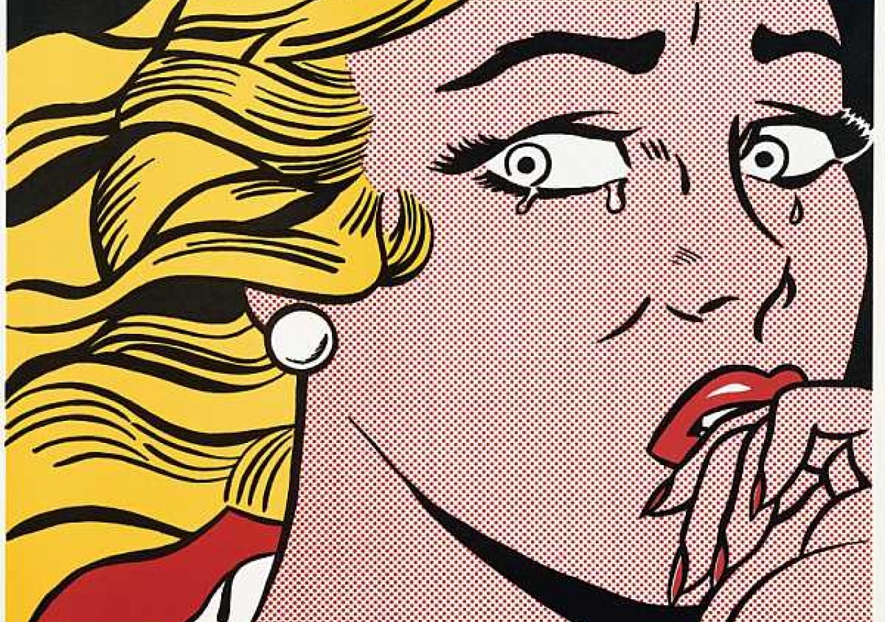
- Another area I considered exploring was "Pop Art", which often originates from cartoons that have been expanded in size. This results in print-style circles, as you can see in Roy Lichtenstein's work:
Pattern Development
As the brief detailed, I have to produce a set of ten letters. As I have chosen to produce a pattern for each letter, I intend to look at varying letterforms, looking at rigid structure (such as H), as well as letters composed of curves (such as S).

These are the letters I have manipulated in order to create patterns. They are in alphabetical order, but from left to right:
A, B, C, H, G, J, Q, S, T , W
The next step was to create patterns out of each of these, focusing solely on mirroring the shapes.


Incorporating Pattern With Type


