- “Type is speech made invisible”
- Industrial
Revolution - Process of print
- Became
mandatory to read in schools.
- Accents,
emphasis & phonemes shown visually instead of verbally.
- “Visual speech”
-CRUDE –
Associations made with “crude oil”. Stencils bring thoughts of oil barrels,
military etc...
- Italics – lead you forward, hints at
movement.
- Type and image
conjunction & context helps with
interpretation of typeface.
- Conflicting
information can be formed via colour.
- Cambridge
university experiment with words – “aoccdrnig to rscheearch at Cmabrigde
Uinervtisy” – strong visual literacy. More difficult to read from Gothic to
Block font.
- Some people
find Roman fonts easier to read than sans serif fonts – often a sign of
Dyslexia. Roman becomes harder to read at a larger scale, in terms of body
copy. Block becomes easier, as the spacing is easier to see.
-You can use lots
of fonts under a different typeface and it work, but difference typefaces often
clash. Rule of thumb: NO MORE THAN 3 FONTS.
Vocabulary
-
Font – The means to create a typeface, be it
computer code, lithographic film, metal or woodcut.
- Usually
standard alpha numeric, and basic grammatical elements. A font is not just
about letterforms, there are also glyphs.
- PUB QUIZ GOLD: Helvetica has a square
full stop, Arial has a round full stop.
- A font isn’t
necessarily an entire typeface. “A
series of fonts make up the Gill Sans typeface”
-Display
font – a font that is usually used at titles and not for a large body of text.
-
Typeface – A collection of characters, letters,
symbols, punctuation etc.. Which have
the same distinct design.
- Composed of
fonts: Light, Regular, Bold, Roman, Condensed, Extended, Boldface.
- You can also
get Gothic (stripped down sans serif font), Block (headlines, width, big black
stroke), Roman (serif fonts) and Script (handwritten, curly terminals) fonts.
- A broader
collection of type, font is more focussed.
- Font Family - A set of fonts all with the same typeface, but with different sizes, weights and slants.
- Weight – Fonts are individual when
different weights, but still come under the same typeface.
- Leading – the spacing between letters.
Originated from the use of lead between letters in print.
- Counter – Negative space within a
letterform. Eg. A, p d, C eg FedEx, OGC
- Bodycopy – the main written text, not
including headlines etc..
- Legibility – the degree to which
glyphs (individual characters) in text are understandable or recognizable based
on appearance. An accurate distinction is needed, through the letter itself.
- Readability – The ease in which text
can be read and understood. Influenced by line length, primary/ secondary
leading, justification, typestyle, kerning, tracking etc..
- Tracking – When letters in a word are
spread out.
- Kerning - When letters in a word are pulled in.
- - - - - - - - - - - - - - - - - - - - - - - - - - - - - - - - - - - - - - - - - - - - -
Readability / Legibility:
Identify the full typeface of your given fonts, and find the most readable:
-Century Gothic-
1. Century Gothic™ Regular
2. Century Gothic™ Italic
3. Century Gothic™ Bold
4. Century Gothic™ Bold Italic
5. Century Gothic™ Cyrillic
6. Century Gothic™ Cyrillic Italic
7. Century Gothic™ Cyrillic Bold
8. Century Gothic™ Greek
9. Century Gothic™ Greek Italic
10. Century Gothic™ Greek Bold
11. Century Gothic™ Greek Bold Italic
- - - - - - - - - - - - - - - - - - - - - - - - - - - - - -
-Futura-

1. Futura® Light
2. Futura® Light Oblique
3. Futura® Book
4. Futura® Book Oblique
5. Futura® Medium
6. Futura® Medium Oblique
7. Futura® Heavy
8. Futura® Heavy Oblique
9. Futura® Bold
10. Futura® Bold Oblique
11. Futura® Extra Bold
12. Futura® Extra Bold Oblique
13. Futura® Light Condensed
14. Futura® Light Condensed Oblique
15. Futura® Medium Condensed
16. Futura® Medium Condensed Oblique
17. Futura® Bold Condensed
18. Bold Condensed Oblique
19. Futura® Extra Bold Condensed
20. Futura® Extra Bold Condensed Oblique
21. Futura® Display
22. Futura® Black
- - - - - - - - - - - - - - - - - - - - - - - - - - - - - -
-Arial-

1. Arial® Light
2. Arial® Light Italic
3. Arial® Regular
4. Arial® Medium
5. Arial® Medium Italic
6. Arial® Bold Italic
7. Arial® Extra Bold
8. Arial® Extra Bold Italic
9. Arial® Black
10. Arial® Black Italic
11. Arial® Condensed Light
12. Arial® Condensed
13. Arial® Condensed Bold
14. Arial® Condensed Extra Bold
15. Arial® Narrow Regular
16. Arial® Narrow Italic
17. Arial® Narrow Bold
18. Arial® Narrow Bold Italic
19. Arial® Monospaced Regular
20. Arial® Monospaced Oblique
21. Arial® Monospaced Bold
22. Arial® Monospaced Bold Oblique
23. Arial® Rounded Light
24. Arial® Rounded Regular
25. Arial® Rounded Bold
26. Arial® Rounded Extra Bold
-Myriad-

1. Myriad® Light
2. Myriad® Myriad Light Italic
3. Myriad® Regular
4. Myriad® Italic
5. Myriad® SemiBold
6. Myriad® SemiBold Italic
7. Myriad® Bold
8. Myriad® Bold Italic
9. Myriad® Black
10. Myriad® Black Italic
11. Myriad® Semi Condensed
12. Myriad® Semi Condensed Italic
13. Myriad® Semi Condensed
14. Myriad® Semi Condensed Italic
15. Myriad® SemiBold Semi Condensed
16. Myriad® SemiBold Semi Condensed Italic
17. Myriad® Semi Extended
18. Myriad® Semi Extended Italic
19. Myriad® Semibold Semi Extended
20. Myriad® SemiBold Semi Extended Italic
21. Myriad® Bold Semi Extended
22. Myriad® Bold Semi Extended Italic
- - - - - - - - - - - - - - - - - - - - - - - - - - - - - -
-Lucinda Sans-

1. Lucida® Sans Roman
2. Lucida® Sans Italic
3. Lucida® Sans Demibold
4. Lucida® Sans Demibold Italic
5. Lucida® Sans Bold
6. Lucida® Sans Bold Italic
- - - - - - - - - - - - - - - - - - - - - - - - - - - - - -
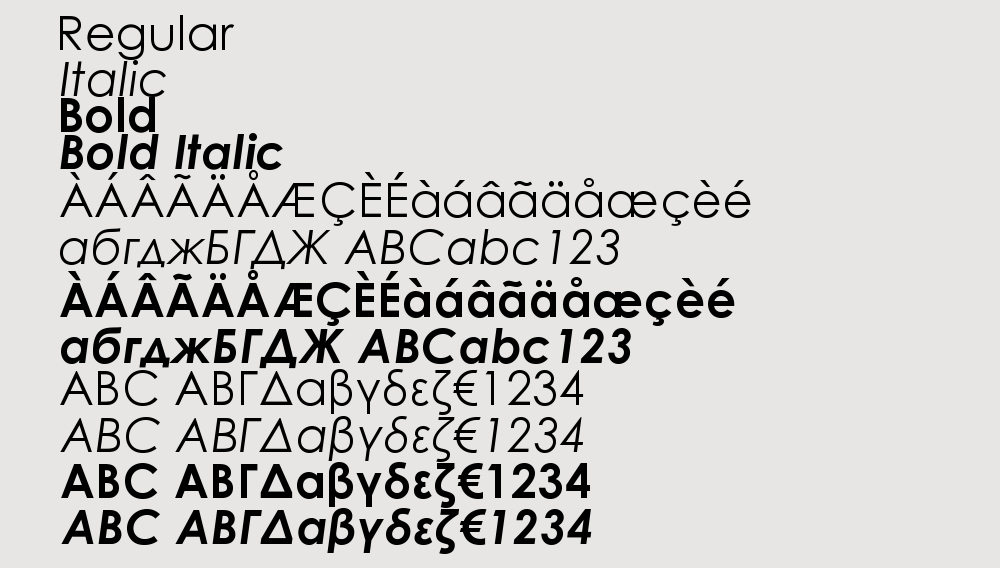
Most Readable Fonts:

1. Century Gothic™ Regular
2. Futura® Medium
3. Arial® Medium
4.Myriad® Regular
5. Lucida® Sans Roman
Why are these the most readable?
Negative Space - I found that the fonts which had the best negative and positive space ratio were much easier to read. Fonts that are "light" can often be hidden by their background at distance, whilst fonts that are "bold" or "extra bold" can become less readable due to the counters within the letters not being as obvious (this is more legibility).
Format - Even though I looked at just sans serif, I found that when looking at serif fonts on a screen they were less readable. This works inversely, with serif type being more readable when printed. I think this may be due to the light on a screen helping with negative space for sans serif, whereas serif letters can often be more obvious on paper, due to us recognising and associating each serif with each letter.
