The research and content for this brief can be found on this post.
Initial Layout
I began by creating a variety of layouts, considering both quite abstract layouts and simple, easy to read layout. I used a key to help picture where different elements of the page would sit: images, title and body text.
Initial Thumbnail Layouts:
As you can see, I chose a simple layout, but only selected an option for the left hand page.
I chose this option, as I found:
- It could contain lots of information, with a section for the title, an introduction section of body text, and a section for text at a larger point size, for quotes or phrases.
- As the right page would have to match it, it could contain much more information. I wanted my book to contain lots of information, as I found that each of my "10 things" contained lots of information, so I did not want to waste any space.
Second Thumbnail Layouts:
This page is split into two sections: varieties for the left hand page, and varieties for the right hand page.
Left Hand Page:
Having already chosen a layout, I decided to alternate the layout of the boxes, with the title varying from top left of the page, to top right, bottom left and bottom right. This is so the pages still contain continuity, but also slight variation, so the spreads don't seem too "samey".
The order in which they will be used (as shown on the sheet), are:
1. Title: Top Right
2. Title: Bottom Left
3. Title: Bottom Right
4. Title: Top Left
5. Title: Top Right
6. Title: Bottom Left
7. Title: Bottom Right
8. Title: Top Left
9. Title: Top Right
10. Title: Bottom Left
Right Hand Page:
I tried to ensure that all the layouts would match any of the left hand page layouts, so I could "mix and match" them. As you can see on the sheet, I chose my top 10, based on the information I plan to put on the pages. Eg. The double page spread on 'Typographic Terms' has been selected as a layout with two columns, one long and thin, the other much wider. This is so that I have two sections, one for the typographic term, and one for the definition.
Order of Pages
As I have decided on a layout which is fairly consistent, it was easy to decide on the order of pages, without having to re- consider the layout of pages to match the previous or next page.
The order of pages was important, so that I would not have to repeat myself with information, or leave people confused if a term is used later on in the book, without a definition previous been stated.
Order:
' Colour Section'
1. Colour Theory
2. RGB & CMYK
3. Pantone
4. Methods of Print
'Typography Section'
5. Origin of Type (essentially the introduction to this section)
6. Anatomy of Type
7. Typography Definitions (different to the Anatomy of Type, as this page is more about body text terms, eg leading, kerning and tracking)
8. Readability & Legibility (usage of terms from the previous 3 spreads)
' Misc Section'
9. Visual Literacy
10. Layout and Grid
'Glossary'
11. Contextual References - A page with references to actual design work which follows some of the previous 10 rules.
Digital Mark Up:
Issuu Link
Background
In order to give my pages more variety yet also hold consistency, I chose to add background patterns.
I liked the idea of my books having an almost instructional booklet / blue print style aesthetic, so I created patterns to suit this.
Original Ideas:
Issuu Link
After consideration, I realised that these background textures lacked continuity, and were too bold, meaning they would distract you from the content.
I created another set systematically, ensuring each pattern was equally as dense, holding continuity:
I used the same guides to create each shape, before using the pattern tool in Illustrator to create the pattern. I also ensured that the stroke for each shape was the same.
Please Enlarge this Issuu Document in order to see each pattern properly.
New Set of Patterns:
Issuu Link
Continuity:
Obviously I had to maintain continuity with type, and colour.
Below are two examples of layout for the left page (filled with placeholder text):
Header Typeface: Alegre Sans Regular, 99pt, Kerned +140
Blue Type (Acting as a sub header): Alegre Sans Regular, 35pt, Colour: C: 72, M:46 Y:2 K:0.
Phrase (Leading depends on how many lines it takes up to fill the space but between 5 and 8 lines when vertical box, and between 2 and 3 lines when horizontal box): Serif12Beta Bold Italic, 30pt.
Introduction Bodytext: Serif12Beta Italic, 16pt.
Overall Bodytext for the rest of the book: Serif12Beta Italic, 11pt.
Designs For Each Page
Colour Theory:
RGB & CMYK:
Pantone:
Methods of Print:
Producing the imagery:
In order to show how CMYK is composed, I chose to use an image I have taken, and create the dots myself:
Using the Photoshop effect 'colour halftone', I edited a photo from my 'Typo Gateaux' project:
I then zoomed in to a certain area and cropped it:
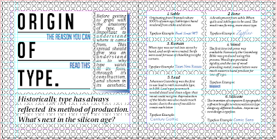
Origin of Type:

Anatomy of Type:
Designing the Diagram:
I researched into typographic jokes, and found one I could deconstruct.
I then used the same colour scheme I have been working with to annotate the image:
As the answers were to be on acetate, I used a separate layer, in order to make the answers be lined up with the areas they fit into.
Diagram that will be on the page:
The acetate answers:
The two together:
Typographic Terms:
The phrase and it's truth:
In order to show some of the typographic terms in a context, I chose to use my 'phrase' section. Below you can see the font, and point size details:
Read & Legibility:
Visual Literacy:
The original crosses:
Originally, I chose to use a pattern to create my shapes. However, I found this to be too confusing next to a patterned background, and almost blending into it.
I chose to make them bolder with a solid fill, as you can see above.
Layout & Grid:
Contextual References:
Contents Page:
This was one of the last things to design, as I wanted to ensure everything else was in the correct and in place, so I would not have to adapt it afterwards.
I produced a simple column layout for this, as I felt the first page the reader should look at should be simple and easy to understand:
I chose to add a subtle amount of blue, to fit with the colour scheme of the rest of the book:
Page Numbers:
This was a difficult thing to design, as I often felt they would either stand out too much, or not be obvious enough.
Chosen Option:
Experimenting with Positioning:
Final Positioning and Option:
Front Cover:
The final thing to design.
Originally, I wanted to include different aspects of the "10 Things", but this proved improbable and ugly, as you can see below: (I included RGB, CMYK and the Pantone Colour of the Year)
After experimenting with layout, this proved to be my favourite:
I then added it into a box, similar to the boxes that appear on every page of the book, with the blue gradient:
This was too plane, so I experimented with different backgrounds which I chose not to use earlier in the project in the double page spreads. They were more successful for the cover, as they make the front cover more interesting aesthetically.
Variations:
Final Cover:
Final Book Design:
Issuu Link


