Having produced my designs for my website, as well as wireframes, the next step was to start the coding:
Creating the title for my website in HTML:
Saving my background image for web:


I chose to save my image slightly bigger than my chosen resolution of 1280 x 720. I also ensured it would be saved as a PNG-24, so the image took up less memory.
Creating an index.html for my page:
Linking an images folder to my index:
Adding a CSS Stylesheet:
How my webpage now looks:
Adding my background image to CSS:
I noticed that despite changing the percentage size of my background image, there was still a small margin on the left.
The problem: I simply left a gap after the semi colon below. I removed this gap and the image moved across to how I wanted it.
CSS code so far:
HTML code so far:
Creating my rollover buttons:
I thought it would be best to create a rollover for my largest word first. This is so I can ensure the type will fit in the 150px box. The rollover will work from lowercase into uppercase.
Working with 2 layers to ensure my rollover lines up:
Adding a container at the top: I did this just so I knew where my top two links could fit.
Original coding for top and bottom container in CSS:
And in HTML:
The result was below:
After further experimentation:
Finally I got the position right, with much more messing around:
Adding my rollover images:
How the rollover looked with capitals:
Removing the colour, creating a transparent container:
Adding the bottom left rollover:
An issue: When I hover over the 'about', it seems to stretch across.
Consulting Simon About Cornered Links
I spoke to Simon about cornered links, and he told me what I was doing wrong. Instead of using a container at the top and bottom, he suggested it would be best to create separate containers for each link. I then did the following in CSS:
The next step was to add the rollover images to the HTML:
This worked perfectly:
An example of the rollover working on 'timeline':
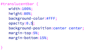
Creating A Translucent Banner
I first tried to copy my background coding as I thought it would be great to create a responsive translucent layer. Instead of using a background image, I set it as white.
This was the result:
I then tried just using a simple container, testing it out at 30px.
I added a top margin to move the bar into the middle:
Final sizing sorted:
In order to make the web page work when made smaller, I made sure the links were at the front. I did so by adding a 'z-index' to each of the containers:
Making the bar responsive:
I attempted to change the bar into a responsive shape, by using percentages:
As you can see, the bar seems to be responsive, with the links all at the front. However, the links aren't responsive, and don't change size. If I have the time, I would like to make these responsive.
Making the bar translucent:
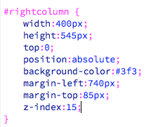
Producing Columns
I worked with my wireframe to produce a simple 2 column grid.
 Changing The Rollover Images
I felt that the rollover images weren't as aesthetically pleasing as I wanted. I also felt they were too large and distracting. I removed the javascipt and rollover images, and started again:
I ensured that the images used were still at the same size as previously used, so the container for each wouldn't stretch the content.
Changing the Grid System
I felt that I wasn't utilising space enough, so decided to create a 3 column grid instead of two:
Creating Different Pages
I decided to begin to make my different pages. Below you can see how I made my 'about page', using the middle column of my 3 column grid. I ensured the columns left and right were marked as 'transparent'. I also created a header size, for the larger section of text.
I saved the page, and linked it to index.
Adding the Image to the Homepage
I still needed to add the image to the homepage. For this, I made the 3 column grid translucent, then created a new container. I ensured this was the same size as my image, and used margins to position the container correctly.
I ensured the image was correct size, by creating a document in illustrator at the right size:
I used the 3 column grid to start my 'timeline' page. I also added a link to my 'submit' page.
I had some issues with the text being a 'purple - link' colour, but I managed to change this to black:
Creating Active Links
I wanted to create an active link for each page - ie. The rollover image stays the same when you're on that page. I consulted Simon about this, and he informed me of ways it can be done without javascript. However, I thought of an easier way, so I didn't have to delete my code.
I had already set up each page, with rollover links on each. I manually changed the rollover on each page, so that it's rollover would be the same image.
Example: On the guys page, I made the pre-rollover image the same as the rollover. This means that on the 'gigs' page, the 'gigs' link would be underlined. You can see this below:
I kept the home page the same, as I felt it wasn't needed to show an active link. It is clearly the home page, as you would have seen it as the first page to visit.
Pages So Far:

As you can see, the timeline and gigs pages still needed content added. They both involve a horizontal scrollbar, which is something I still need to work out.
This is the stage I got to before my final crit. Obviously with both 'timeline' and 'gigs', I wanted to show exactly how the pages would work, which is why I prepared mockups for my final crit.