Not all RGB colours can be reproduced in CMYK, a much larger range with RGB, due to the use of light. Each of these modes have their own 'gamut' - Range of colours.
RGB is Photoshop's default mode.
Gamut Warning


Adjusting Saturation:

Using an Adjustment Layer


1. Produce the layer mask and change saturation so all colours are printed.
2. Paint with black to remove the areas which do not need a change of saturation.

Rather than Photoshop having to deal with colours that do not print, we can adjust these.
Adjust layers also stop the image from permanently changing.
Proof Colours
A way of seeing what the colours would look like if you convert to CMYK (works as a preview).

"Work in RGB mode until you finish editing your image. Then convert the image to CMYK mode and make any additional color and tonal adjustments. Especially check the highlights and shadows of the image. Use Levels, Curves, or Hue/Saturation adjustment layers to make corrections. These adjustments should be very minor. Flatten the file if necessary, then send the CMYK file to the professional printer."
The Swatches Palette
Pressing Alt whilst on the swatches palette and clicking will delete existing swatches.
Pressing alt after choosing a colour (in the palette on the left) will add that colour to the swatch palette.

The top alert tis a gamut warning, and shows it won't print using CMYK. It offers a different colour that will.
Below that, the option shows the colour is web safe.
Saving Swatches

Either for access in Photoshop or in other Software Programmes.
When saving Swatches in Photoshop, there is a colour swatch location you can save it in, or save it with your files that make up a project.
Working With Spot Colours
Colour Libraries


Typing in the number will search for the specific swatch.
In Photoshop, you cannot have spot colours and RGB in the same document.


Creating a Duotone Image
Aka. A 2 Tone Image.
It has to be a greyscale image.


Using Monotone with Colour Libraries

Using a Monotone Curve - Changes the amount of black and white in the image.

Dragging the curve off will reset the curve.
You can change the colour of this by going back to the Monotone option.
Duotones

This makes it simple to work with two different inks - black and the Pantone Yellow colour.
Channels


Using the directly selection with the new channel:

Spot Channel Transparency:

Using Spot Varnish:
Create a channel and name it spot varnish. (eg. the orange above). They will see this ink, and apply it as a spot varnish.
Or, you can duplicate layers, and save it as a spot colour:

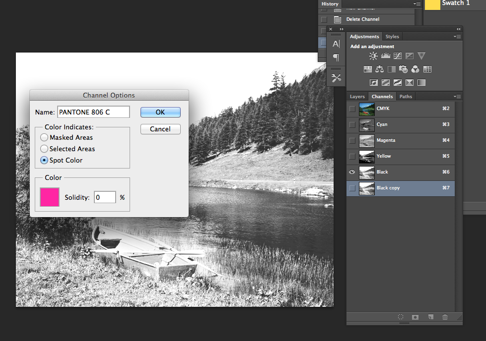
Save as either a TIFF or PSD file.
Knocking out the Grey Channel
Do you want to remove the spot colour or print on top?
Hold Command whilst clicking the spot colour layout to cut out the layer.


