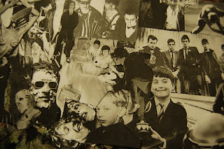
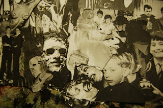
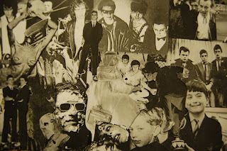
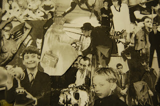
A collage background for my website, but composed of imagery cut out of vinyl artwork.
I gathered a selection of images from different vinyls, and prepared them to be printed and cut out (as seen below). To ensure consistency within the collage, I ensured all images were converted to greyscale, as well as roughly the same brightness / contrast.
The next step was to cut them out, pand lay them out for the collage:
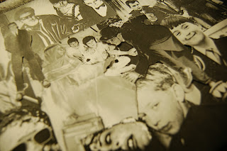
I then took photos of different cropped sections:
I feel that these initial experimentations went well,. The bad quality of the print out adds to the rough, DIY effect. However, I had a few issues:
- The images are too 'zoomed in' - I feel I need to print out more album covers to create a large college with more detail.
- The image quality is low - I used my iPhone to take these photos. If I was to use the image on a high resolution screen, I would have to have a higher quality image. I intend on taking further photos in good lighting using my SLR, or using a scanner at university. The problem with this is being able to arrange the collage blind.
SLR Images:
I decided to take further images using my SLR, in order to get photos with a higher resolution to work with. You can see these below:


