
-Changes To Make-
Problems I Encountered Previously With Typeface:
1. The patterns I produced were varied in several ways:
- The letters I used for each pattern were at different sizes. This meant they did not have any consistency.
- Some of the letters were stretched in either height or width, meaning that some appeared bolder, and some appeared lighter.
- A few of the patterns simply did not work. They took up too much space or did not look like a pattern.
2. The typeface I used was too confusing. Despite the fact that it took up lots of space, and gave the pattern a large surface area, it took away from the clarity of letters. "Doughboy" seems to only work in block colours.
-Changes I intend To Make:
- Ensure the letters are all the same size, through the use of rulers and a grid. This can be said the same for each letter used in the patterns.
- Ensure that the letters within the pattern are not stretched, so that all the patterns have the same weight.
- Make sure the patterns are dense enough to be used as clipping masks.
- Experiment with the use of different typeface's to use as a clipping mask. I need to find one that strikes the balance between exposing lots of the pattern, and creating readable letters.
Below: Doughboy.

As you can see, "C" is much bolder than "H". This is due to the both the different pattern I used for H, and the fact that the C's I used in the pattern are much larger. I also think C is confusing, and the pattern should be much more dense.


Difficult to see on a small scale, but the areas I have highligted in green show that the spacing between each twin of A's are different. I will spend much more time ensuring these are equal when re - designing the pattern.
Below: The production of the pattern for "T". As you can see, I have added guides to make sure the positioning of the patterns are correct. I have also temporarily adjusted the opacity in order to double check that the shapes are in the correct position.


- - - - - - - - - - - - - - - - - - - - - - - - - - - - - - - - - - - - - - - - - - - -
-Finished Patterns-
(click to enlarge)
(click to enlarge)


I put all the patterns into a grid, in order to work with when I have decided which typeface to use.

-Deciding On a Pre - Existing Typeface-
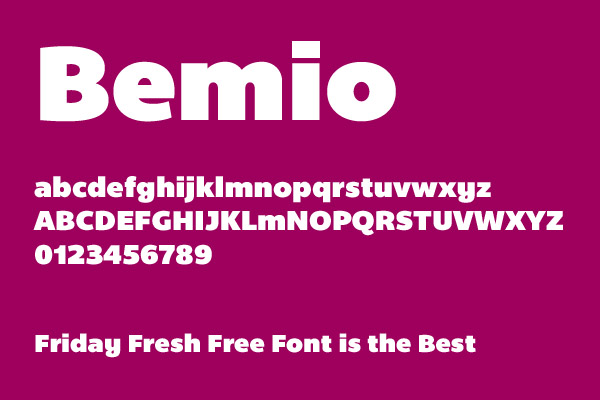
-Bemio-

-Impact-


Once again, I felt as if this typeface has too many curves to use with my pattern.
-Sullivan-


I think this typeface works really well with the pattern, in particular the bevelled font. The structure of it is rigid, and the highlighting on it seems to give a "pop up" effect, which emphasises further the use of the word "Pop".
- - - - - - - - - - - - - - - - - - - - - - - - - - - - - - - - - - - - - - - - - - - -
-Finished Letters-


I inserted the letters into the same grid as I used for the patterns, as shown below:

As the brief instructed, I had a choice to use any CMYK colour:

I chose to go with Cyan, as I feel it has connotations of liquid or water, which has its associations with the word "Pop".


I chose to go with Cyan, as I feel it has connotations of liquid or water, which has its associations with the word "Pop".

