
The brief instructed the photo's were to be taken strictly within the college, so I chose to take my photos on a wednesday, a day which the college is normally fairly desolate.
One consideration I had to take was: how will I tie all the images together?
Obviously the imagery of a triangle itself could tie them together, but only if I took obvious photos of triangles, and of objects that were composed of similar triangles.
Δ▼Δ▼Δ▼Δ▼Δ▼Δ▼Δ▼Δ▼Δ▼Δ▼
Before taking photos, I looked at re-occurring themes within the interior of the college, these were:
- Structure - The college is composed of lot's of structure that hold a purpose, which has not been hidden away. These include ceiling beams, the reverse side of stairs, window frames etc..
- The colour blue - For some reason a lot of the college contains objects of the same hue. Examples of this can be seen as flooring, railing for steps, and bins.
- Clutter - In particular, the Mosaic bar. Rubbish is often left behind on tables, and chairs not tucked in. No room in the college ever seems to be neat and tidy. Maybe I could look at clutter can compose triangles in a random way?
- Light - Obviously this is needed in order for the college to be provided with a function, but I like the idea of how light and shadows can cast certain shapes, or illuminate areas of the college in different ways. How has the architecture of the building influenced it's visibility?
- Signage - Triangles are often used as a form of signage, mostly due to the communication of the shape as an arrow. This can be seen most commonly on the lift buttons, but also on the floor to direct people to certain areas for open day.
Δ▼Δ▼Δ▼Δ▼Δ▼Δ▼Δ▼Δ▼Δ▼Δ▼
I narrowed the areas I could look at down into the two I intended to work with: " The colour blue" and "Light".
Here is my contact sheet or photos, I took roughly 100 photo:

I then chose a "top 5" of each theme, shown below:
The Colour Blue:


Light:
Before taking these photos, I was inspired by the work of Fine Artist James Turrell.
To find my research on him and other design influences, click here for my post on my Design Context Blog.
Before taking these photos, I was inspired by the work of Fine Artist James Turrell.
To find my research on him and other design influences, click here for my post on my Design Context Blog.


Selected Set:
The set of blue images seemed far too obvious. I like the idea of images produced from light, as the usage of a camera to capture them works fantastically. Whenever I take a photo, I consider it as a "frozen moment in time", which has seemed to become my mantra when taking the photos for "light". I like the idea that the shapes that are cast from either shadow or light are temporary, and will change.
Within an an hour or so, the natural light and shadows change shape, and may even morph into something that isn't a triangle any longer. When capturing shapes produced by non natural light, I like the idea that they are always there in sight, but disappear when the lights are turned off.
Δ▼Δ▼Δ▼Δ▼Δ▼Δ▼Δ▼Δ▼Δ▼Δ▼
I chose to manipulate the photos so that they are solely in black and white.
Transformation to Black and White:


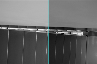
The above images show the comparison between black and white and the original image, which holds lots of hue. If I wanted to, I could have manually adjusted CMYK, but I wanted the images to be strictly black and white.
Levels:
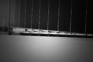
I felt that my image looked too flat when in just black and white. I adjusted the levels to give the image more depth and emphasises the contrast between light and dark, the focus of my images.


Smart Sharpen:
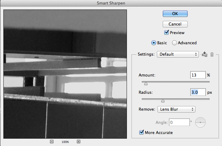
Due to my images mostly holding sharp architectural and metallic lines, I felt these could be emphasised further by subtly sharpening them. I chose to use "smart sharpen" as it gives you much more control than the other sharpening options.

Adding a vignette:
I chose to add a vignette to give the photos a more classic feel, and also to emphasises the contrast in lighting in even further.
Firstly, I used the elliptical marquee tool to select the area in the centre which I wanted to stay lightest. I then inversed it, and feathered it, so that contrast given would not be in a sharp oval shape. Then I adjusted the levels again, to make the edges of the image a gradient in tone.


Final Image:
Δ▼Δ▼Δ▼Δ▼Δ▼Δ▼Δ▼Δ▼Δ▼Δ▼Δ▼Δ▼Δ▼Δ▼Δ▼Δ▼Δ▼Δ▼Δ▼Δ▼
Final Set of Images:
This is because I wanted to focus just on lighting, and feel as if colour could be a distraction. I also added a vignette, to give the images a slightly more atmospheric feel.
Transformation to Black and White:


The above images show the comparison between black and white and the original image, which holds lots of hue. If I wanted to, I could have manually adjusted CMYK, but I wanted the images to be strictly black and white.
Levels:
I felt that my image looked too flat when in just black and white. I adjusted the levels to give the image more depth and emphasises the contrast between light and dark, the focus of my images.


Smart Sharpen:
Due to my images mostly holding sharp architectural and metallic lines, I felt these could be emphasised further by subtly sharpening them. I chose to use "smart sharpen" as it gives you much more control than the other sharpening options.
Adding a vignette:
I chose to add a vignette to give the photos a more classic feel, and also to emphasises the contrast in lighting in even further.
Firstly, I used the elliptical marquee tool to select the area in the centre which I wanted to stay lightest. I then inversed it, and feathered it, so that contrast given would not be in a sharp oval shape. Then I adjusted the levels again, to make the edges of the image a gradient in tone.


Final Image:

Δ▼Δ▼Δ▼Δ▼Δ▼Δ▼Δ▼Δ▼Δ▼Δ▼Δ▼Δ▼Δ▼Δ▼Δ▼Δ▼Δ▼Δ▼Δ▼Δ▼
Final Set of Images:


Δ▼Δ▼Δ▼Δ▼Δ▼Δ▼Δ▼Δ▼Δ▼Δ▼Δ▼Δ▼Δ▼Δ▼Δ▼Δ▼Δ▼Δ▼Δ▼Δ▼
The Back of The Postcard
I chose to keep this simple, with just a triangle on the back.
Choice of triangle - Penrose Triangle
Why this shape?
I found that most of the images I took were only triangles due to the angle I was looking at it. rarely were the shapes cimplete objects, they were composed of overlapping straight lines.
The way in which the below shape works is due to fore- shortening and the overlap of lines, which I feel relates to the images I used.

This impossible shape was designed by a mathematician called Oscar Reutersvard in the 1940's.
A sculpture of the optical illusion situated in Perth, Australia. This shows that the shape only exists when looked at from a certain angle, similar to my images.

Other variations of the shape:
1. A Penrose Hexagon
2. A Penrose Square
3. A Penrose Octagon
4. A Penrose Pentagon


Design Variations:
I chose to keep the shape simple, and just experiment with different tones in relation to the outline and fill.
My final choice is the last image.


