WATCH AFTER PRESENTATION, COLOUR IS WRONG ON PROJECTOR.
Theory started around 1700's - Pre Impressionist Painters working with scientists.
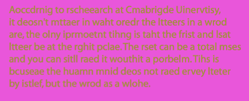
"Aoccdrnig
to a rscheearch at Cmabrigde Uinervtisy, it deosn't mttaer in waht oredr the
ltteers in a wrod are, the olny iprmoetnt tihng is taht the frist and lsat
ltteer be at the rghit pclae. The rset can be a toatl mses and you can sitll
raed it wouthit porbelm. Tihs is bcuseae the huamn mnid deos not raed ervey
lteter by istlef, but the wrod as a wlohe."
"Aoccdrnig to a rscheearch at Cmabrigde Uinervtisy, it deosn't mttaer in waht oredr the ltteers in a wrod are, the olny iprmoetnt tihng is taht the frist and lsat ltteer be at the rghit pclae. The rset can be a toatl mses and you can sitll raed it wouthit porbelm. Tihs is bcuseae the huamn mnid deos not raed ervey lteter by istlef, but the wrod as a wlohe."
- Less legibile and readable.
"Aoccdrnig to a rscheearch at Cmabrigde Uinervtisy, it deosn't mttaer in waht oredr the ltteers in a wrod are, the olny iprmoetnt tihng is taht the frist and lsat ltteer be at the rghit pclae. The rset can be a toatl mses and you can sitll raed it wouthit porbelm. Tihs is bcuseae the huamn mnid deos not raed ervey lteter by istlef, but the wrod as a wlohe."
- Hurts your eyes, harder to read.
"Aoccdrnig to a rscheearch at Cmabrigde Uinervtisy, it deosn't mttaer in waht oredr the ltteers in a wrod are, the olny iprmoetnt tihng is taht the frist and lsat ltteer be at the rghit pclae. The rset can be a toatl mses and you can sitll raed it wouthit porbelm. Tihs is bcuseae the huamn mnid deos not raed ervey lteter by istlef, but the wrod as a wlohe."
- Even less readable.
We all see colour differently. Light is emitted from different sources. The lower the wavelength, closer to blue, the higher = closer to red.
Different colours have different wavelengths, and reach our eyes at different speeds.

The sky is blue since red, the strong light passes straight through. Blue bounces around through sky against the molecules that are there, giving a perception of blue.
Eye contains two kinds of receptors: rods and cones.
Rods - Identify grey.
Cones - identify colour.
When a single cone is stimulated, the braind perceives the corresponding colour. If our green cones are stimulated. we see "green". We only actually perceive red and green as real colours, we make yellow through mixing other colours. Red Orange, Blue Violet and Green give us billions of colours.
1800's - How do we create a systematic approach at looking at colour?

Primary - You can't make them from other colours.
Secondary - A combination of primary colours.
Tertiary - combination of secondary colours.
Since we can;t perceive yellow, GREEN is more true, Red, Green and Blue - RGB - Screen
CMYK - Print - K = Key, it adds tone.
The eye cannot diffetentiate between spectral yellow and some combination of red and green. The same effect accounts for our perception of cyan, magenta, and the other in between spectral colours.
Because of this physiological response, the eye can be fooled into seeing the full range of visible colours through the proportionate adjustment of just three coloursL red, green, blue.
The colour modes are't distinct, they'r inter relative.

Subtractive Colour Mode
The more colours you put together, the duller and darker the product is.

Subtractive Colour

Additive Colour

Yohann Ittens Colour Wheel. It starts with the triangle of primaries, then moves outwards.
Complimentary colours - opposite each other in the spectrum.
Yellow - Violet
Blue - Orange
Red - Green
If you mix each of them in the right proportion, you end up with a neutral grey, as they cancel each other out - tertiary neutral.
If you're mixing red with green, you're mixing with blue and yellow.
If you mix any together, the other two primaries are still involved.
The world we live in has a neutral colour range, as colours cancel each other out.
PANORAMAS OF COLOURED OBJECTS
- - - - - - - - - - - - - - - - - - - - - - - - - - - - - - - - - - - - - - - - - - - - - - - - - - - - - - - - - - - - - - - - - - - - - - - - -
Part 2 - Dimensions of Colour
CHROMATIC VALUE = HUE + TONE + SATURATION
Names given to a colour are its hue.
- - - - - - - - - - - - - - - - - - - - - - - - - - - - - - - - - - - - - - - - - - - - - - - - - - - - - - - - - - - - - - - - - - - - - - - - -
Part 2 - Dimensions of Colour
CHROMATIC VALUE = HUE + TONE + SATURATION
Names given to a colour are its hue.
GET PICTURES OFF POWERPOINT ON ESTUDIO
Saturation and tones of colour are perceptions of the lightness of the colour. Saturation affects the brightness of the colour and effects the hue and how yellow the yellow is for example. Often made more grey from saturation.
As colours are desaturated, their chromatic value drops.
High chromatic value colours have high luminance. Lower chromatic colours have "shades" of the luminant colours.
Increasing the amount of light , the colour reflected creates a "tint".
By combining the desaturation of shade and tint, you create "tones".


The central colour is still the same, but not seen as "the reddest red"

The richer orange makes the original "orange" look much more like a "dirty yellow"
The magenta makes the red look more brown, because of the luminance.
The outside frame even changes as it goes along, due to the comparison of the orange side with it, then the red side with it.
The magenta makes the red look more brown, because of the luminance.
The outside frame even changes as it goes along, due to the comparison of the orange side with it, then the red side with it.
--------------------------------------------COLOUR IS SUBJECTIVE--------------------------------------------
As a Graphic designer, this gives much difficult, due to it's context. Colour cannot be specified without isolation, which is why there is a need for Pantone.

Pantone Matching System - a swatch - making a judgment against the chart - you get given a code, and that exact colour can be printed. This can also be done on Photoshop etc. An agreed set of colours.
 Pantone - An objective system in a subjective world. Made up of different swatches. Uncoated/ coated options - this helps differentiate between things matt and shiny.
-----------------"If you want to with with colour in design, it has to be systematic---------------
As a Graphic designer, this gives much difficult, due to it's context. Colour cannot be specified without isolation, which is why there is a need for Pantone.


-----------------"If you want to with with colour in design, it has to be systematic---------------
Define a series of objects that represent the brightest, dullest, palest, darkest etc..
How much towards those extremes does it go?
Those objects should define the dimensions of those options.
Pantone match each of your objects.
- - - - - - - - - - - - - - - - - - - - - - - - - - - - - - - - - - - - - - - - - - - - - - - - - - - - - - - - - - - - - - - - - - - - - -
Class Work
We categorised our coloured objects into the different areas of the colour wheel, so that there was a continuous line around in a circle of objects.
Panorama of Room:


The area I was organising (in a group) was blue.


We then had to chose specific grouping systems in order to categorise the colour further:
Greenest Blue:

Pantone Code: 3262U
Most Violet Blue

Pantone Code: 294U
Lightest Blue
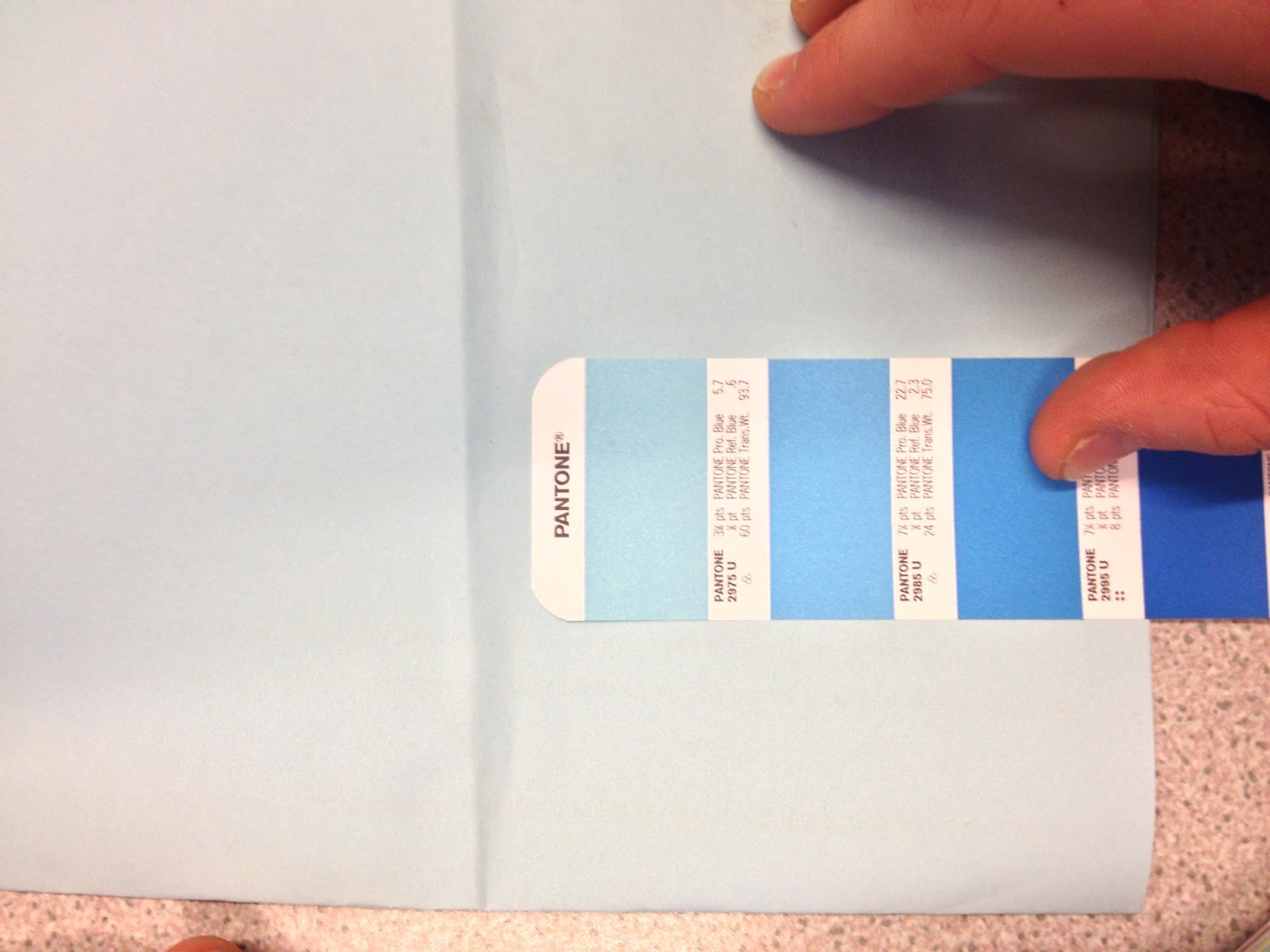
Pantone Code: 2975U
Darkest Blue

Pantone Code: 2955U
Richest Blue

Pantone Code: 286C
Dullest Blue

Pantone Code: 294U
Brightest Blue:

Pantone Code: Pantone Process Blue C
Issues:
- Light. The bright lights of the room not only made some objects lighter or darker in tone, but also the hue was changed due to the yellow lights. eg. Something under the light could seem much brighter and greener (if the object is blue) than when outside the light. The usage of sunlight as oppose to an unnatural source could give an entirely different result.
- Tone. We were meant to be judging the colours on just the hue, but some objects were much lighter or darker, therefore hard to judge. We solved this by moving objects that were generally lighter towards green, and the darker objects towards violet.
- Texture: Objects that varied in texture were hard to judge against each other. eg. a shiny Christmas ball against a suede leather shoe are hard to judge. This was solved through the use of two separate Pantone swatches; one for matt and one for gloss.
- Translucency: Objects that were translucent are hard to judge, due to light being refracted through the objects. The solution was to jude the object out of context, this being on grey or white paper.
- Pattern: Patterns can be hard to judge, due to multiple colours covering equal amount of space. The solution is to view the pattern from far away, so that the colours seem to "merge" creating a selection colour. However, this proved hard whilst using the Pantone Swatches, as I problems focussing my eyes on the swatch being so close, whilst the pattern so far away.
- Personal Opinions: We all see colours differently, colour is subjective.
- Photographing Evidence: The issue with this is that the colours often appeared entirely different on the camera. The only solution would be to adjust the camera settings in a "trial an error" method. However, we were limited for time, so this couldn't be changed.
- - - - - - - - - - - - - - - - - - - - - - - - - - - - - - - - - - - - - - - - - - - - - - - - - - - - - - - - - - - - - - - - - - - - - -
Out of Class Work
The History of Colour Theory
Sir Isaac Newton
developed the first circular diagram of colors in 1666.
Since then, scientists
and artists have studied and designed numerous variations of this concept.
Differences of opinion about the validity of one format over another continue
to provoke debate. In reality, any color circle or color wheel which presents a
logically arranged sequence of pure hues has its strength.

Colour Harmony
A pleasing
arrangement of parts, whether it be music, poetry, but here, in relation to colour.
When something is
not harmonious, it's either boring or chaotic. At one extreme is a visual
experience that is so bland that the viewer isn’t engaged. The human brain will
reject under-stimulating information.
The other extreme
is a visual experience that is so overdone, so chaotic that the viewer can't
stand to look at it. The human brain rejects what it can not organize, what it
can not understand. The visual task requires that we present a logical
structure.
Colour harmony
delievers visual interest and a sense of order. The end product is a harmonic
equilibrium.
Colour Harmony with analogous colours:

- 3 colours side by side on the wheel
Colour Harmony with complimentary colours:

- colours on the opposite side of the spectrum
Examples of Colour Schemes:
Analogous:


Complimentary:


For more colour scheme guides, here is a link to my Pinterest board on colour.
- - - - - - - - - - - - - - - - - - - - - - - - - - - - - - - - - - - - - - - - - - - - - - - - - - - - - - - - - - - - - - - - - - - - - - - - -
Part 3 - Colour & Contrast
Additive gives you white, subtractive gives you black (when all the colours are together).
LOOK UP TONES/SHADES DIFFERENT
Start using hue, saturation and tone - chromatic values (instead of "colour")

Because of this physiological response, the eye can be "fooled" into seeing the full range of visible colors through the proportionate adjustment of just three colors: red, green and blue.
Ittens & Contrasts:
The only reason we see what we see is because we identify a difference:
• Contrast of TONE
• Contrast of HUE
• Contrast of SATURATION
• Contrast of EXSTENSION
• Contrast of TEMPERATURE
• COMPLEMENTARY contrast
• SIMULTANEOUS contrast
- - - - - - - - - - - - - - - - - - - - - - -
Contrast of Tone:
Formed by the juxtaposition of
light and dark values. This could be monochromatic. Rods (in your eye) differentiate tone.
Monochromatic - one colour.
A desaturated colour chart:

Brightest - yellow
Darkest - blue
Mid tone - red.


The black and white are are equal in readability, due to the tone being the same difference from the mid tone, unlike the third which is closer to it.
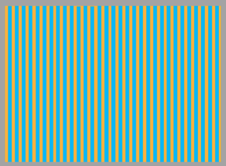
Contrast of Hue:
Formed by the juxtaposing of different hues. The greater the distance between hues on a colour wheel, the greater the contrast.
Primary colours, the biggest difference in hue.
Blue has the highest contrast against the white, due to the tone. The yellow, recedes as its closest to the white.

The black background reverses it, so the yellow stands out, almost popping off the screen.

When trying to look at "between the lines" of the colours below:
Hard to concentrate on when equidistant.

Because the blue is closer to the background, the hue makes the colour less visible. The tone is also similar, unlike yellow, which stands out more.
Contrast of Saturation:
Formed by the juxtaposition of light and dark values and their relative saturations.

We say something is blue, due to it being the "bluest". We compare to other colours which seem more "grey" and less saturated.
The Next 4: When they're put together, how do they interact?
Contrast of Extension:
Formed by assigning proportional field sizes in relation to the visual weight of a colour. Also known as the contrast of proportion.
Blue - the "heaviest" colour because of tone, yellow the lightest, mid weight = red.
We can start putting colours together to create a balance. Amount:
How much yellow can we put down to create a visual balance with violet? Because violet is heavier, we can put less down.

When we consider balance, one colour is going to jump out and one recede.
A block of colour - harmonious, easy to look at.

When split, your eyes prefer to look at blocks of colour, unlike below:

When spread out with the same amount, there is still a problem with each colour fighting:

An equal amount and number of each colour doesn't necessarily mean a balance is achieved. Below: The left seems to work better than the right:

Contrast of Temperature:
Red - hottest, blue - coldest, yellow - mid.
Formed by juxtaposing hues that can be considered ‘warm’ or ‘cool’. Also known as the contrast of warm and cool.


"Warmer" reds "cool" own the other red in contrast.
When looking between the lines, the orangey red makes the cooler red shift into a more of a magenta colour.
Elaboration: Black line separates colours. There is a clear distinction between the colours. When the lines are removed, your eyes trick themselves into seeing a gradient of colour.


The contrast in temperature creates the set of gradients due to comparison.
Complementary Contrast:
formed by juxtaposing complementary colours from a colour wheel or perceptual opposites.
If you put complimentary colours together, the result is horrific:

Even with less saturation, with blue and orange, the result is the same:
The highest level of contrast: green and red. The lowest - yellow/blue as they're equidistant. Yellow is easier to see than blue, due to the tone. The blue blends together more with the green, and recedes into it.

Annoying to look at, but similar in tone and chromatic value:

Unlike this:
Simultaneous Contrast:
Putting colours next to each other that will have a maximum amount of impact.
Formed when boundaries between colours perceptually vibrate.
Green (yellow and blue) and yellow. When you look at it long enough, you see orange, as red is absent. The yellow blurs into the green, due to the green holding yellow. The blue is forced as green, which then forces out its complimentary (orange) in the yellow.

Below: When looking between the yellow, you can see hints of violet. When looking between the blue, you see orange:

10 objects, 5 of each complimentary
Explore how the contrasts work in real life.
Photos here
- - - - - - - - - - - - - - - - - - - - - - - - - - - - - - - - - - - - - - - - - - - - - - - - - - - - - - - - - - - - - - - - - - - - - - - - -
Part 4 - Subjective Colour
Contrast of hue/tone/ proportion:

Far more impact/ focus:

Because yellow needs it's complimentary, this is forced, in order to maximise your ability to see that colour. Violet is forced in to help you see yellow.
Orange is forced in to help you see the blue. (Made up of the other primaries of red and yellow)

Relativity of colour:


There are only 3 colours not 4. No where across the line does the colour change, but it seems to optically.
Right Image: The left side (in the block) looks dull and green, whilst the right looks far more yellow.
When you look at the top letters, a reddy/ violet tinge is seen:

The two colours are complimentary. The top letters look more orange, and the bottom blue, both due to being forced by its complimentary:

Highly chromatic colours will impose themselves onto weaker colours.
PROOF: stare at the dot. when the red flag is introduced, the outsides seem to wobble. When you move back to just the dot, you still see the red flag.


With a white background, the complimentary is shown:


Orange cross is seen. SPOOKY.
- - - - - - - - - - - - - - - - - - - - - - - - - - - - - - - - - - - - - - - - - - - - - - - - - - - - - - - - - - -
Part 5 - Print
As a group, we were told to bring in printed graphic design, from various places.. eg. a newspaper, leaflets, flyers etc...


We then sorted them out into the amount of colours we think they used: 1, 2,3 and 4 (this being CMYK).
We then used a linen tester to further examine the print methods, be it optical mixing or physical mixing.

Physical Mixing- When the colour has been pre- mixed with ink, so the end product is one solid colour when magnified or from a distance. This is how screen printing ink is made.
Optical Mixing - When the colour is consisted of dots that from a distance, merge together to create a colour. This is how CMYK works, as well as half tone.

A pantone colour, with its optical mixing CMYK values:

When using CMYK, the colour is mixed through the four different plates, Cyan, Magenta, Yellow and Key.
This is shown below:


A common myth is that monotone is simple "black and white". However, it refers to one colour. Each one of these plates is monotone.
When printing on the same sheet four times, the overall creates the full colour image:

When using this process to mass produce, watch out. Say for example, you were producing work which used only two of the colours, eg. Cyan and Magenta. Ensure that colours you're using coincide with this.

This colour is 100 % Cyan & 100 % Magenta.

This colour is 100 % Cyan & 100 % Magenta, but with 5 % Yellow, with no obvious difference shown.
However, price wise, you would have to pay for an extra plate. In mass production circumstances, this could cost you a few thousand pounds more.
A similar situation happened to Fred (our tutor), where he would have been charged a vast amount extra, if the person at print did not call him up and tell him!
Inversely, you can use this to modify your colours. If you have chosen a colour to work with, and it has a small amount of another plate in it, you could chose to remove that in order to save yourself money, and increase your profit margin.
