Due to producing the images inside and under unnatural lighting, each image was yellow in its tone. I decided to convert the images into greyscale, so they're easier to work with.


Different Tones:
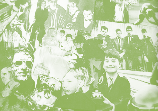
Monotone:
Using Monotone, I wanted to see what I could achieve:

It's vital to play with the levels, and see how this can edit the image.

Variations using different levels and the same colour:


Different Colours
I chose a level that seemed to work well, then edited the colours, to try something else out:


Duotone:
I felt it would be good to see how I could work with duotone, giving the image more detail.


Having now experimented with both mono and duotone, I feel monotone would be better to work with. Duotone provides much more detail, but creates images too dark. I intend on using the same image for the other pages, and text would be hard to show up on with a darker background.
Overlays:
This is another approach I could take to adding colour to my collage.


I felt that the best overlay to work with was 'lighten' - you can see this below.

I wanted to try this with different colours:

One benefit to using overlays (as oppose to mono and duotones) is the use of gradients.


Having experimented with gradients, I feel they're not appropriate to my theme.
The Next Step
I intend on working with monotones at different levels to find the appropriate colours. I also would like to see how working with half - tones could work.
