Below you can see design variations I made, before coming to a final design:
I started off with the design below:

I found this to look quite cheap, not the same sophisticated aesthetic I was looking for, I removed the drop shadow and started again:


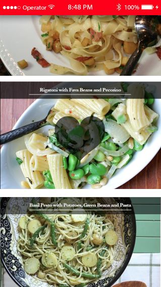
I looked at the aesthetic of my website, and decided it would be best to match it on the app, the result being below. I feel this works well, and is much more sophisticated than my previous designs. The page would just droll horizontally, with the top bar disappearing when the scrolled down from the top. When double clicked, users can 'like' a recipe'. This would appear under likes, so they can view the recipe with others they like the look of. A single click will take you to the recipe.

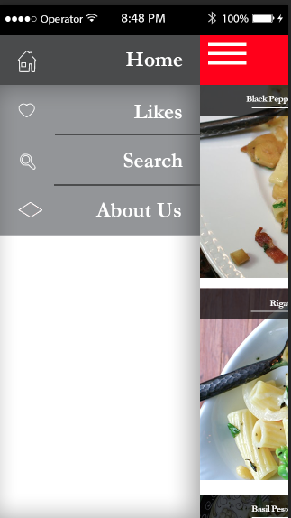
When the lines are clicked at the top menu, you can see the following options:
Below you can see how the recipe pages would work. This is from a 'single click' from the homepage.


I mocked up how the app would look on a homepage of a phone too:

