I chose to work with Roxxie Blackham. We initially reacted to the brief with issues we have found throughout the year.
New Experiences:
- Living away from home.
- Cooking for yourself.
- Cleaning the kitchen/ bathroom.
- Washing up.
- Buying budget food.
- Buying suitable food.
- Doing laundry/ organising when to do it.
- Meeting so many new people at once.
- Having the least experience at university.
- Being away from your friends / partner.
- Meeting people from other places - North / South divide.
- Learning new accents / slang - learning Geography of the UK.
- Being in a new city/ new surroundings.
Difficulties
- Social interaction.
- Freshers Flu.
- Committing to studying.
- Finding your way to uni.
- Getting around uni.
- Getting around Leeds.
- Finding cheap places to eat.
- Visiting home.
- Maintaining relationships / friendships.
- Keeping your room tidy.
- Finding a house for 2nd year.
- Living without a TV.
- Travelling - transport and walking.
- Print costs / general cost for materials.
- Getting to / booking workshops.
- Book print slots.
- Plucking up courage to talk to your tutors.
Finding a House for 2nd Year
Roxxie and I chose this option, as we have both found it to be the most difficult, and by far, most stressful responsibility to deal with.
Problems we faced:
- Finding a reliable and trustworthy Estate Agency to look at housing with.
- Finding appropriate people to live with.
- When to start looking for housing.
- Knowing where your money is going towards, and if you're getting good value for money.
- The number of people that is best to live with.
- Location - eg. Hyde Park, Burley or Headingley?
- Finding a housemate to fulfil a place.
- Paying a deposit.
- Signing and understanding a contract - asking for copies of things you have signed.
- Security and safety - is the area safe, and are your belongings?
- What do you really need?
Research:
Primary:
Our class / friends who study at different Universities:
- Who they went through to find their housing.
- How they found the process - if they had any problems?
- How much variety of housing have people seen?
- How much they're spending a week next year.
- Any advice they have on housing.
- Did you feel comfortable with the Estate Agents you spoke to - are they truthful or just trying to sell the house?
- Did you feel comfortable with the Estate Agents you spoke to - are they truthful or just trying to sell the house?
Estate Agents:
- When students should look for housing.
- How much they should expect to spend.
- How many people should they live with?
- The best places students could live that aren't over priced.
- Areas to stay clear of.
- How much they charge for deposits / admin fees & how much time you have to pay a deposit.
- How long their contracts are for, on average.
- Any websites that they would recommend to do with house hunting / spare room hunting.
- Where they advertise their properties.
- Samples of their brochures.
- Whether they take you to the houses or meet you there.
- Are they members of the NAEA - National Association of Estate Agents
Ourselves:
- Take photos of areas and housing to give guidelines on what to go for / what to look for.
Secondary:
- Use student forums to find out information - How people have struggled / where to look / general advice.
- Generally looking at Estate Agencies online and collecting the best on how they present themselves.
- Look in student housing newspapers and packs to find agencies / housing.
- Look at ways to promote our information - websites / newspapers / the agencies themselves.
Methods of Communication:
We listed methods to communicate our message to future students.
- Fun questionnaires to find out if people are appropriate to live with.
- Maps to do with location of housing.
- Infographics on budgetting.
- A questionnaire on how affordability of housing.
- Kinetic typography video on househunting.
THIS NEEDS TO BE GOOD. It needs to look like graphic design. Consider production. Come to crits prepared. THE BOARDS NEED TO LOOK LIKE GRAPHIC DESIGN.
Presentation to Tutor & Feedback
We presented our idea of helping students with house hunting to our tutor and the rest of the class.
One criticism: The work we're presenting is at the start of a student's first year, when they will not even be considering house hunting.
Change of concept: Instead of helping people with house hunting, we chose to encourage 1st year students to go to the main areas of student housing in Leeds, such as Hyde Park or Headingley. This means when it comes to house hunting, they will know which areas are safe, and which areas are near certain things that appeal to them, such as supermarkets or specific shops etc...
Communication: We intend to use products to communicate the message, that relate to somewhere they could visit. Examples could include:
- A drink coaster that recommends going to a certain pub in Hyde Park
- A pack of popcorn that recommends going to the Hyde Park Picture House
- A specific marker pen that has information on a shop in Headingley that you can buy it from.
- Pint/ Wine glasses that encourage going for drinks in Headingley / Hyde Park.
Concept, Method of Delivery and Method of Production
Below are the presentation board which Roxxie and I presented during a crit:
Group Crit with Simon and 3rd Years
We presented our board to Simon, members of our class, and some third year Graphic Design students, here is the feedback we received:
- The concept was strong and has a lot to work with, and the 3rd year students told us that in first year they experienced problems of not knowing much about Hyde Park and Headingley, and felt intimidated when moving in to a new area in 2nd year.
- (When bringing up printing onto pint/wine glasses) - Production costs would be too expensive. Originally, Roxie and I assumed we were just producing a 'one off' series of products for one student, whereas we were informed that the work we produce should be able to be produced for the entire year, so production cost would have to be kept low.
- Good use of experimentation with a variety of processes - The 3rd year students informed us that they wish they experimented more with processes in 1st year, and were impressed that we intend to use multiple processes.
- Consider a way of ensuring that 1st year students will keep these products.
Obviously we needed to ask students and Leeds locals about unique opportunities that 1st year students miss out on, so we produced a questionnaire, which received almost 50 results. The questions and results can be found here on my design context post.
As a reaction to the results we received from the questionnaire, we also decided to visit these places, in order to get our own take on them.
Below is an Issuu Document showing the places we visited:
Issuu Link
Having been to all these places, we came up with a list of places which we would like to promote:
- Pubs/ Bars - The Hyde Park, The Original Oak, The Skyrack, The Box
- Restaurants/ Cafes - LS6 Cafe, The Grill at Macy's, Bretts Fish Restaurant
- Estate Agents - Sugarhouse Properties, Rent Inc
- Shops - Best Kept Secret, Dinsdales Art Shop
- Stadiums - Headingley Carnegie Stadium
- Cinemas - Hyde Park Picture House
We chose all of these, as we felt each one had a unique quality which you could not find inside anything in the city centre, e.g. Best Kept Secret has the largest fancy dress selection in Leeds.
If we were to promote something which had something as good, or better, in the town centre, then promoting them would be worthless.
We also came up with a revised series of cheap products to produce:
- Drink Coasters - Promoting Pubs
- Popcorn Packaging - Promote going to Hyde Park Picture House
- Bus Wallet - A way of showing how cheap travel is to Hyde Park/ Headingley
- Sketchbook - Promoting visits to Dinsdales Art Shop
- An overall bag to encase the above objects
Design Sheets:
Roxxie produced the following design sheets, having been influenced by our secondary research of high end ornamental typography (research can be found here on my design context post) We used 'Buttermilk' - a font by designer Jessica Hische - as our basis, then added swirls to make make it more ornamental.


Travel Passes: Not a very exciting thing to design, so we struggled with inspiration. Luckily, we found an origami way of producing a bus wallet (top right of photo), which we chose to work with.

Popcorn packaging: We looked at different ways in which we could use transparent sections, but decided against it, due to it making the product less professional looking, and not as high end. We chose to go for the middle left idea (with ribbon closing the top) as we felt it was elegant, and matched the rest of our packaging well.

Crit with Amber and Simon
Below is the feedback we received, having presented the details of work above. Our response is shown in red.
- Don't be too unrealistic with processes. Originally, we planned to screen print and emoboss most of our products. We could not use digital print, due to us planning on using gold ink. Instead, we chose to use a cheaper processes which is much less time consuming, this being foiling.
- What else can you add? Ensure that you're producing enough work for two people. We chose to produce a publication as well as the products, in order to tie everything together. It will also contain more information about the places we're promoting, and also other places which we could not design products for.
- Working digitally may be less time consuming and more effective. Having produced our general ideas on paper, Roxxie and I started to produce work digitally, as shown below.
Digital Designs
Roxie reproduced one of here designs digitally, but we felt it did not look professional enough, and did not give the 'ornate' aesthetic that we were aiming for.

I chose to add frames to the text, resulting in the following ideas which I produced:


Below is the final design I produced to go on the front of the sketchbook:

I then produced a few rough mockups, to see how the design would look on a sketchbook, confirming that it would suit our aesthetic choice:


Having both grasping an understanding of the aesthetic we're going for, Roxxie was left to design the other products, whilst I researched and produced the rest of the publication.
Here are the designs she produced for the Drink Coasters:
Issuu Link
Publication
I was left with the task of researching places of interest for the publication, as well as designing it.
I chose to add information about why each place was unique, opening times, an address, transport links, and contact details. Information on these can be found on my design context post here.
Unlike the rest of the project, I felt the inside should be very simple, with function prioritising. This is because the book will be used as a reference, in order to tie everything else together.
Layout:
Here is my design sheet I produced to consider different layout:
 You can also see the grid which I used to produce each page. I ensured this was simple, in order to relay the information effectively:


We realised that the entire page would have to be gold, as when left black, the areas in contrast to the gold, seem to disappear.
The finished sketchbook:

 Publication:
We realised that the foiling struggles to pick up detail (especially on stock that isn't the smoothest), so we experimented with the imagery from the publication, to see how it would look with foiling:


Unfortunately, a great detail is lost. We experimented with half tone, to see if this would help:


Below: The first image is greyscale, the second is half tone. As you can see, even less detail was achieved using half tone. We decided that the image was much more successful (and still professional looking) without any foiling treatment at all.

We experimented with just foiling the title, but found that it would make the rest of the page fade even further into the background:


- Use student forums to find out information - How people have struggled / where to look / general advice.
- Generally looking at Estate Agencies online and collecting the best on how they present themselves.
- Look in student housing newspapers and packs to find agencies / housing.
- Look at ways to promote our information - websites / newspapers / the agencies themselves.
Methods of Communication:
We listed methods to communicate our message to future students.
- Fun questionnaires to find out if people are appropriate to live with.
- Maps to do with location of housing.
- Infographics on budgetting.
- A questionnaire on how affordability of housing.
- Kinetic typography video on househunting.
THIS NEEDS TO BE GOOD. It needs to look like graphic design. Consider production. Come to crits prepared. THE BOARDS NEED TO LOOK LIKE GRAPHIC DESIGN.
Presentation to Tutor & Feedback
We presented our idea of helping students with house hunting to our tutor and the rest of the class.
One criticism: The work we're presenting is at the start of a student's first year, when they will not even be considering house hunting.
Change of concept: Instead of helping people with house hunting, we chose to encourage 1st year students to go to the main areas of student housing in Leeds, such as Hyde Park or Headingley. This means when it comes to house hunting, they will know which areas are safe, and which areas are near certain things that appeal to them, such as supermarkets or specific shops etc...
Communication: We intend to use products to communicate the message, that relate to somewhere they could visit. Examples could include:
- A drink coaster that recommends going to a certain pub in Hyde Park
- A pack of popcorn that recommends going to the Hyde Park Picture House
- A specific marker pen that has information on a shop in Headingley that you can buy it from.
- Pint/ Wine glasses that encourage going for drinks in Headingley / Hyde Park.
Concept, Method of Delivery and Method of Production
Below are the presentation board which Roxxie and I presented during a crit:
Group Crit with Simon and 3rd Years
We presented our board to Simon, members of our class, and some third year Graphic Design students, here is the feedback we received:
- The concept was strong and has a lot to work with, and the 3rd year students told us that in first year they experienced problems of not knowing much about Hyde Park and Headingley, and felt intimidated when moving in to a new area in 2nd year.
- (When bringing up printing onto pint/wine glasses) - Production costs would be too expensive. Originally, Roxie and I assumed we were just producing a 'one off' series of products for one student, whereas we were informed that the work we produce should be able to be produced for the entire year, so production cost would have to be kept low.
- Good use of experimentation with a variety of processes - The 3rd year students informed us that they wish they experimented more with processes in 1st year, and were impressed that we intend to use multiple processes.
- Consider a way of ensuring that 1st year students will keep these products.
- Do some research into which places students like to go to outside the town centre, and which areas are most popular.
- Research into what products students would want.
Group Crit with Simon and 3rd Years
We presented our board to Simon, members of our class, and some third year Graphic Design students, here is the feedback we received: (how we reacted to this feedback is seen in red)
- The concept was strong and has a lot to work with, and the 3rd year students told us that in first year they experienced problems of not knowing much about Hyde Park and Headingley, and felt intimidated when moving in to a new area in 2nd year. (this reinforced that our concept is useful)
- (When bringing up printing onto pint/wine glasses) - Production costs would be too expensive. Originally, Roxie and I assumed we were just producing a 'one off' series of products for one student, whereas we were informed that the work we produce should be able to be produced for the entire year, so production cost would have to be kept low. (we gave our products a re- think, and decided to stay away from producing glasses, and stick with cheaper products)
- Good use of experimentation with a variety of processes - The 3rd year students informed us that they wish they experimented more with processes in 1st year, and were impressed that we intend to use multiple processes. (we realised that 1st year students may also be impressed by the processes which the university can offer them, and by executing their usage well, it will give the student assurance that they have enrolled on a good course)
- Consider a way of ensuring that 1st year students will keep these products. (we changed the general look of our products to make them look much more high end and expensive, despite production costs being low)
- Ensure that students even want these products. There is no point producing things which students do not want and will not use, as our messages will not get across. (we conducted a questionnaire, as you can see below)
Obviously we needed to ask students and Leeds locals about unique opportunities that 1st year students miss out on, so we produced a questionnaire, which received almost 50 results. The questions and results can be found here on my design context post.
As a reaction to the results we received from the questionnaire, we also decided to visit these places, in order to get our own take on them.
Below is an Issuu Document showing the places we visited:
Issuu Link
Having been to all these places, we came up with a list of places which we would like to promote:
- Pubs/ Bars - The Hyde Park, The Original Oak, The Skyrack, The Box
- Restaurants/ Cafes - LS6 Cafe, The Grill at Macy's, Bretts Fish Restaurant
- Estate Agents - Sugarhouse Properties, Rent Inc
- Shops - Best Kept Secret, Dinsdales Art Shop
- Stadiums - Headingley Carnegie Stadium
- Cinemas - Hyde Park Picture House
We chose all of these, as we felt each one had a unique quality which you could not find inside anything in the city centre, e.g. Best Kept Secret has the largest fancy dress selection in Leeds.
If we were to promote something which had something as good, or better, in the town centre, then promoting them would be worthless.
We also came up with a revised series of cheap products to produce:
- Drink Coasters - Promoting Pubs
- Popcorn Packaging - Promote going to Hyde Park Picture House
- Bus Wallet - A way of showing how cheap travel is to Hyde Park/ Headingley
- Sketchbook - Promoting visits to Dinsdales Art Shop
- An overall bag to encase the above objects
Design Sheets:
Roxxie produced the following design sheets, having been influenced by our secondary research of high end ornamental typography (research can be found here on my design context post) We used 'Buttermilk' - a font by designer Jessica Hische - as our basis, then added swirls to make make it more ornamental.


Below: Different ideas for drinks coasters, experimenting with different typefaces:

Travel Passes: Not a very exciting thing to design, so we struggled with inspiration. Luckily, we found an origami way of producing a bus wallet (top right of photo), which we chose to work with.

Popcorn packaging: We looked at different ways in which we could use transparent sections, but decided against it, due to it making the product less professional looking, and not as high end. We chose to go for the middle left idea (with ribbon closing the top) as we felt it was elegant, and matched the rest of our packaging well.

Crit with Amber and Simon
Below is the feedback we received, having presented the details of work above. Our response is shown in red.
- Don't be too unrealistic with processes. Originally, we planned to screen print and emoboss most of our products. We could not use digital print, due to us planning on using gold ink. Instead, we chose to use a cheaper processes which is much less time consuming, this being foiling.
- What else can you add? Ensure that you're producing enough work for two people. We chose to produce a publication as well as the products, in order to tie everything together. It will also contain more information about the places we're promoting, and also other places which we could not design products for.
- Working digitally may be less time consuming and more effective. Having produced our general ideas on paper, Roxxie and I started to produce work digitally, as shown below.
Digital Designs
Roxie reproduced one of here designs digitally, but we felt it did not look professional enough, and did not give the 'ornate' aesthetic that we were aiming for.

I chose to add frames to the text, resulting in the following ideas which I produced:
Below is the final design I produced to go on the front of the sketchbook:

I then produced a few rough mockups, to see how the design would look on a sketchbook, confirming that it would suit our aesthetic choice:


Having both grasping an understanding of the aesthetic we're going for, Roxxie was left to design the other products, whilst I researched and produced the rest of the publication.
Here are the designs she produced for the Drink Coasters:
Issuu Link
Publication
I was left with the task of researching places of interest for the publication, as well as designing it.
I chose to add information about why each place was unique, opening times, an address, transport links, and contact details. Information on these can be found on my design context post here.
Unlike the rest of the project, I felt the inside should be very simple, with function prioritising. This is because the book will be used as a reference, in order to tie everything else together.
Layout:
Here is my design sheet I produced to consider different layout:


The document is in black and white as this is the most effective way of the foiling sticking to the paper. The actually document will look entirely different when black stock and foiling have been used.
Finished Document:
Creating the Bag
I started off with a sheet slightly larger than A3, and made measurements so that all the content would fit in the bag with a snug fit.
I then cut the bottom, in order to create the right shape for the net:

To ensure sharp edges with a professional finish, I used a folding bone to score all the edges:
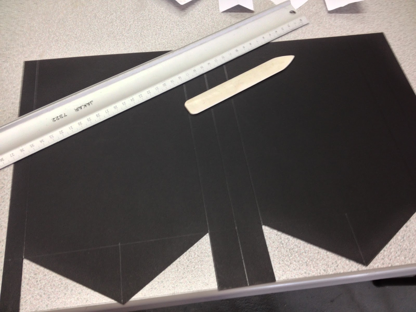
I then used double sided tape to secure the edges of the box:

The same process was used to create the popcorn packaging, but on a smaller scale.
Printing and Foiling
Having now produced all of our designs, we printed black toner onto black paper, preparing them for foiling.
Sketchbook:
Initially, we experimented with just using foiling on different sections of the cover, and leaving the rest black:
We realised that the entire page would have to be gold, as when left black, the areas in contrast to the gold, seem to disappear.
The finished sketchbook:
We realised that the foiling struggles to pick up detail (especially on stock that isn't the smoothest), so we experimented with the imagery from the publication, to see how it would look with foiling:
Unfortunately, a great detail is lost. We experimented with half tone, to see if this would help:

Below: The first image is greyscale, the second is half tone. As you can see, even less detail was achieved using half tone. We decided that the image was much more successful (and still professional looking) without any foiling treatment at all.

We experimented with just foiling the title, but found that it would make the rest of the page fade even further into the background:
We then wanted to see if foiling the body text would even out the balance with the title, with a strikingly bold result:

When light hit it at the right angle, text was extremely easy to understand and read. The book was meant to act as a guide, and to be taken outside, and the foiling worked fantastically under natural light.
Final Class Crit:

Roxxie and I presented our work to a group of 6 or 7, and this is the feedback we received:
1.
- looks
high quality
-
consistent
- well
crafted
- gold text
could maybe be more readable
2.
- gold
images and black images are a little hard to see. Perhaps try white?
3.
- I think
printing something onto the bag would finish off what is a very good project.
Even if it is just "Hydepark & Headingley".
- gold body
copy is sometimes difficult to read.
4.
- bag looks
empty, consider design so it fits the overall theme.
5.
- maybe
some branding for the overall package to keep it all the same? It's all
different things, but I get that.
Reaction To Crit: - Leave the bodytext inside the publication black - the text is much more readable and time / money is saved by not using foiling.
- Create a bellyband for the bag, as the bag was too big to print onto.
