In today's session, we took our initial concepts for websites, and started to think about visuals, as well as ways viewers could interact with the website.

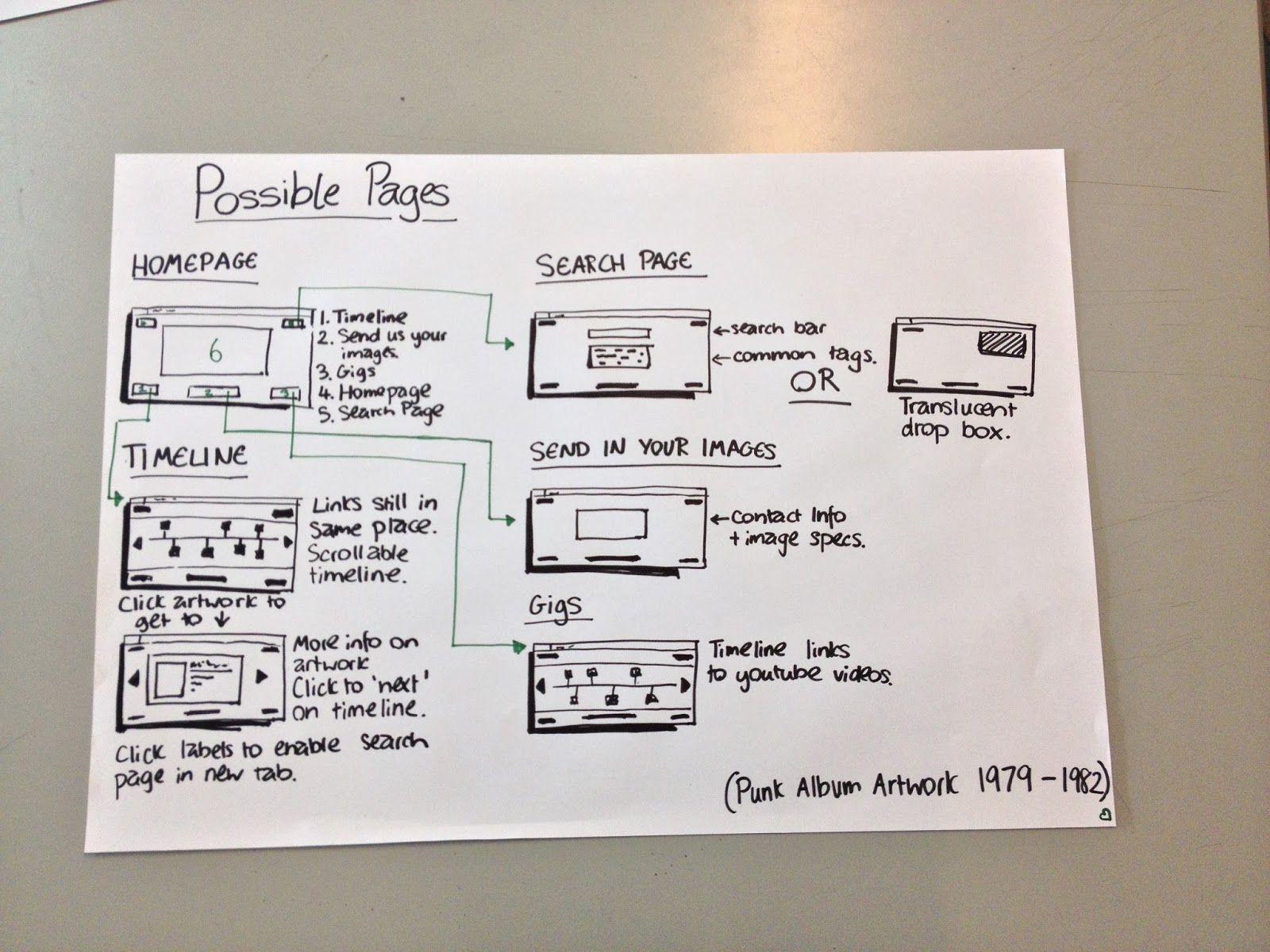
- Homepage - Explanation of what the website is about. This will also be emphasised through large imagery.
- Timeline - An interactive infographic, where users can click on Vinyls to find out more information about them. There will also be tags under each vinyl (eg. 1979, Girl Band, Irish), to help users find similar interests. I'm unsure as to if the clickable Vinyl links would count as a second type of page. Obviously doing this for 100's of Vinyls would be great,. but I aim to demonstrate my concept with just a few Vinyls.
- 'Send In Your Images' - A section where users can submit their images of vinyls + info. I would also have to be specific with the imagery, in order to hold continuity within them.
- Search Page - This could possibly be just a section at the top of each page. However, if I was to include it as a separate page, I could contain more information, such as popular tags and searches. This would also link to the videos page.
- Gigs - Many Punk bands are now getting back together (such as The Buzzcocks), and videos are appearing on youtube. This page of the website could simply be links to recent videos of bands, or maybe even videos people have made digital (from the 70's / 80's) and put onto YouTube.
As a group, we then discussed what we felt were the 5 main pages of a basic website. This is what we came up with:
Homepage - Indicative of Content, Introduction
Contact Page - E-Mail, Social Media, Inquiry Form, Telephone Number, Address
Information/About Page - Ethical Statement, Facts
Gallery/Portfolio - Image (Categorised only if actually helpful for the user)
Forums/Posts/User Posts - Very common now that the technology supports it
Images & Feedback
We then had to draw up sketches on how we think our homepage could possibly look. I produced multiple ideas for the homepage, as well as some sketches on each of the other possible pages.
The sketches are shown below:

Feedback


Typed Up Feedback
I have also colour coded the feedback with my reaction to it below.
- Why possible GIFs?
- How is it a DIY Punk Layout?
- Top Right Design could be interesting, but a lot of images.
- Well thought ideas, which will enable you to make strong progression.
- Considered navigation.
- Clickable links on top right design may be too crowded.
- Strong initial ideas.
- Timeline idea could look really aesthetically pleasing.
- Clickable links on the homepage could be too busy.
- Clear link to subject mater.
- Aesthetically links very well. I would move away from a DIY style layout, since it doesn't suit web.
- Are the clickable links too much?
- Work out the difference between screen & print.
- Interesting and engaging concept.
- Visually represent the concept effectively.
- Where will the main links be?
- Lots of images may slow the website down.
- Making the website quite Modernist and functional would be really interesting.
Reaction to Feedback
Positive Feedback on Concept - It seems that the feedback I received in terms of my concept was fantastic. This reinforces the idea that I have something to work with.
Idea with main page having a mosaic of clickable Vinyl links - This has all been negative feedback. My peers feel that the page would be far too busy, and possibly even slow the website down. I agree with this statement, and feel this idea would be very difficult to work with. It would also not solve the problem that exists, as there are already plenty of badly navigated websites that exist already.
Work with a different style of aesthetic - I was recommended to consider more of a 'Modernist' style website. I really like this idea. It would be great to separate my website from others that exist, and also would stop the website seeming dated. I really want the website to be highly functional, and feel this could be a perfect way of doing it.
I feel working with a 'DIY Punk' style layout would not work well on web, and could also be far too cliche.
Was this feedback helpful?
Overall, I feel it has been. I now feel I have a good concept to work with, as well as much more consideration into the aesthetic of the website. I really like the idea of a juxtaposition of Modernism and Post Modern design. I would like to use Modernist or minimal typography, but use Punk imagery and colours.
Considering how little visual information was shown to my peers, I feel they have done well to give me constructive feedback which I can work with.
