OUGD503 Responsive: Scott Nash - Fashion Branding (Brief 08) - Full Project

I overheard that 3rd year fashion students at Leeds College of Art needed branding for their own business / end of year show, and I got in contact with some of the students. 

I decided to work with Scott Nash, a 3rd year fashion student. He wanted branding done for personal use, as well as things for an end of year show. 

First Meeting With Scott
I wanted to see what exactly Scott's style was like, and the way he works. He took me through his portfolio, showing me what he likes. 

The initial thoughts I concluded were: 

- Architectural 
- Sharp Contours / Shapes
- Subtle hints of colour?
- Personal Expression
- Concealed Identity

What Scott would like designed: 
Business Card, CV, Letterhead, Envelopes, Labels, Lookbook, Hangers, Display

I set Scott a task to come up with some phrases that described his business: 


I then came up with some initial ideas to do with these descriptions. 


I added one more idea, which I quickly mocked up as a business card & letterhead:


Concept:

A very minimal representation of a line of thread. Scott has mentioned he likes very minimal design, and the use of an ambiguous shape (which can be utilised over the entire brand identity) should work well. 


Feedback From Scott

- Scott agreed that the last idea could work well over a variety of platforms. I suggested the use of a horizontal line as a logo on his hangers, which he really liked the idea of. 

- Scott showed me a typeface he has been using and liked, shown below:


'Dolce Vita' Font
I explained to Scott that this typeface (only in caps) could be difficult to use, unless used for just titles. However, I got an idea of what typefaces he likes, and hope to find a compromise font that I could work with. 


Next Steps

As you will see below, I produced a variety of ideas for business cards, as well as a letterhead and invoice. 


Scott's Reply

Unfortunately, this was Scott's reply:

"Hey sorry i didn't see that u had replied my Facebook isn't giving me notifications, and i been so busy, I've had another meeting with my tutor and i think I'm just gonna have to skip on branding, as I'm not sure i even wanna make a business of it after uni and were not remotely getting marked on it, and with the amount I'm spending on my collection i dot wanna spend money on something that isn't being included in overall grade and something i may not even use again after uni, sorry about this but its 100+ that i could use for final fabrics which i actually need right now, feel free to still use it for rue project but I'm not gonna use branding for my collection now, really sorry about this but at end of day i don't have the money to spend if its not gonna benefit me in the end, i hope you understand."


This response was extremely infuriating. Despite the main focus of this brief to be part of the module, I had also arranged payment with him. It seems that Scott doesn't understand that the branding itself will benefit him after graduation, not just his grade. I now intend on speaking to John Watters about approaching him about the payment.
OUGD503 Responsive - Designing a Contract / Invoice

In order to ensure I am covered for payment (as well as making my business more professional) I decided to write up a contract for my clients to sign, as well as producing an invoice. 

Below you can see both sheets: 


OUGD505: Studio Brief 1 - Study Task 4 - Build A Brand

We were told to construct a brand .......

COPY DANIELLE / AMYS NOTES

I was in charge of the business branding, both designing and mocking up. 

Below you can see what I produced: 


OUGD503 Responsive - Organic (Brief 01) - Process Experimentation

There were two pieces of equipment I wanted to purchase and test out:
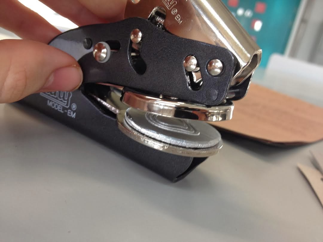
- Embossing Seal
- Hole punch 

Embossing Seal:
I bought this online, with a custom seal of the logo made. The seal I bought is supposed to work best at 150 gsm, and so I tested this out on stock between 100gsm and 300gsm. 


First test: 

I thought it would be best to test the embossing seal on my chosen stock for each option, to see if I need to change my choice of stock.

Letterhead Stock:


Business Card Stock: 

Label Stock: 

Order Form Stock: 


Second Test: 
I wanted to test out extremes, testing a stock at 100gsm, and another at 300 gsm. 

As you can see, at 100 gsm the embossed design gets creases, whilst the design at 300gsm simply doesn't print properly:  


Eyelet Setter
This is for the envelope closing mechanism and also the clothing tags. 


Unfortunately the underside doesn't look as good as expected. However, this will be hidden (most of the time) with the envelope, and on the underside of the clothing tag, which won't have any information or design on anyway. 


This is for the envelope closing mechanism and also the clothing tags. 

Producing An Envelope

After beginning to use my hole punch and eyelet setter, I wanted to see how I could produce a string bound envelope. This was chosen as oppose to a standard envelope, as it hints at something more high end. 


OUGD505: Studio Brief 1 - Crit

Below you can see the things I prepared for the crit:

- Mock up of Japanese Stab Stitch Binding 
- A variety of stocks I could print on
- The 3 packaging nets
- The publication printed at a 1:1 scale. 


Feedback


Main Points Raised:

The (+1) show that more than one person agreed on the point.
I have also highlighted the main points I need to address. 

Strengths:
- Well considered stock choice (+2)
- Overall contemporary, sophisticated design (+1)
- All aspects are well thought out, eg. stock, binding method, type
- Really love the Japanese type + binding, very appropriate to topic
- Very simple, clean, grid based layout!
- Like the idea of Japanese 'hole' for packaging.

Areas for Improvement: 
- Black stock doesn;t flow with choice of stock for publication
- Intro page - looks closer to the margin on English side
- Page 11 layout is too spaced out, too confusing for the eye. 
- Page 15 bottom is out of grid and doesn't align with page 15

Considerations
- Maybe try and justify text in columns, to match your grid system. 
- Inside margin needs to be bigger, to allow for the binding. 
- Black thread for binding. 
- Watch out for the design falling into the spine, you will will need an extra 5mm in the spine. 
- Are you going to screen print of laser cut onto the cover for the title? 

OUGD503 Responsive: The Londonaise Pétanque Tournament (Brief 07) - Full Project

For those that don't know, Pétanque is a HUGE sport in France, essentially a different version of boules. I was approached to design a leaflet for a London tournament, with players competing from around the world. 


The brief:

 Hi Joe,
           attached is the current draft Flyer for The Londonaise plus a summary of what has been decide/arranged so far.
To me, the current Flyer is poor - the Union flag symbolising GB and not London - I think an iconic image like Tower Bridge would symbolise London far better? Perhaps also image of Boules/Boule player.

For me, the Key points for the Flyer are - Title:- 'The Londonaise', 'Biggest Petanque Touranment Londion has seen'  -or something like that. Highlight the fact that it is in London
Where:- Barnard Park
When:- Weekend 7th-8th June 2014
Prize fund: Total 7500 euro, 2500 euro top prize
Who for: Open to all abilities, Matches on Saturday will lead to 4 seeded groups on Sunday
Entry Fee £30 per triple
Other stuff: Celebrity Launch on Friday 6th June
For more info:  visit www.thelondonaise.com

Also the colours/font you choose for the flyer, we would repeat on the web site. 
If you have any questions, feel free to contact me.

All the best, Alan


I came up with thee following two ideas, based on my research into Olympic Posters / British Underground Posters:


Alan really liked both responses, and informed me of a few changes to make, to the idea he wanted to develop (the leaflet on the right):

To Change / Add
- Remove the prizes in pounds, they only need to be in euros. 
- Make the boules/ jack look more petanque like - Try changing the colour or adding lines. 
- Add something to do to with "London's Biggest Petanque Tournement".
- Emphasise the date. 

Response: 


I was then informed that out of the two people making decisions on the leaflet, one really liked the design as it is, but the other wanted it to 'look more British', and fixated on adding either a union jack or silhouettes of London architecture. 

To Change / Add
-Change the website to 'www.thelondonaise.eu'
- Add either a union jack or silhouettes of London buildings 

Response: 


Alan loved this design, and he chose to print the leaflets at his convenience!

OUGD505: Studio Brief 1 - Study Task 2 - Packaging Nets

Below you can see the packaging nets I produced for my crit. I wanted to produce something that matched the stock of my publication, and also the high end look of my publication. 

Envelope:


2 Different Sleeves:
I used a circle to represent the Japanese flag, and tested different places in which the circles could be positioned. 


Copyright 2010. All rights reserved.

RSS Feed. This blog is proudly powered by Blogger and uses Modern Clix, a theme by Rodrigo Galindez. Modern Clix blogger template by Introblogger.