OUGD503 Responsive: Collab Brief (Brief 04) - Pizza Box Production Test

In order to see how accurately my packaging net was (and to try the box before printing properly), Alex and I got the box laser cut. 

The cardboard in the laser cutter:


 We set up the edges to be cut, and the folds to be kiss cut. This is so it will be easily seen for us to score. 


 We added circles to the areas corners of the box, to be cut out. This is just on tissue paper, and so we can elevate the sheet on pins. The holes in the tissue paper will show us where to place the pins. The point of the pins is to stop the laser bouncing off the bottom bed, and burning the edges. This way of cutting will allow a cleaner edge. 


 The pins dropped into place. 


 The result: 


 The edges were hard to score, but it was lucky that these would be concealed on the inside. 


 Changes to Make
The folding mechanism struggled to work on the front of the box (as you can see below). You can see that I intend on making a few modifications to the box, to make this fold work easier.  


OUGD503 Responsive - Organic (Brief 01) - Printing Final Designs

Producing The Final Envelope

Having already tested a few envelopes out, you can see below my final envelope being put together. 


Creating the Clothes Tags

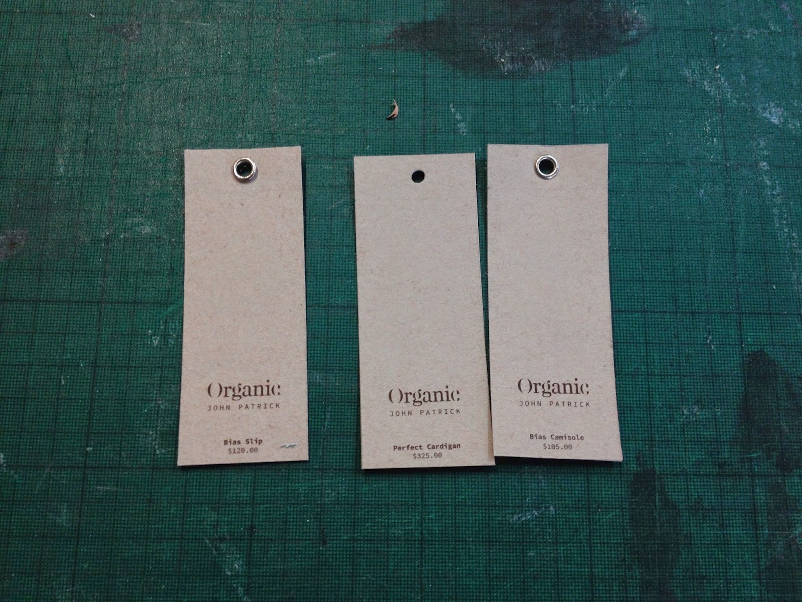
I printed out three different examples, then measured and die cut holes out of each. 


I tested out some with and some without the eyelet. The eyelet appeared to get squashed, so I decided to leave them without, giving a cleaner edge. 


Choosing A Colour For Each Page

For each stock, I wanted a darker version printed for the content. Below you can see a test of different shades of mint, to find which one would work best on the page. Obviously this could have been done on screen, but I find that printing gives a much more consistent result. 


I also compared each shade to another printed and finalised sheet, to make sure that the difference in tone was the same as the difference in tone on another sheet. 


Of course each piece of branding was stamped with the embossing seal. 


The Finished Branded Stationary, Ready For Photography


OUGD503 Responsive: Digital Club Leaflet (Brief 09) - Full Project

I was approached by Will Duffy (who works at Digital - A club in Newcastle) to design a leaflet for a club night. This is something I wouldn't ever want to do as a career, but I wanted a quick turnaround brief to try something different. 

Unfortunately I was given just 3 days to start & COMPLETELY finish the leaflet. I accepted this challenge, as it is something I will almost definitely have to face as a professional after graduation. 


The Brief: 

Hi Joe,

So what we want on the front is something like:

bounce presents

Room one:

Hannah Wants
Applebottom 
My New Leng

Room two:

Jonas Rathsman
Isaac Tichauer
Eli and Fur

Room 3:

Special Guest
Residents

Friday 9th May 

Not Just A Ticket 
Tickets - From £8
Digital

If you have a look at example 1: would like it in that kind of format with the bounce logo where the E M one is and a similar sort of layout to that one.

On the back would like two columns of three pictures each with a thin white banner going across each one with the name of the acts on them. will send the pics in another email.

The attached photos:


Concept

I got the idea that Will wanted something summery, so I came up with a few ideas:

- Vivid gradients
- Bright colours
- Ambiguous shape / form
- Simplicity (to match Digital's logo and aesthetic. 


First / Second Idea:


I sent Will the first idea, revolving around the above concept. 
He replied saying: 

"I think the background needs to change.. is a bit bland. Also could we look at some different fonts and make the artists names much bolder. Hannah wants need to be a bit larger font, applebottom slightly less, then my new leng slightly less"

I found this response very frustrating, but it made me realise exactly what he wanted - A generic club leaflet. You can see this as the second design in the Issuu document above.

Response:

Will loved the second design, and wanted to take it forward. He told me a few ammedments he wanted me to take:

.......


OUGD503 Responsive: Collab Brief (Brief 04) - Pizza Box Screen Preparation

I used the same file as used for laser cutting, to ensure the sizing would be the same. 

The colours were split into 3 layers for each box - red, white and blue. I worked with layers instead of separate documents, to ensure everything was overlaid in the right place:


I then went down to the digital dungeon, and got each sheet printed exactly to scale:


I wanted to see if the laser cut boxes were at the same exact scale, so I placed a box over one of the printed pages. As you can see below, the sizing seems to be perfect, success!


OUGD503 Responsive - Organic (Brief 01) - Deciding On Final Designs

Below is an Issuu publication, showing how my designs had developed from the last crit. As you can see, all the design itself is finalised, and so the choice of stock and printing are the only things needed. 


Below are some (very quick) mockups of the hanger / box. These will be raftered with the laser cutter, cutting a thin top layer where the design will sit. 

Designs for hanger:


Designs for box:


OUGD503 Responsive - Organic (Brief 01) - Producing The Box / Hangers

Producing the Box

Sanding It Down

As John Patrick is keen on ethics and a green practice, I used a reclaimed box for the packaging. 


I sanded the box down, so I could print on the side of it.


To give the appearance of an aged box (bleached by the sea), I experimented with two different bleaches to make the box whiter. 


Laser Cut


Producing the Hangers

Laser Cutting

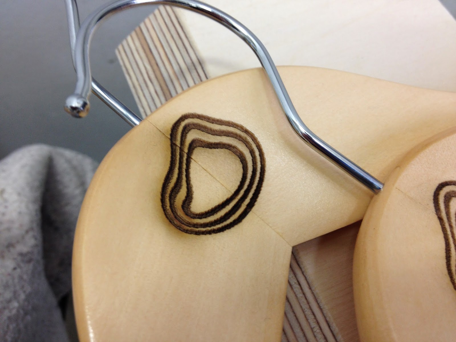
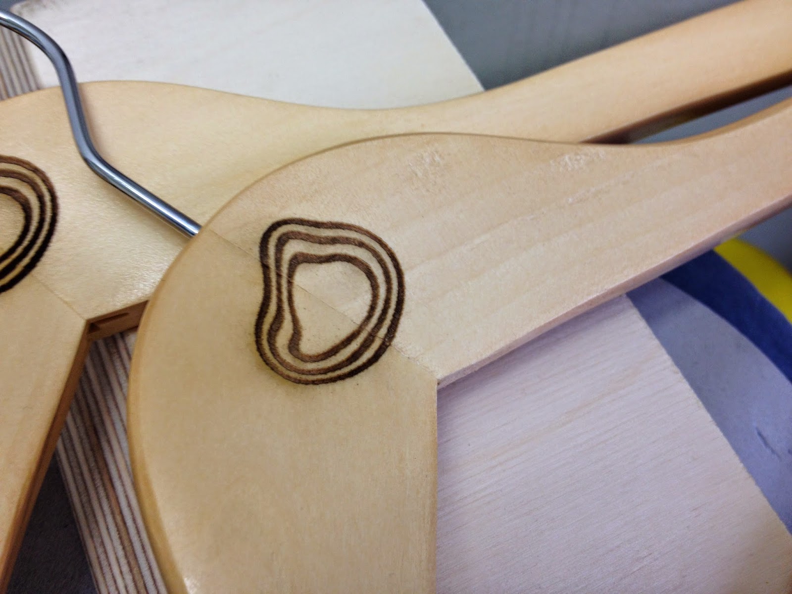
I bought 5 wooden hangers, and experimented with different strengths of laser. The last image shows the strength I settled on, which was replicated over 3 hangers. 


OUGD503 Responsive: Studio Brief 1 - Collaborative Practice - Design Boards + Board Crit

  The boards Alex & I Produced:


A write up of the crit sheet:

Strengths:

Strong visuals and using bright colours sits well with the brand. The aesthetics have been followed well.
Consistently well structured. Aesthetics tie in with existing brand, creating a ready to use concept.

Suggestions:

Domino's logo isn't on the app. The app badge should be the Domino's logo.
Show off how the app could appear on different screen sizes.
How would the new promotion be promoted.

Communication of the concept:

Done well, idea of the app is strong and target audience is relatable.
Visual concepts are very clear, explains concept well.

Suggestions:

Didn't understand pizza box proposal, not explained well enough.
Would the app be a part of the existing site. Is it available on android too?

Communication of Deliverables:

Clear communication, balance between type and image. App well presented.
Boards illustrate well how the app navigates.

Suggestions:

QR code scanner changed to blippar? Change pizza box explanation.

Communication of Audience/Context:

Clean aesthetics and colours are relevant. Audience is fairly self explanatory.

                                                                                                  
Elements to Modify:

More use of red backdrop.
Domino's logo.
More big, less small.
No text first page.
Other product mockups e.g. Android phone, iPad.
Change top info to names, page number and brief.
Explain/Illustrate packaging solution.
Reconsider app button.


Copyright 2010. All rights reserved.

RSS Feed. This blog is proudly powered by Blogger and uses Modern Clix, a theme by Rodrigo Galindez. Modern Clix blogger template by Introblogger.